Skincare Logo Ideas To Bring Your Brand to Life
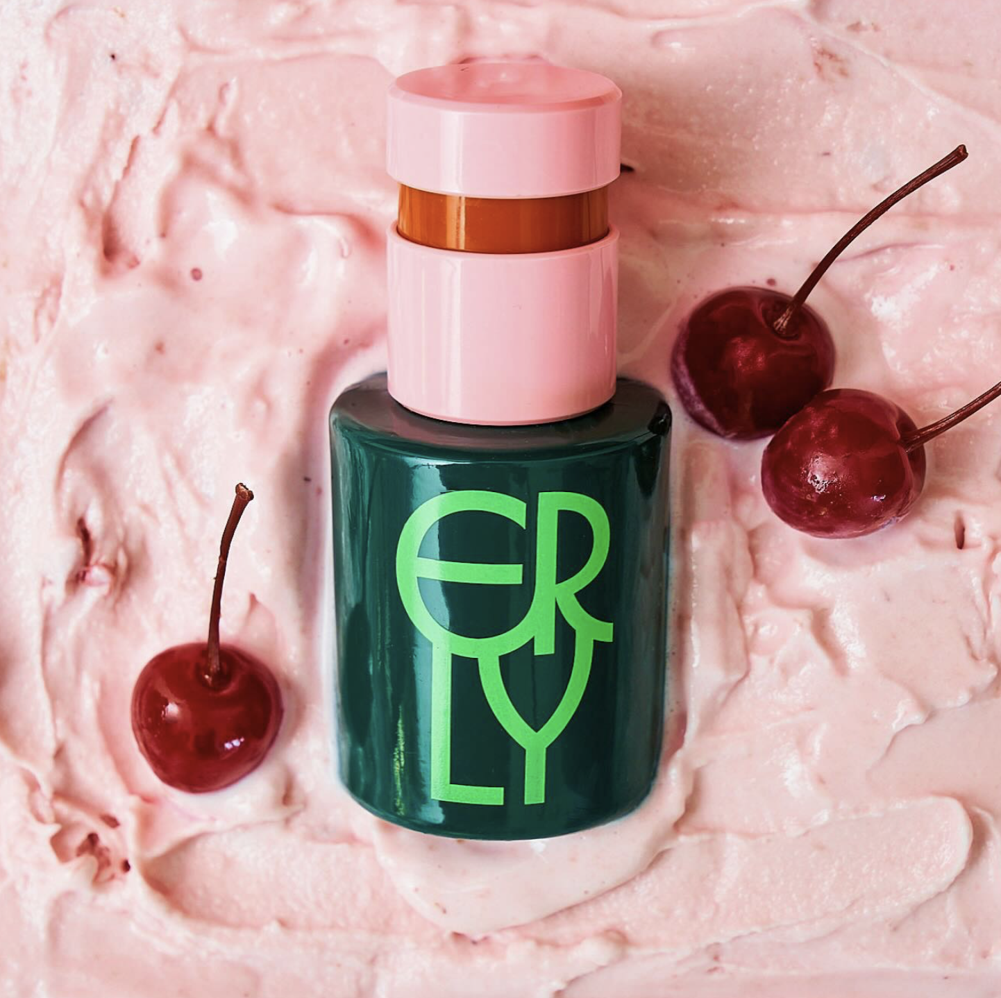
Table of Contents
A skincare logo lives everywhere your brand shows up. On bottles that sit by the sink. On shipping boxes that arrive at someone’s door. On Instagram posts, ingredient lists, and wholesale line sheets. Over time, it becomes one of the most familiar parts of your brand.
Because of that, skincare logo ideas deserve more attention than many founders give them. A logo sets expectations before a customer ever touches the product. It signals quality, values, and credibility in seconds.
Let’s take a closer look at skincare logo ideas that work for modern beauty brands. We’ll break down popular logo styles, what they communicate, and when each one makes sense to help you make smarter design decisions that support your brand long-term.
What Makes A Great Skincare Logo
A great skincare logo earns trust before a customer ever tries the product. It holds up in daily routines, small packaging, and fast digital moments, quietly reinforcing the brand every time it shows up.
Simplicity And Clarity
Some of the best logo ideas for skincare businesses work for one simple reason – you understand them immediately. The name is readable. The design feels intentional.
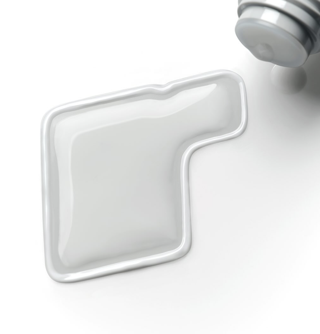
This kind of clarity matters more in skincare than in many other industries. Logos end up squeezed onto slim serum bottles, printed on textured boxes, and reduced to tiny icons on a phone screen. When the design is simple, it holds its shape everywhere and still feels recognizable.
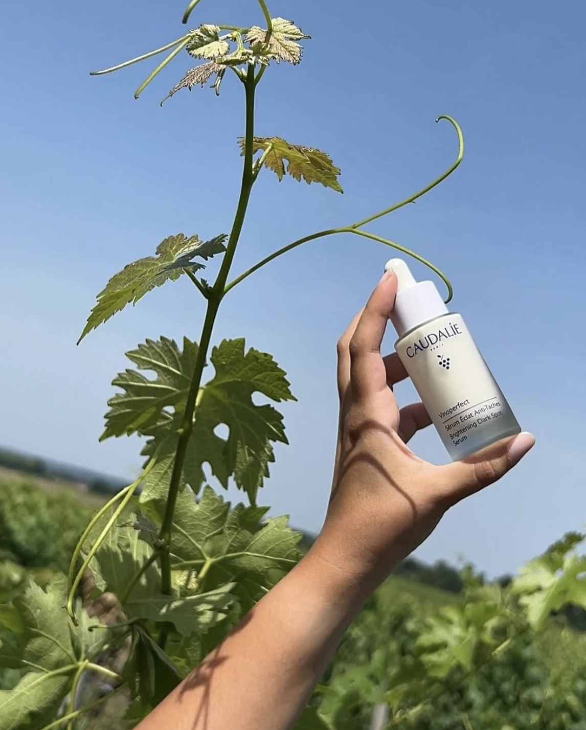
Research around brand recognition shows that people remember clean, uncluttered visuals more easily, especially when they encounter them in different places. For a skincare brand, that means the logo design still feels like the same brand on a box, a website, or social media post.
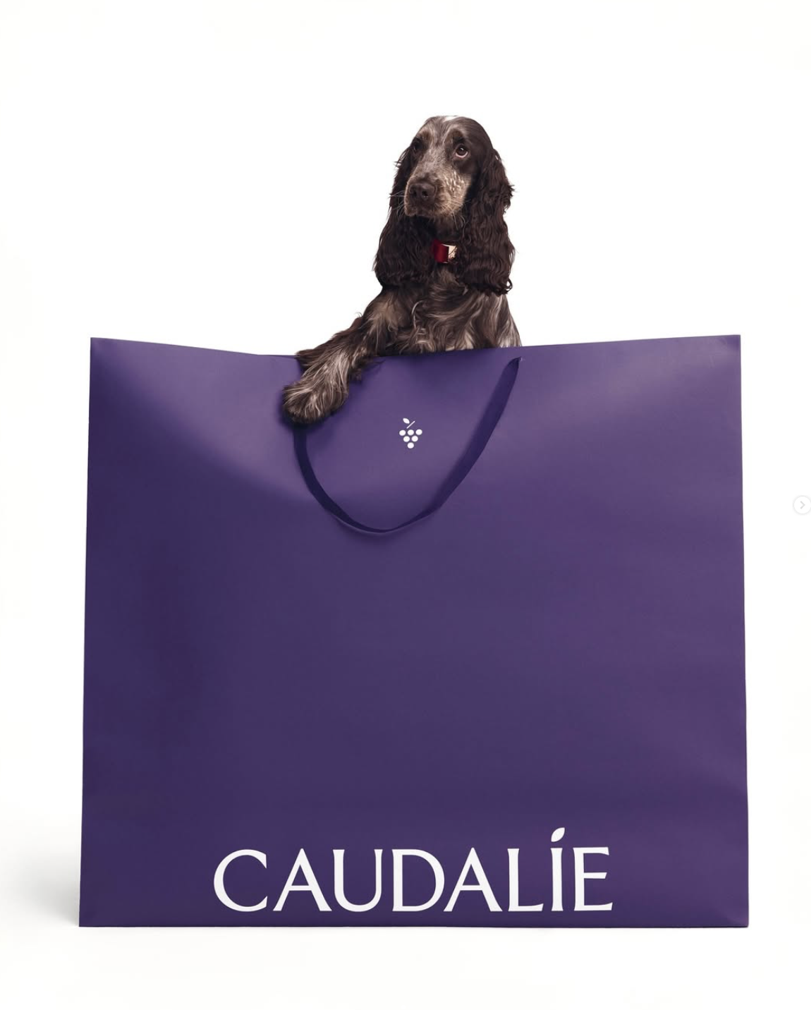
Source: Caudalie & La Roche-Posay
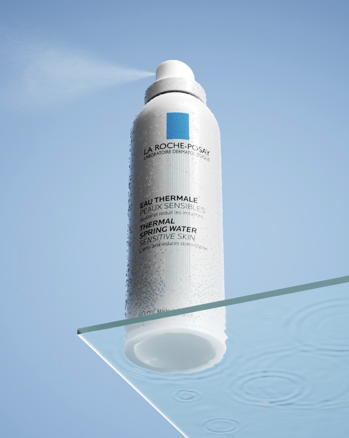
Readability Across Packaging And Digital
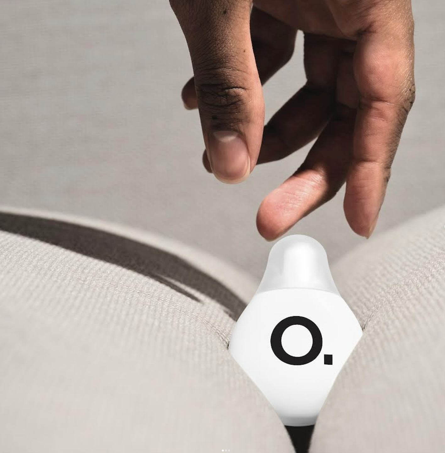
Strong skincare logos stay clear wherever the brand appears. On small serum bottles, ecommerce product pages, social media profiles, and packaging, the skincare logo remains readable and easy to recognize at any size.
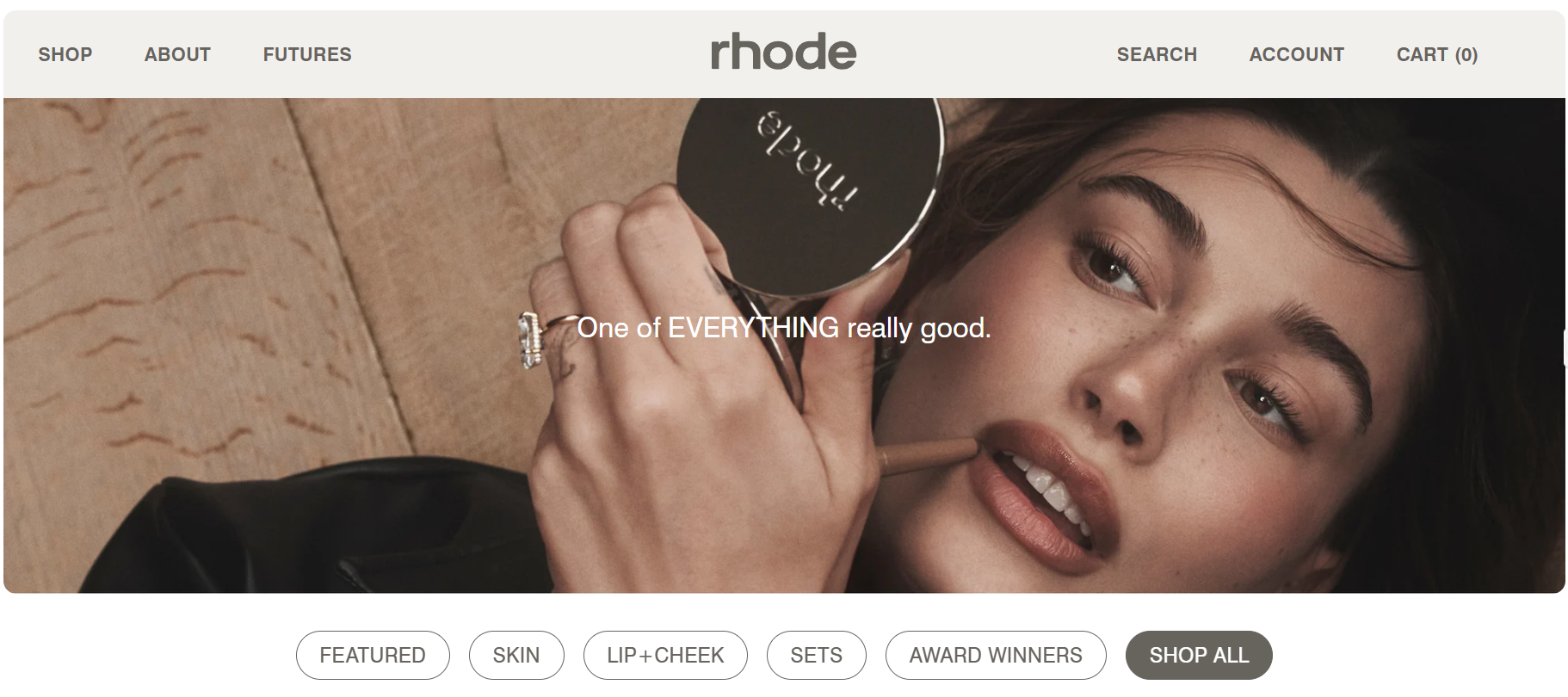
Source: Rhode
Readability shapes how customers process a brand. Clear typography and balanced spacing help people recognize a skincare logo faster on mobile screens and online stores, where most product discovery happens today.
For a skincare business, readable logo design creates consistency. That familiarity helps the brand feel professional, established, and trustworthy across every customer touchpoint.
Brand Alignment And Longevity
Skincare logos tend to last when they actually come from the brand itself. A beauty logo feels stronger when it reflects the brand’s story, the kind of skincare products being sold, and the people the business is meant for.
That connection matters more than many founders realize. A study on brand identity found that consistent branding, including logo design and visual style, helps customers recognize a brand and choose it again over time. Whether you create your own skincare logo from scratch or work with a professional designer on custom skincare logo options, alignment gives the brand a better chance to grow without needing constant visual changes.
Skincare Logo Ideas By Style
When you’re building a skincare brand, the style of your logo communicates as much as the name itself. Here are common logo directions used by successful beauty brands, what they visually look like, what they signal to customers, and when each one works best.
Minimalist Skincare Logo Designs
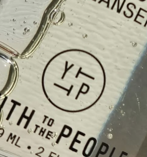
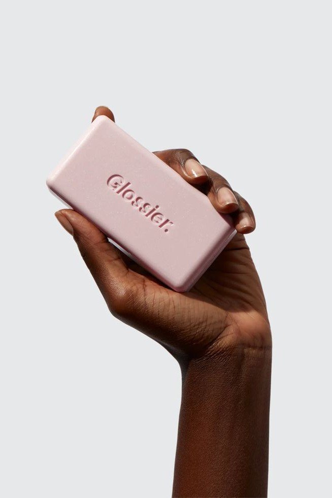
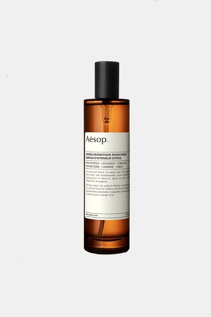
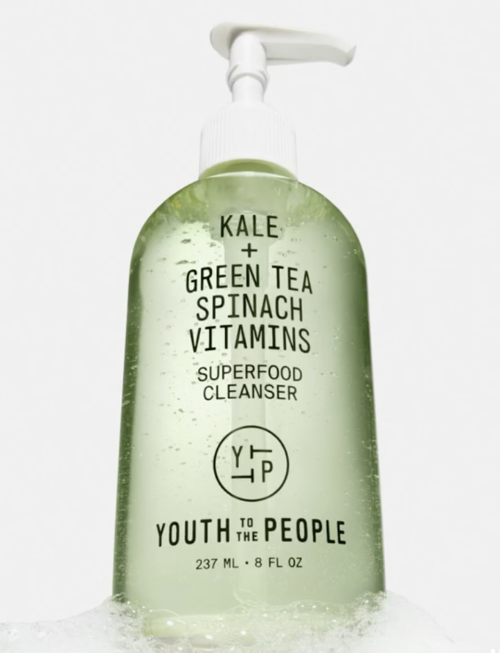
Minimalist skincare logo ideas feel quiet and considered. Clean type, simple layouts, and open space give the brand name room to exist on its own. Brands like Glossier, Drunk Elephant, Aesop, Youth to the People, Sunday Riley, and The Ordinary use this approach so the logo feels like part of the routine.
This style suits clean beauty and everyday skincare brands that value clarity and transparency. It also moves easily across packaging, ecommerce, and social media.
If you choose to work in this direction, attention goes to typography and proportion. One strong font, thoughtful spacing, and a steady skincare logo creates a refined and dependable brand image.
Botanical and Nature-Inspired Logos
Botanical skincare logos usually pull from the natural world in a very subtle way. Soft plant shapes, simple leaf details, organic lines, and earthy colors show up often. You see this across brands like Origins, Caudalie, Tata Harper. The logos feel connected to ingredients and sourcing.
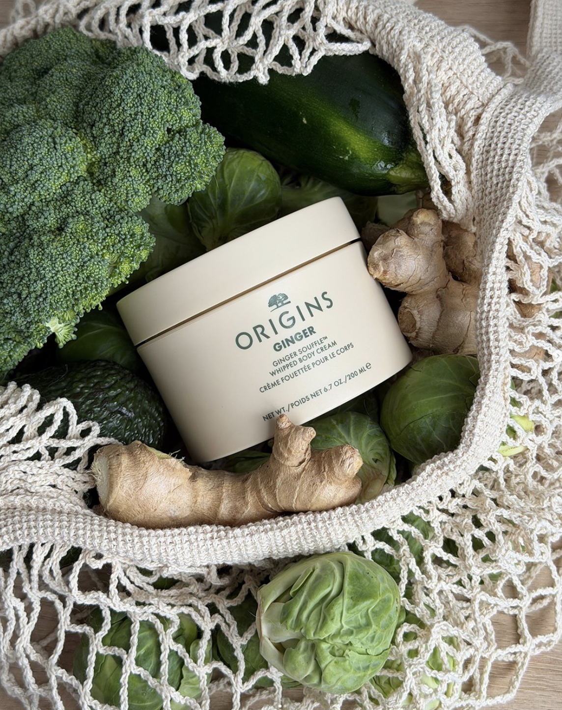
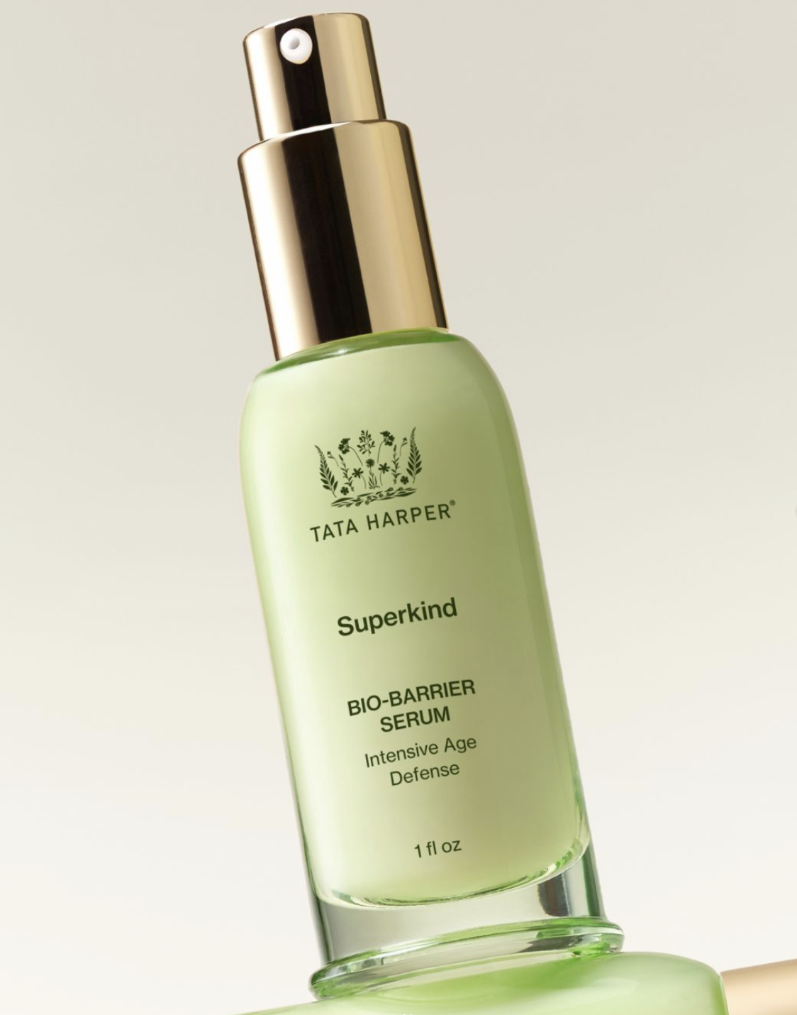
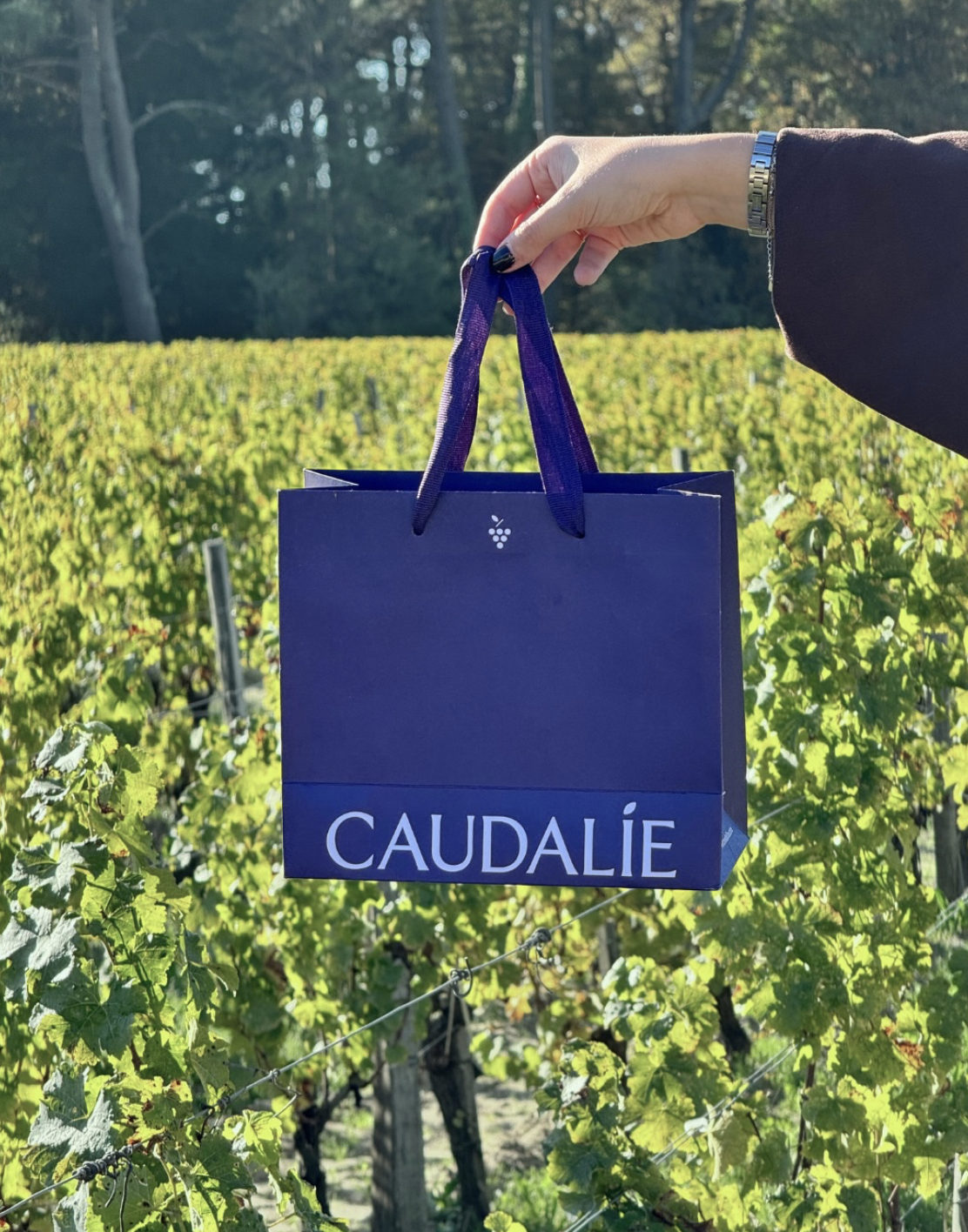
This direction works well for natural skincare, plant-based formulas, and brands built around wellness. Logos like this signal care and intention. When executed well, the logo feels calm and grounded, like it belongs to the product. If you're going this way, keep the botanical elements subtle and the typography clear, so the brand feels modern, professional, and easy to trust.
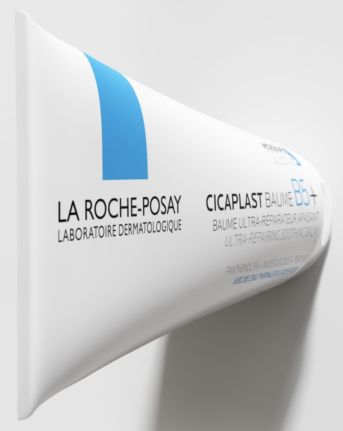
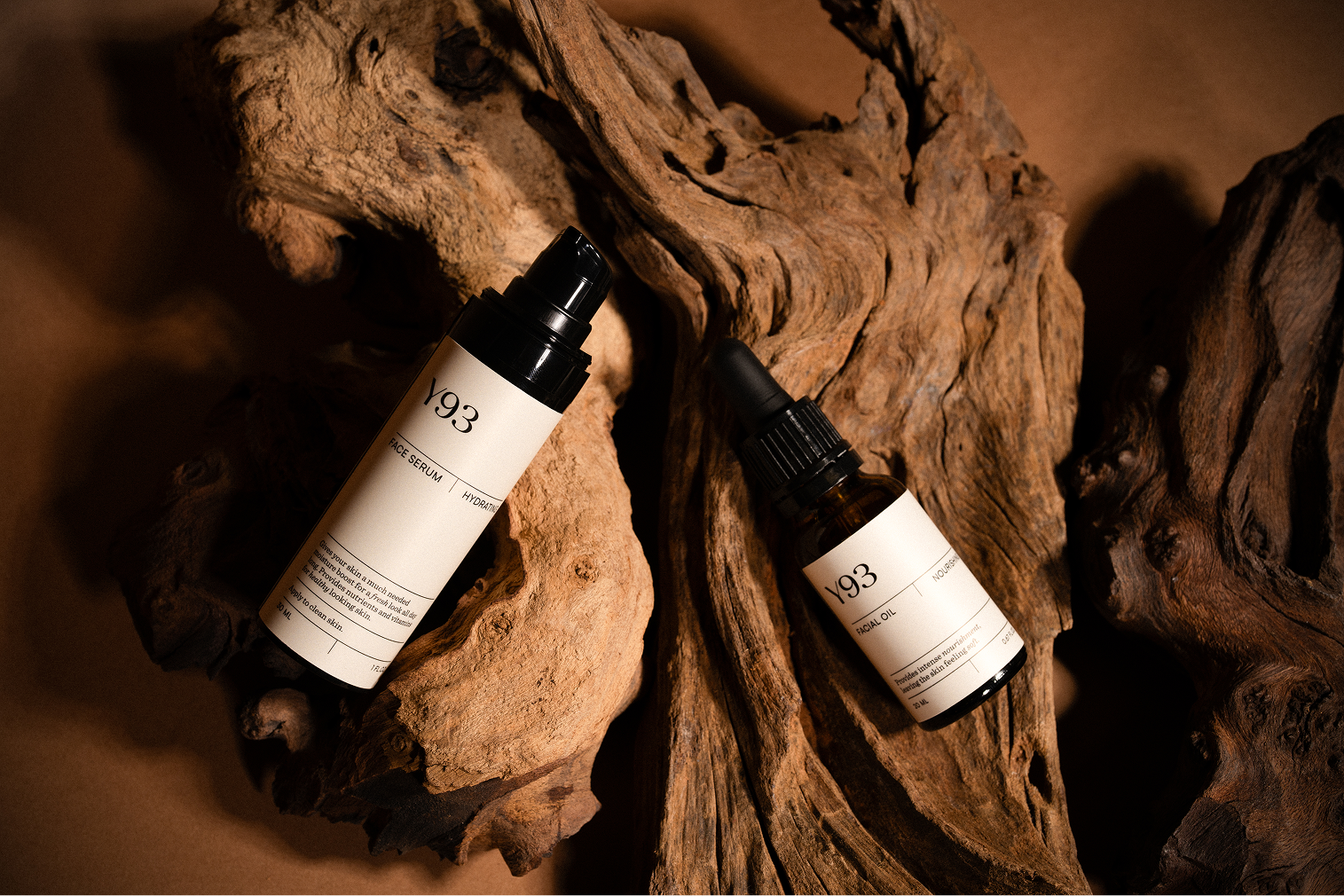
Clinical and Dermocosmetic Logos
Clinical and dermocosmetic skincare logos usually feel calm, structured, and intentional. You see clean sans-serif type, orderly layouts, and colors like blue, red, white, and soft grey. Brands such as CeraVe, La Roche-Posay, Vichy, SkinCeuticals, and Eucerin follow this approach so the logo feels steady and trustworthy.
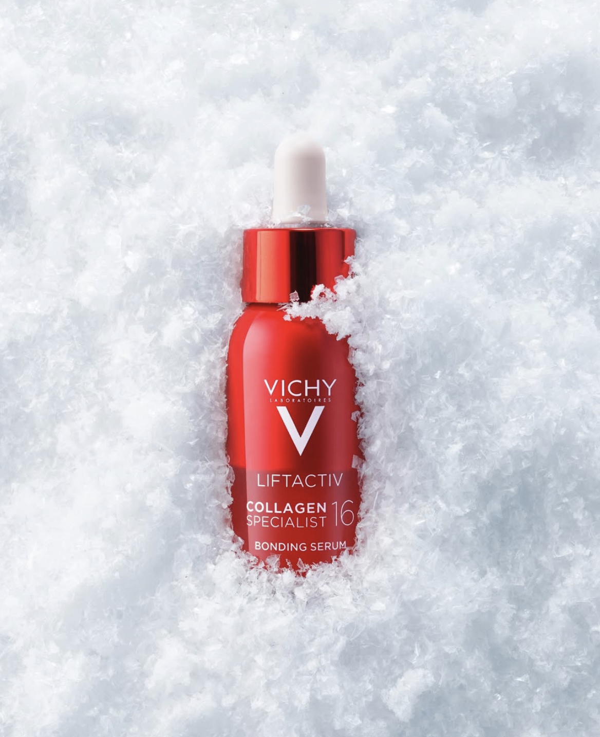
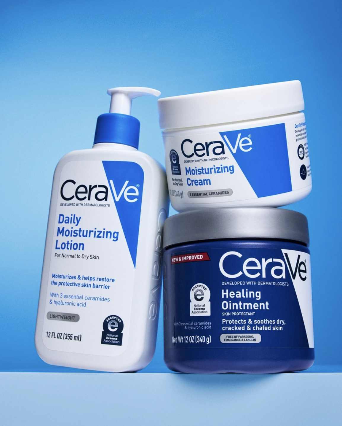
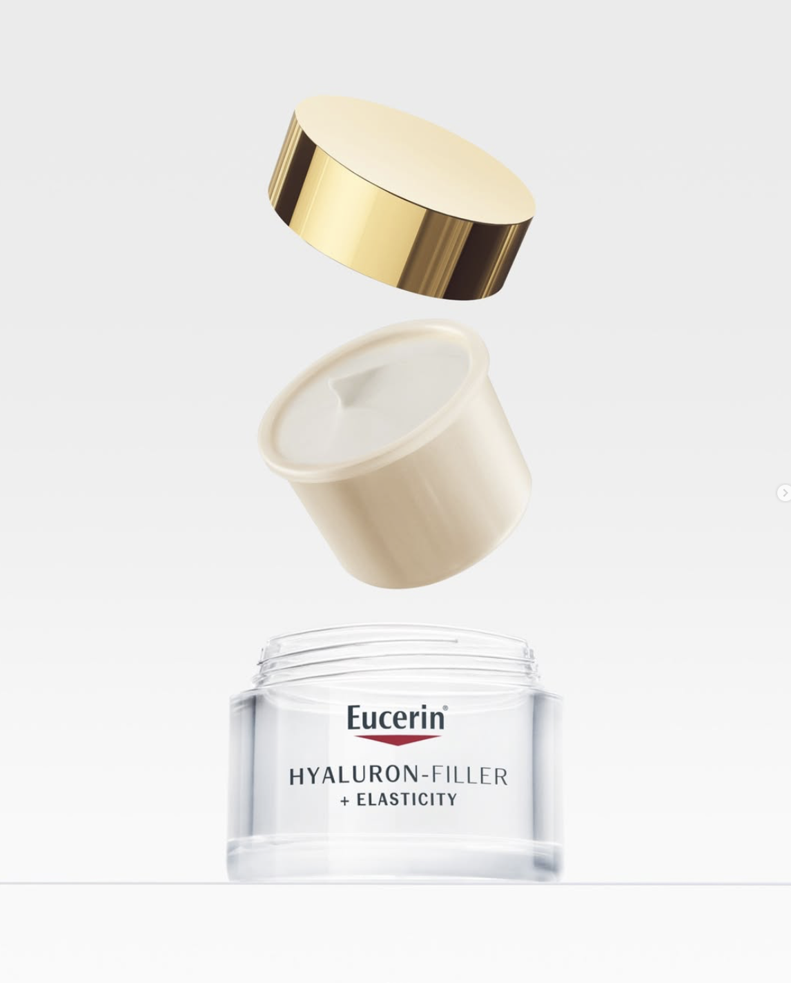
This style fits skincare brands built around results, formulas, and expertise. Customers tend to associate this design with credibility and consistency, especially for products aimed at specific concerns. When done well, the logo sets clear expectations before anyone reads the ingredients.
In execution, clarity leads everything. Straightforward typography, balanced spacing, and a controlled visual system help the logo feel professional across packaging, ecommerce, and everyday use.
Luxury and Premium Skincare Logos
Luxury skincare logos usually keep things very restrained. The brand name does most of the work. Typography comes first, often with serif fonts or custom lettering, and everything else stays quiet. You see this across brands like Chanel, Clé de Peau Beauté, La Mer, Augustinus Bader, and Estée Lauder. The logos feel settled, like they’ve been there for a long time.
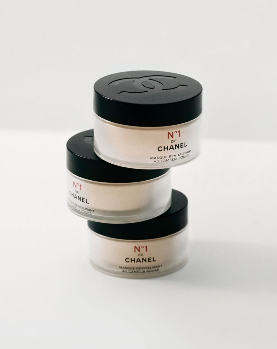
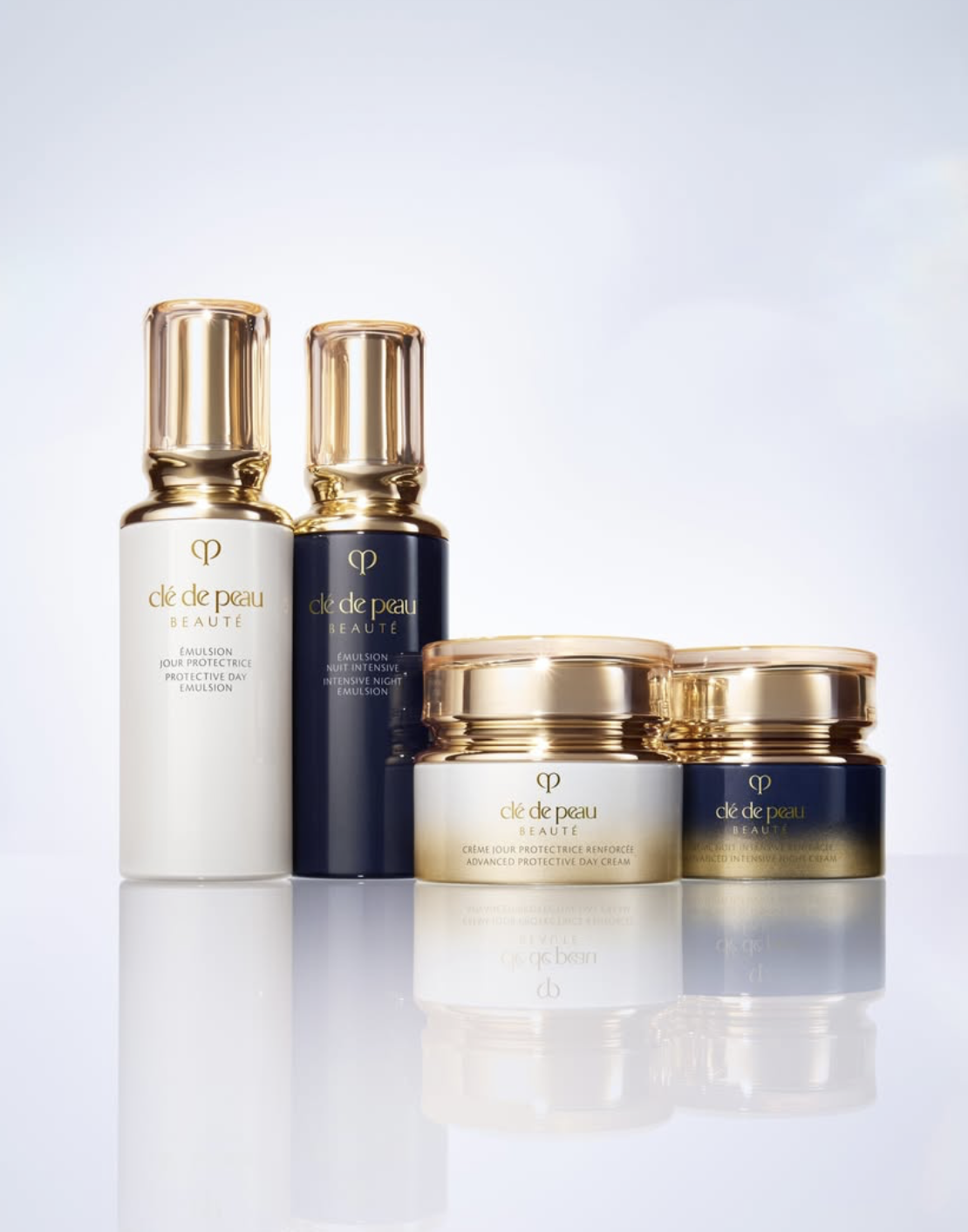
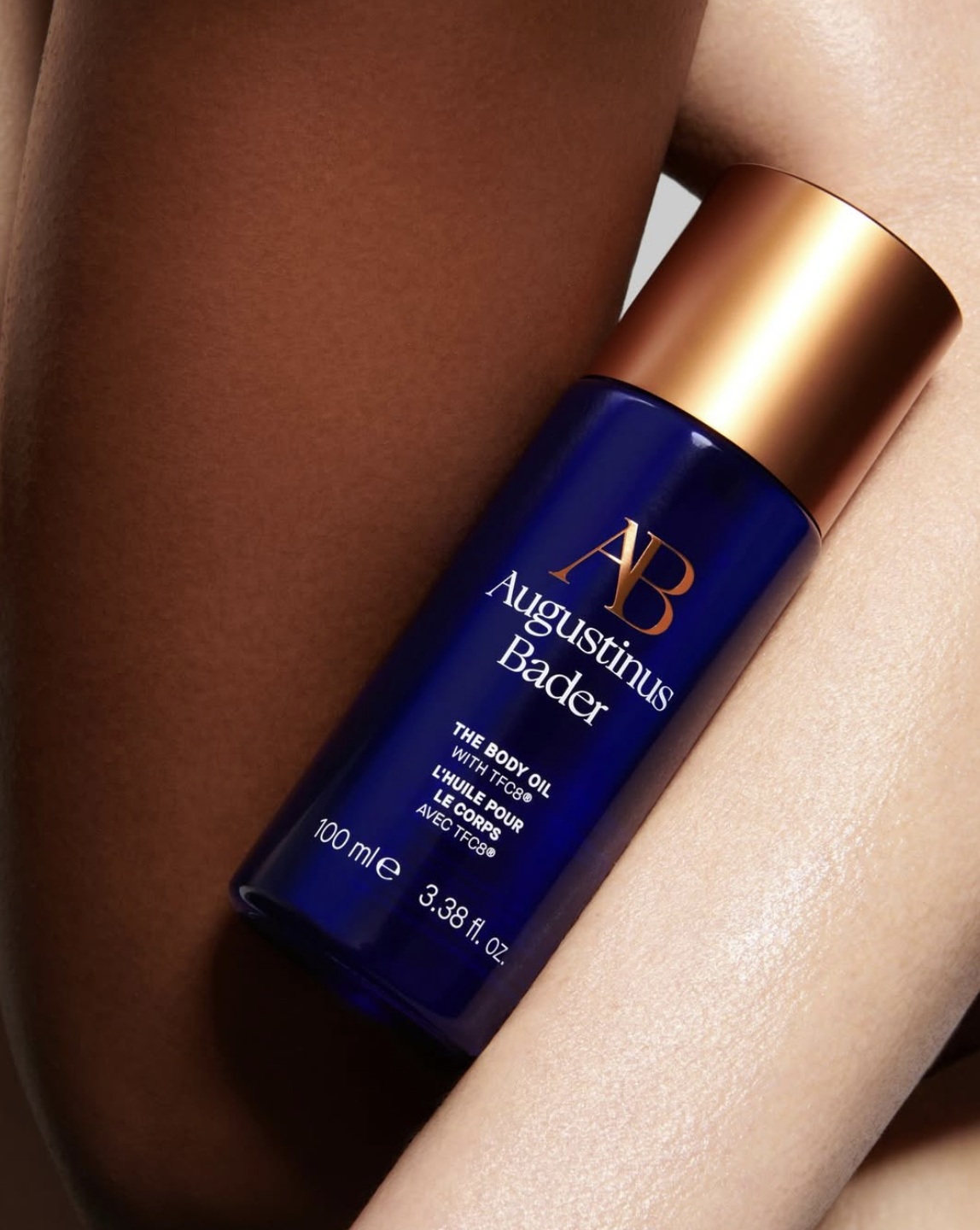
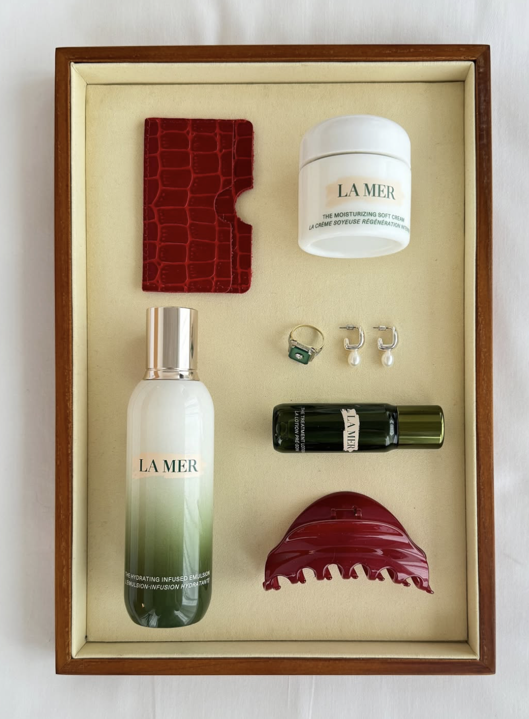
This kind of logo design fits the premium skincare category where customers from the first moment expect care, precision, and consistency. The logo sets that expectation without needing to explain it.
In luxury branding, small choices carry a lot of weight. Spacing, proportions, and finish shape how the logo feels on the skincare, hair care or face care products. So, keep the design simple and allow the materials, packaging, and product experience to elevate the brand.
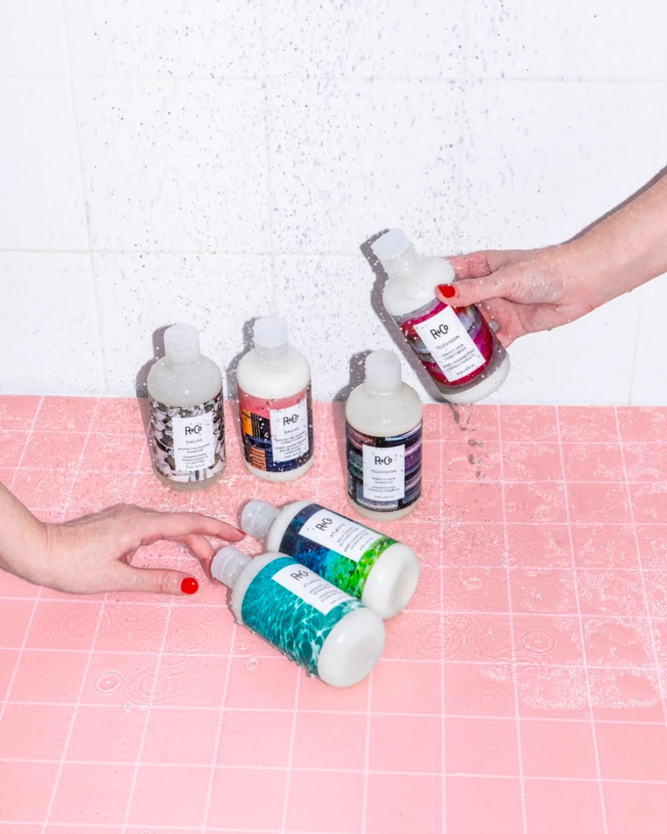
Bold and Modern Skincare Brands
Bold skincare logos lean into personality The logos feel confident, graphic, and easy to spot, especially online. They use strong type, unexpected layouts, and confident proportions that give these logos energy and presence. Great examples of bold and modern logos are Facile, Starface, ERLY, Daise, Bubble Skincare, Then I Met You.
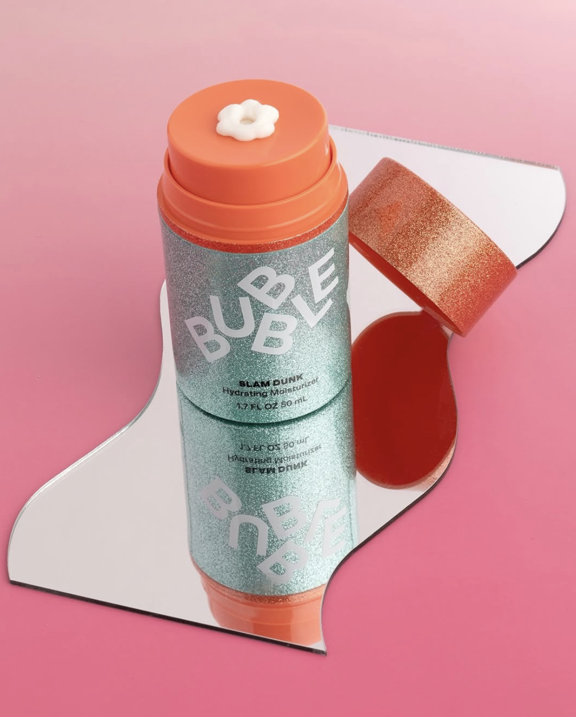
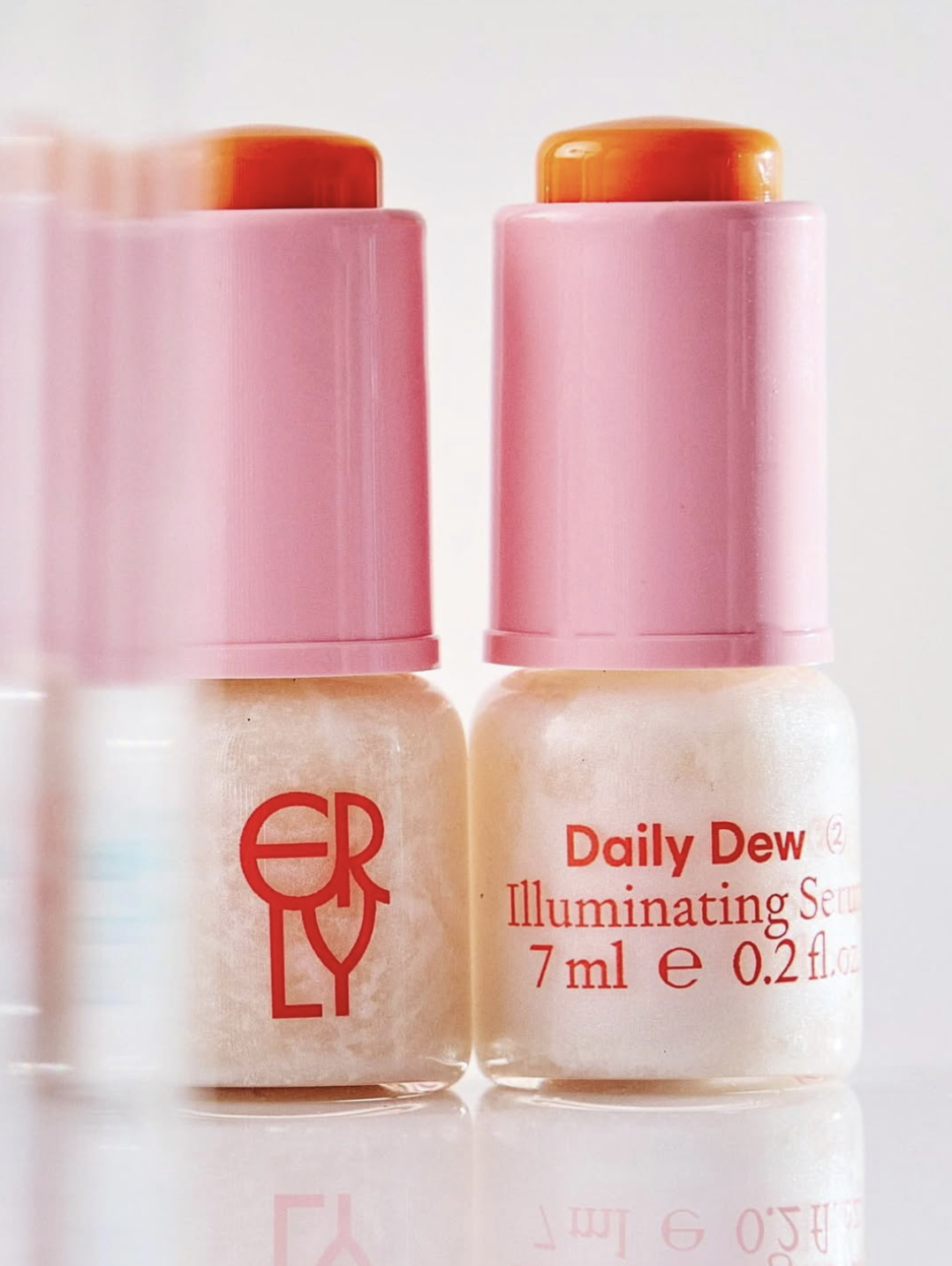
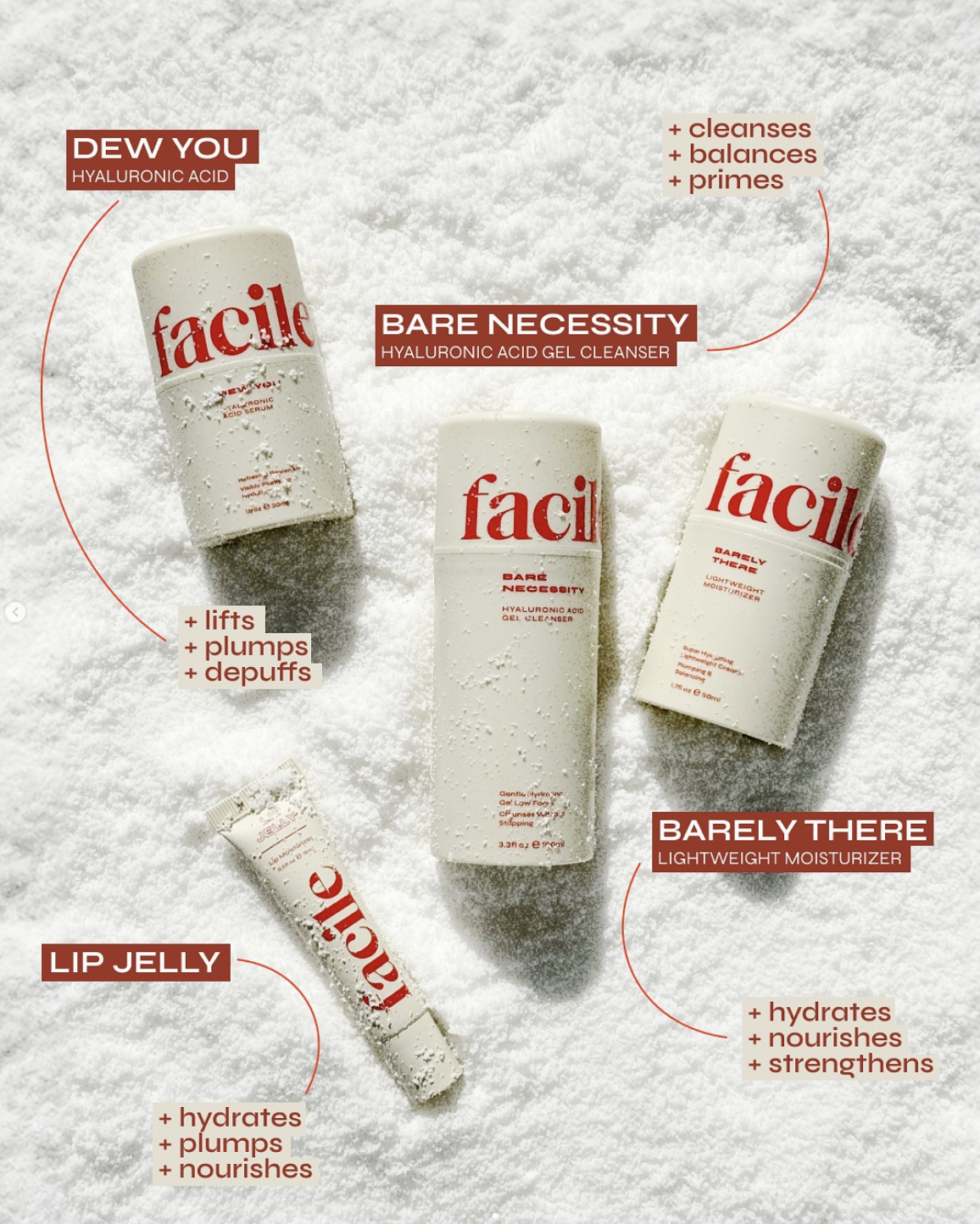
This style fits indie skincare brands and direct-to-consumer launches that speak to a younger, trend-aware audience. It feels current, expressive, and easy to connect with, which helps the brand feel present in today’s beauty world.
When working in this direction, focus keeps everything grounded. One clear idea carries the logo, whether that’s typography, color, or layout. It helps the design stay recognizable and confident across packaging, ecommerce, and social media.
Typography, Symbols, and Color
Once you have chosen the overall logo style, typography, symbols, and color are what turn an idea into something that actually matches the brand. This part of the process is less about rules and more about choosing what feels right for the skincare business and the customers.
Serif vs. Sans-Serif in Skincare
Type sets the mood right away. Serif fonts often bring a sense of heritage and care, which is why they show up in more premium skincare. Sans-serif fonts feel simpler and more current, so they’re easy to pick for clean beauty or clinical skincare.
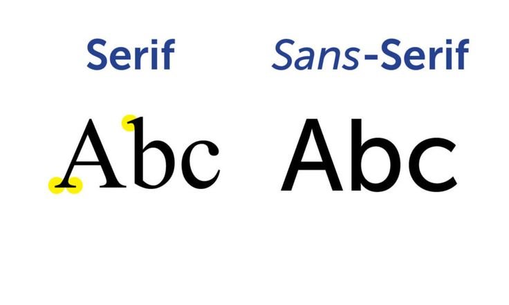
Which one works best really depends on the brand. During the logo design process, the goal is to choose typography that matches the essence of the products and helps the brand stand where it belongs in the market.
You can see this clearly with La Mer, where serif type supports a luxury, heritage feel, and The Ordinary, where sans-serif typography reinforces clarity and function. The difference shows how type alone can shift how a skincare brand is perceived.
Icon-Based vs. Wordmark Logos
Some skincare logos include symbols. Others simply use the name. Icon-based logos can bring personality and work well on packaging details or social media. Wordmarks keep things clear and help customers remember the brand faster.
For many brands, starting with a wordmark keeps things simple. It makes the process easier and helps achieve recognition early. Icons can come later, once the brand feels more established.
For example, Drunk Elephant uses a recognizable symbol as part of its identity, while The Ordinary relies almost entirely on typography. Both approaches work, but they create very different first impressions.
Color Psychology in Skincare Branding
Color of the product packaging and logo is usually the first thing customers notice, even before they register the name. Soft shades tend to feel calm and familiar. Greens often show up in natural skincare because they already match what customers expect. Blues usually feel safe and dependable. Brighter colors bring energy and help a logo stand out faster.
Choosing color really depends on what the brand wants to achieve. When the palette matches the essence of the skincare brand and stays consistent across packaging and digital channels, everything feels more intentional. That consistency makes the logo easier to recognize and helps customers feel comfortable picking it again.
Common Skincare Logo Mistakes
A lot of skincare logo decisions make more sense when you look at what hasn’t worked for other brands. Learning from these patterns can save you time, money, and frustration before a logo ever reaches customers.
Overcomplication
One of the most common skincare logo mistakes is trying to say too much at once. Multiple icons, decorative fonts, gradients, and extra details often end up fighting each other. This happens a lot when brands rely heavily on templates or try to customize every option a free logomaker or logo contest offers.
A simpler approach usually feels clearer and leaves customers more satisfied because the brand is easy to understand.
Trend-Chasing
Trends can be useful for inspiration, but building a skincare logo around whatever looks popular in the moment rarely ages well. What feels fresh today can start to feel awkward surprisingly fast.
When trends shift, logos tied too closely to them start to feel out of place. This is why many established skincare companies keep their logos restrained and consistent. Choosing longevity over short-term attention, helps the brand stay recognizable over time.


Poor Scalability
Another mistake shows up once the logo leaves the screen. A design might look polished in a mockup and fall apart on a real product. Thin lettering, intricate icons, and tight spacing often lose clarity on small jars, tubes, or ecommerce thumbnails.
This usually shows up when a logo is put together quickly using free tools or downloaded files that never get tested in real situations. A scalable logo keeps things simple as the business grows. It works on new packaging and stays clear across every platform.
A thoughtful logo gives a skincare brand room to grow, evolve, and stay recognizable, so learning from other mistakes helps you create something real that truly brings the brand to life.
Create A Logo That Lives With Your Brand
A skincare logo ends up being part of customers everyday life. It sits by the sink, shows up on packaging, and pops up on a phone screen often enough that it starts to feel familiar. Over time, that familiarity turns into trust.
The strongest skincare logo design ideas are built to fit the brand, the products, and the people using them. When that balance is right, the logo stops feeling like a design decision and starts feeling like a natural part of the brand itself. That’s why it’s worth creating a logo that carries the brand’s essence clearly, honestly, and with care.
Frequently Asked Questions
-
The best logo style depends on what the brand is trying to say and what is the target audience. Some skincare brands feel strongest with a clean, minimal logo, while others need something more natural, clinical, or expressive to match the product and positioning.
-
They can. But many brands start with just the name because it’s the clearest way to build recognition. Icons usually come into play later, once customers already know who the brand is.
-
A redesign makes sense when the brand has genuinely changed or grown, not just because design trends have shifted.
-
Usually the colors that feel right are the ones that already match the product. Calming routines tend to lean softer. Natural formulas often make sense with greens. Blues feel safe and familiar. Brighter colors can help a brand show up online.
-
You should be able to. A good skincare logo looks just as clear on a bottle or box as it does on a phone screen. If it only works in one place, it usually causes problems later.
Must read