Beauty Design & Branding: Top Trends to Watch in 2025

Well, 2025 has somehow landed at its halfway point. Not exactly the usual time for trend predictions, but a good moment to step back and see where design and branding in skincare have moved so far. And where the next six months (traditionally the heavy-hitters for sales) might take us.
For those who don’t know me, I’m Chief Growth Officer at Selfnamed. But my work experience has taken me across both sides of the table, building brands from the inside and advising them from the outside. Fashion, product, digital, and now private label skincare – I’ve seen how the game works. That mix keeps me honest: not every trend is worth chasing, and not every shiny thing makes sense for your brand.
One thing about trends: they’re not always brand new. Many have carried over from last year, evolving rather than disappearing. And like before, some still pull you in completely opposite directions — which is perfectly fine. It’s all about what fits your brand, your audience, and your long game.
So let’s take a look, shall we?
Table of Contents
Old money vibes
You think it's new, but it never was. It’s always been here. The mass market and trendsetters over-watched it for years. You might think of it as something out of Sean Connery’s James Bond era, with a vintage vibe. But in reality, it never left, not in real life and not online.
From Hermès’ first fragnance Eau d'Hermès to a $785 bottle of La Prairie’s Skin Caviar Liquid Lift, this kind of luxury never disappeared.
In fact, the Skin Caviar Liquid Lift even appeared as part of Gerri Kellman’s skincare routine in HBO’s Succession. That show ran for nearly five years and heavily influenced fashion, design, and lifestyle. The focus on "quiet luxury" where quality and subtle sophistication matter more than loud displays of wealth simply gave renewed attention to brands that have always quietly existed.
Succession didn’t invent the aesthetic. It just put a spotlight on a world where money is no object and taste whispers louder than logos.


Hermès' first fragrance is still here. Created in 1951 by perfumer Edmond Roudnitska, it has quietly outlasted more than 70 years of shifting trends.


The very first Hermès cologne was created by Françoise Caron in 1979. It was initially called Eau de cologne Hermès, before being renamed Eau d'orange verte in 1997. Now iconic, it stands out for its vivid green freshness and the line has expanded into more mass market product types (Body washes, soap etc.).
Loud luxury is out. Whispered luxury is in. Think subdued serif fonts, deep navy or forest green bottles. It’s wealth signalling for people who don’t need to signal anything.
I see more indie skincare brands embrace this aesthetic as a way to position themselves in the prestige segment without resorting to flashy design. Brands like Merit follow this principle – understated packaging, sophisticated typography, and clean layouts that let the product do the talking. The visual language says "expensive" without needing to shout.
The "old money" aesthetic also fits well with the growing customer demand for quality, expertise, and timelessness. It signals a certain confidence: this product doesn’t need to chase attention because it knows its value. For new skincare brands entering the high-end space, this vibe instantly elevates perception.


Text is the design
Design without copy is just decoration. In today’s overcrowded beauty space, aesthetics alone don’t cut it (though they obviously are needed). What separates forgettable products from cult favorites? Words. Copy is the sharpest design tool brands have, but most still treat it like an afterthought.

Source: Rhode
Bold, intentional language gives skincare products personality, edge, and meaning. It’s what turns a jar of cream into a statement. If your product sounds like everything else on the shelf, no amount of minimalist packaging will save it. In 2025, the brands that win are the ones that dare to speak up. Literally.

Source: POV Beauty
Still, most beauty startups treat copy like a checkbox: safe, generic, forgettable. And that’s a missed opportunity. Because without a voice, design is just decoration. But when design and voice work together, that’s identity. That’s what makes you stand out. That’s what sells.
The future of beauty branding belongs to those who can write as sharply as they can design. Anything less will get lost.

Source: Moksi Skincare
Design goes full circle
Sharp edges are out. Curves are everywhere. From packaging design to campaign visuals, the entire beauty space is softening up. Bottles are getting more rounded, caps more domed, and even product display blocks are leaning into organic, circular shapes.
The previously-mentioned Rhode is probably the most recognizable face of this trend right now. Its pill-shaped lip treatments, glossy finishes, and ultra-minimal packaging capture the soft, rounded aesthetic perfectly. Rhose balances luxury and approachability in a way that feels both modern and timeless.


Indie brands like Bubble have made round, playful packaging a signature. Their curved caps and pill-shaped bottles feel approachable and fresh. Glow Recipe takes it even further, building full product lines around droplet-shaped bottles, rounded jars, and smooth, glossy surfaces. Both brands make skincare feel modern, tactile, and inviting — a quiet signal that skincare is meant to feel good, not clinical.


Brand: Bubble
Image credit: Bubble


Brand: Glow Recipe
Image credit: Glow Recipe
Rounded design also plays well on digital screens. Think bubble fonts, curved UI buttons, and soft gradients that mimic depth and shape. In a world that’s been visually sharp and grid-based for years, rounded forms feel new again, offering a bit more calm, softness, and tactility both on the shelf and on the feed.
Alien beauty
Welcome to the aesthetic that looks like it crash-landed from a distant galaxy. In 2025, one of the boldest beauty design trends is all about deep space energy. Think cold chrome finishes, glitchy typefaces, UV-reactive inks, and packaging that looks like alien biotech. It’s not trying to be soft, natural, or even approachable. It’s unapologetically strange, synthetic, and surreal.
This is skincare reimagined through a cosmic lens. Tubes that resemble space probes. Bottles shaped like artifacts from a forgotten civilization. Labels that flicker like corrupted code. Every detail feels engineered, not handmade; more AI lab than apothecary. It’s giving interstellar. It’s giving you are being watched by something smarter than you.
And yet, it’s magnetic. Consumers are drawn to it because it doesn’t just sell hydration or glow. It sells transformation. It creates a world. It offers escape. And in a saturated market where everything claims to be clean, gentle, and minimal, this design language speaks louder: this product is not from here.
It’s a mood, a manifesto, a glitch in the algorithm of sameness. Alien beauty doesn’t whisper. It transmits.
Source: Godmode Beauty

Source: OEM


Source: OEM
Maximalism, but with restraint
There’s a faction of brands (and customers) who are craving more color, more fonts, more energy. All done with an intention. Brands that follow this play with loud elements, but everything still feels clean, fresh, and intentional. It’s not chaos. It’s organized energy.
Look at brands like Eadem or Youthforia – they masterfully use bold color palettes, playful graphics, and oversized typography to break through the sea of minimalism. Their packaging feels fun and energetic but never messy. The maximalist design draws younger consumers who want their skincare to feel like self-expression.
Maximalism done right allows indie brands to build very distinctive identities. It creates strong shelf presence, highly shareable content, and a natural fit for social media. The key is balance: bold choices, but with structure and brand consistency.


Brand: Eadem
Image credit: Eadem


Brand: Youthforia
Image credit: Youthforia
Anti-perfect content
The pendulum keeps swinging. Flawless flatlays are losing steam. Audiences are more drawn to messy bathroom counters, real skin texture, and behind-the-scenes chaos. No airbrushing, no smoothing, no problem.
Indie brands like Dieux Skin and Peace Out Skincare lean heavily into this approach. They show real skin, real people, and real routines. Instead of hyper-produced photo shoots, you’ll see close-ups of skin texture, blemishes, and unfiltered results. This kind of honesty resonates strongly with younger consumers who’ve grown tired of unrealistic beauty standards.
Anti-perfect content makes brands feel more human. It builds trust, drives engagement, and reflects how people actually use skincare in their daily lives. For indie brands, it’s also cost-effective – less need for high-budget productions, more focus on authenticity.


Brand: Dieux Skin
Image credit: Dieux Skin


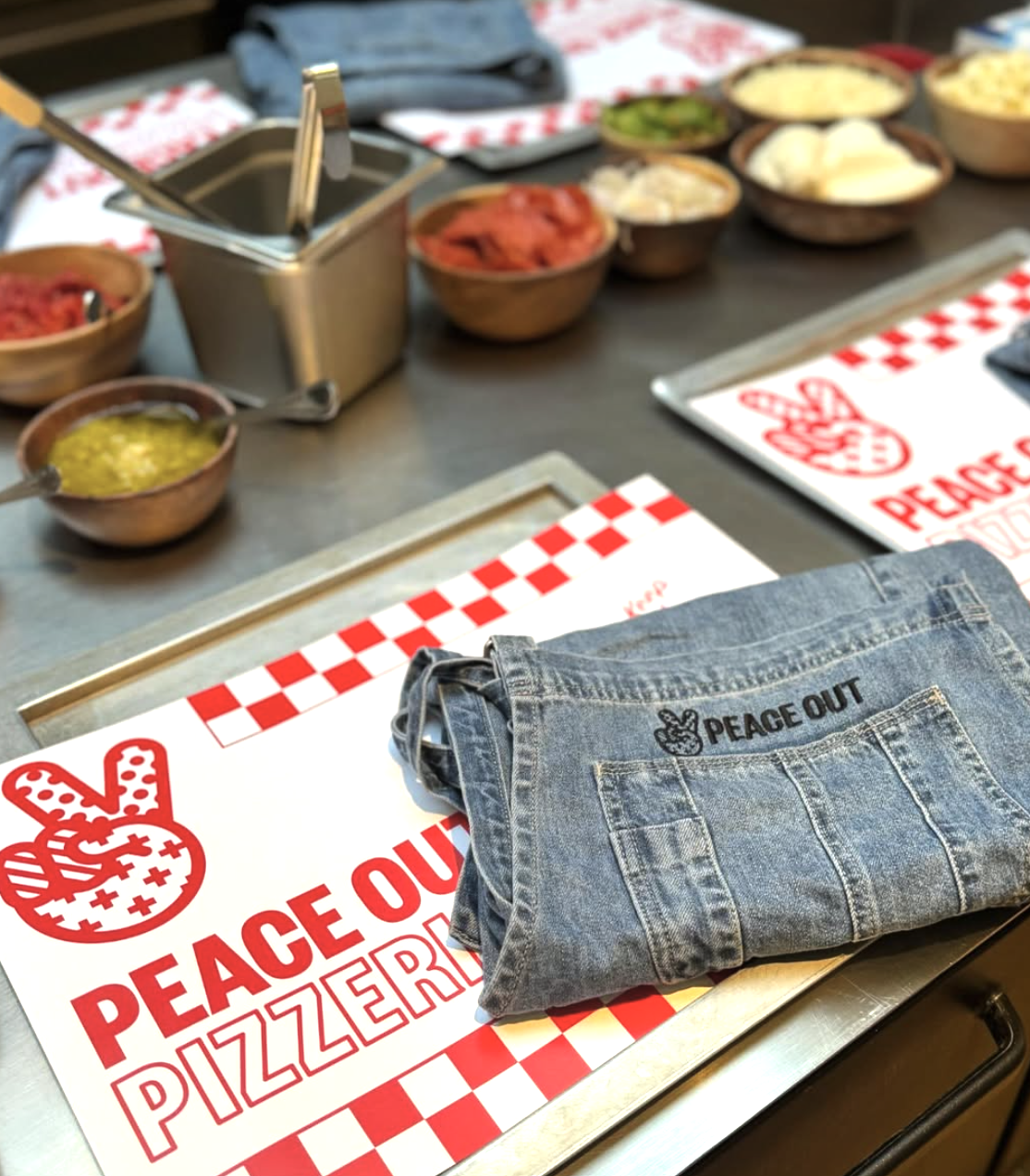
Brand: Peace Out Skincare
Image credit: Peace Out Skincare

Utilitarian meets pharma lab
This was a trend I mentioned last year as well, and it’s one of my favorites. Clinically serious, without looking like a hospital. The "we know our formulas" design language continues – simple labels, functional bottles, clinical names. But with small touches that make it all feel human.
Brands like The Ordinary, Humanrace, and Naturium exemplify this blend. The designs feel intentional, science-driven, and trustworthy. Bottles are functional, labels are straightforward, and ingredient transparency is front and center. Yet there’s still personality in the details – color choices, fonts, and textures soften the clinical edge.
For many indie skincare startups, this is a smart way to communicate product efficacy while still building a recognizable brand world. It appeals to educated consumers who care about what’s inside the bottle – but still want their bathroom shelves to look good.


Source: Niche Beauty Lab
Image credit: Niche Beauty Lab


Brand: Humanrace
Image credit: Humanrace

Brand: Versed
Image credit: Versed

Brand: omy cosmetics
Image credit: omy cosmetics
Layered nostalgia
This is not about copying the 90’s or the oughts. It’s remixing it. Y2K gradients, early internet fonts, vaporwave colorways. It’s familiar without feeling like a costume.
Vacation Inc. might be one of the best current examples of layered nostalgia in skincare. They’ve built an entire sunscreen brand on vintage 80s/90s holiday vibes – poolside leisure, old-school resort fonts, and even retro-inspired scents. But it never feels cheesy because every detail is thoughtfully modernized.


Brand: Malin+Goetz
Image credit: Malin+Goetz
Source: Ilia Beauty
Other indie brands like Good Weird remix nostalgic design elements in fresh, surprising ways. The result is design that taps into collective memory while still feeling new. It’s fun, recognizable, and highly shareable – a perfect formula for digital-native beauty brands.


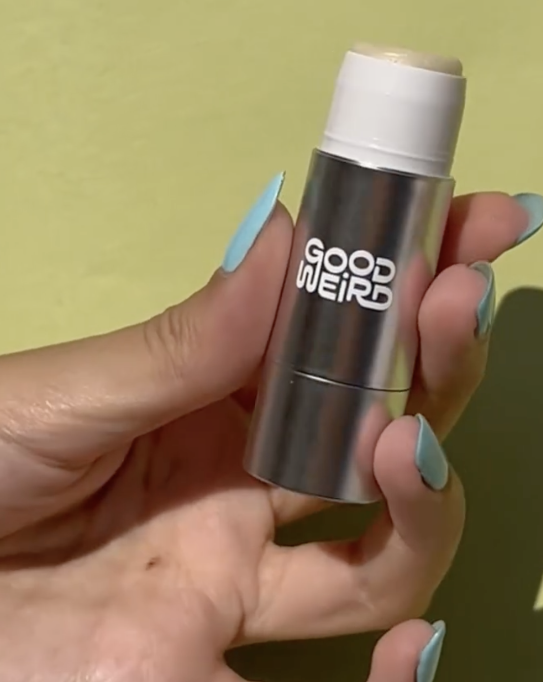
Brand: Good Weird
Image credit: Good weird
Everything is connected
In 2025, design disciplines are fully blending. Architecture influences packaging. Interior design inspires branding. Fashion shapes color palettes. Even skincare formulas borrow language from pharma, wellness, and nutrition. The lines between categories are basically gone – it’s all just aesthetic culture now.
I see indie brands create entire brand ecosystems where the product feels like part of a larger lifestyle. Aesop’s store interiors mirror its packaging language. Corpus uses soft architectural shapes. Humanrace curates unboxing like galleries.

Brand: Hello Klean


Brand: Hello Klean
Image credit: Hello Klean

Brand: Frama
Image credit: Frama


Brand: CORPUS
Image credit: CORPUS
For indie skincare brands, this cross-pollination allows them to build deeper brand worlds. Customers don’t just buy a product, they buy into a full experience that extends to their bathrooms, their routines, and even their social feeds. Design is no longer a standalone piece – it’s embedded into the entire customer journey.
Honorable mention: AI
Another trend that has come over from last year. Honestly, not really a trend, just part of our lives. But how has it impacted the way we think about design and branding? AI is here, but it’s not your designer.
In 2025, AI has become a creative assistant for indie brands. Founders use it to brainstorm product names, generate packaging mockups, create early-stage visuals, and quickly test ideas using a variety of AI tools. It helps overcome creative blocks, speed up ideation, and lower some of the entry barriers for small teams.
It’s still very difficult to generate fully polished visuals with perfectly placed products. You can create great mood boards and atmospheres, but accurately positioning products inside those AI-generated moods is still tricky. The tools are improving fast, but for now, they work best for inspiration, not full production.
The real work with its originality, taste, cultural awareness still belongs to humans. The best indie brands use AI as a tool, not a crutch. It’s your moodboard, your sketchbook, your helper. But it can’t replace what makes a brand actually feel like a brand.
A few thoughts to leave with
Aesthetic is emotional. Design isn’t just how it looks. It’s how it makes people feel. Whether it’s old money packaging, round and calm shapes, or brutalist fonts, great design builds emotional equity. If people feel nothing, you’re selling a product, not a brand.
Blend the boundaries. Everything influences everything: architecture, fashion, interiors, skincare, even tech. The best design work today is layered, borrowed, and cross-pollinated. Great brands don’t live in a category, they live in culture.
AI won’t replace taste. AI is here, it’s useful, and it’s not going away. But the best creative work still comes from human judgment, weird ideas, and knowing when something just feels right. Use AI as a tool – not as your creative director.
Perfect is boring. Flaws, textures, and realness make brands feel alive. From unfiltered skin to messy behind-the-scenes – authenticity can build trust.
Everything loops back. Trends recycle, remix, and resurface. The best work doesn’t chase trends, it absorbs them, filters them, and creates something that feels current without feeling temporary.
Must read