Design Trends That Define Beauty Branding in 2026
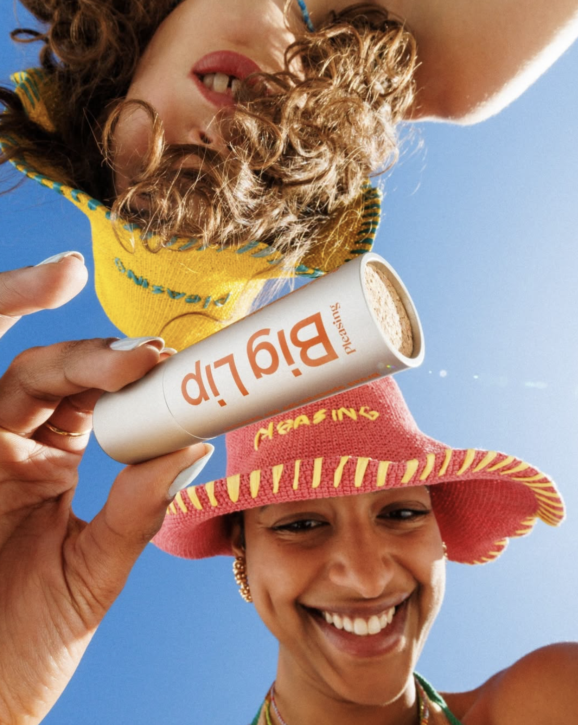
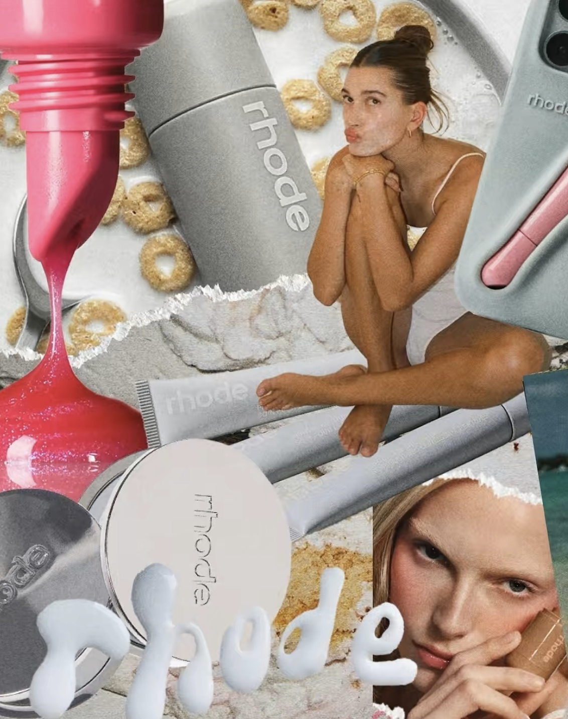
Table of Contents
Big words. Wonky designs. Dreamlike figures. Is that what we can expect in 2026 from beauty branding and design trends? Yes, yes, and yes.
After a year of contrast, 2026 turns the volume higher. In 2025, beauty branding was split between quiet authority and expressive experimentation. From “old money” and pharma-inspired design to restrained maximalism, alien aesthetics, and layered nostalgia. Meaning outweighed polish.
In 2026, the polarity stretches even further. Beauty brands are fully leaning into maximalism and embracing naïve, child-like drawings while satisfying our appetite for escapism through dreamlike, AI-generated surrealism. And we’re here for it.

But what do these trends mean for your beauty brand?
Design trends mirror our collective state of mind. After years of minimalism and restraint, creativity is pushing back. We crave freedom, emotion, and play.
At the same time, AI’s omnipresence leaves us divided. We’re curious to explore it, yet increasingly drawn to what feels human.
So take this article as a read on our collective mood, desires, and tensions, shaped by overstimulation, AI, and a growing hunger for feeling something real. The trends show where attention is moving, what resonates now, and why.
With that in mind, let’s dive headfirst into the beauty design trends defining 2026.
More Is More
Remember when beige ruled the world? When minimalism defined good taste? Well, here’s the last nail in that coffin, at least for now.
We’ve overdosed on 50 shades of beige and lived too long on the “less is more” diet. Finding that sweet spot of not too much and just enough color or number of fonts felt like tightrope walking.
Now it’s time to throw the whole balancing act away. Forget restraint. Embrace indulgence. More is more again.
Yes, baby – maximalism is back. 🤩
Layered layouts, loud colors, in-your-face letters, and so much more is what maximalism is all about in 2026. It’s an aesthetic defined by confidence, personality, and visual noise that means something. As noted by Adobe, “controlled chaos and playful unpredictability” will set the tone. And while maximalism doesn’t leave much breathing room in designs, it lets us all take a deep breath from perfectionism.
And there are many brands that have tapped into maximalism.
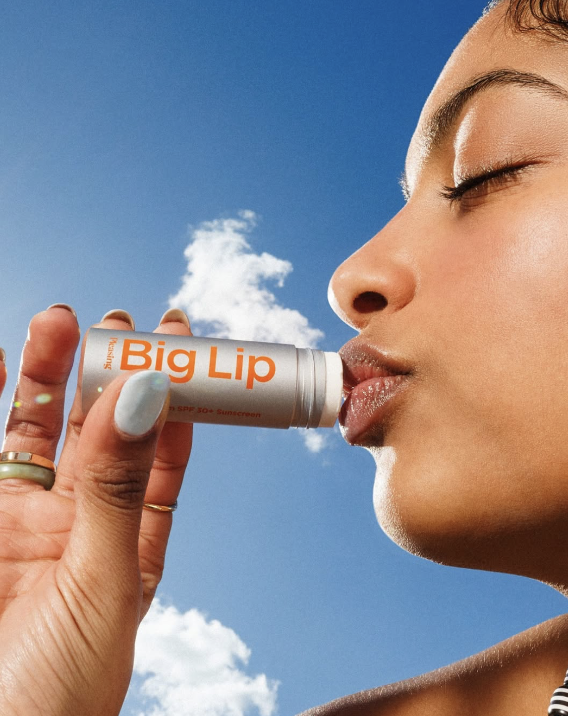
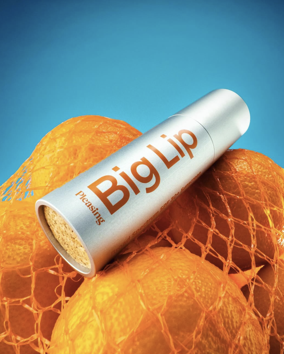
Pleasing takes typography and lifestyle imagery to the max. Bright, playful colors combined with simple yet striking font makes us stop and stare.
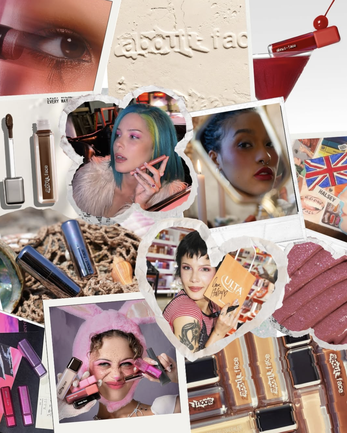
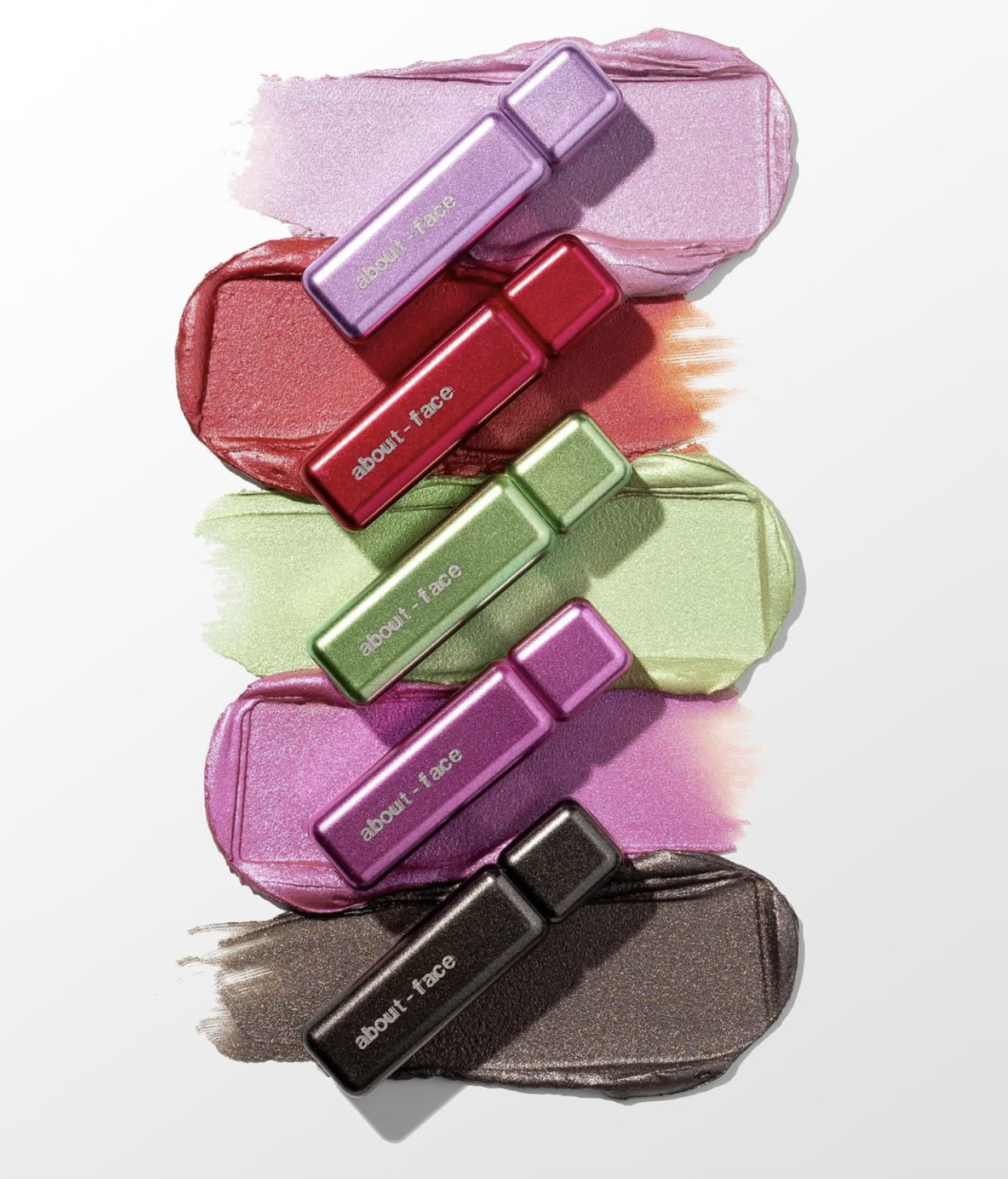
About-Face leans into expressive chaos, channeling Gen-Z energy through saturated color and bold typography.
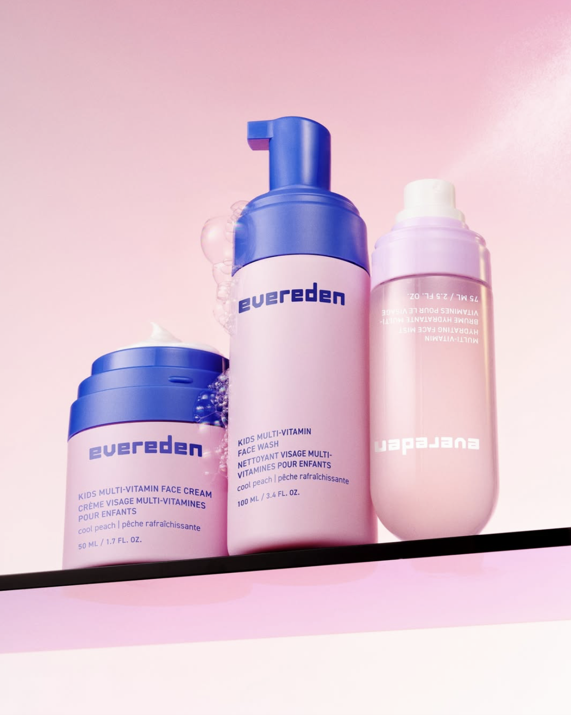
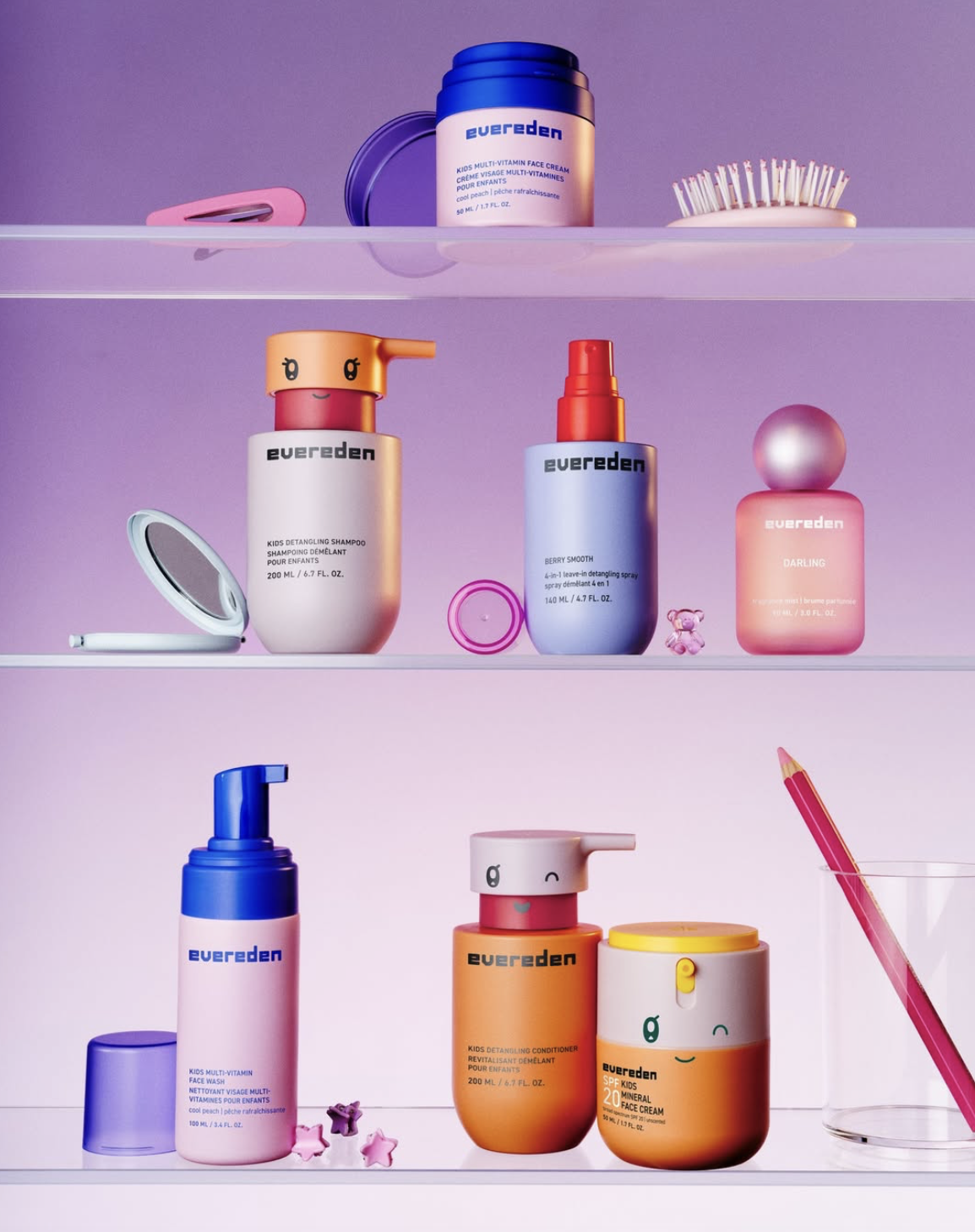
Evereden speaks directly to Gen Alpha, embracing playful maximalism that feels intuitive, bold, and digitally native rather than overdesigned.
It’s important to note that maximalism in 2026 isn’t big and loud for the sake of it. It’s amplified brand identity. And if this speaks to your brand, it’s time to dive into maximalism and, most importantly, have fun with it!
Imperfect, Naïve Design
As the design world navigates its love–hate relationship with AI, organic, human-touch design is what truly cuts through the AI noise.
Imperfect lines, scribbles, doodles, and child-like drawings feel intentional. This awakens authenticity, emotion, and presence. Whether it’s a quiet protest against AI or simply a contrasting visual trend, people clearly love it.
Here are some standout brands known for embracing this design.
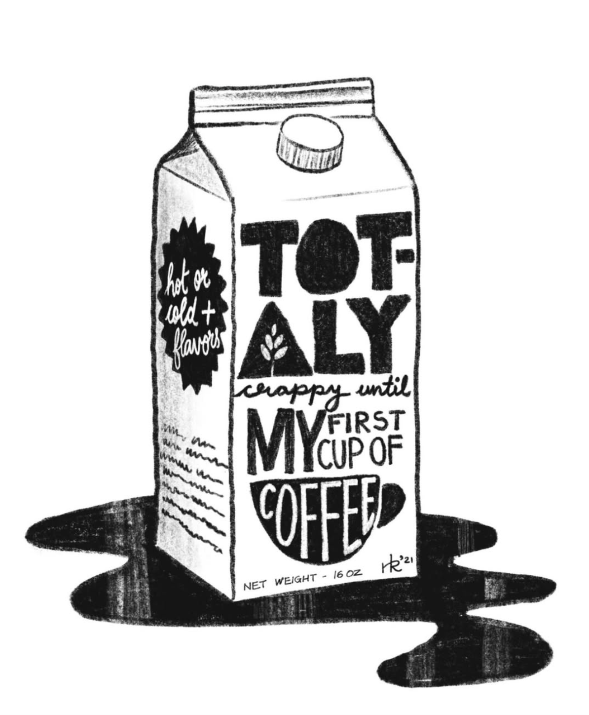
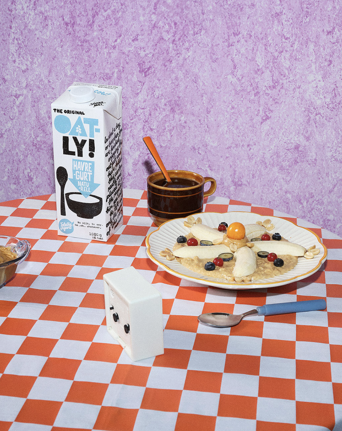
Oatly continues to set the standard for intentional imperfection, using hand-drawn typography, uneven layouts, and raw illustrations to give the brand an outspoken, human, and refreshingly unpolished feel.
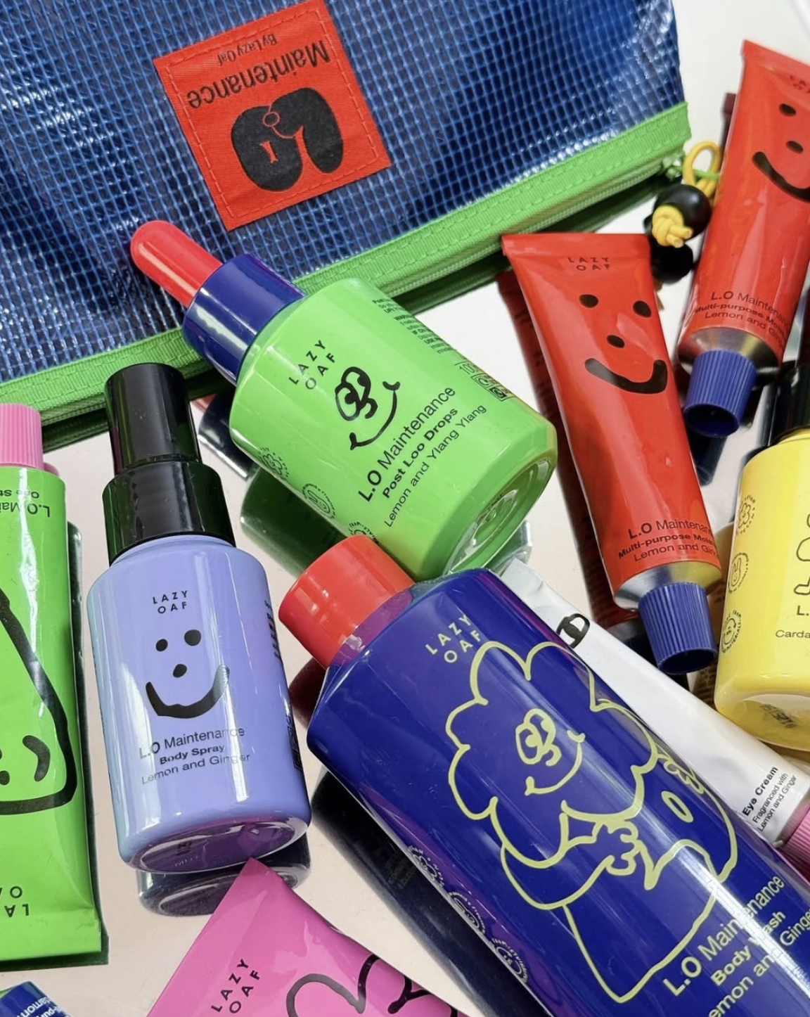
Lazy Oaf embraces playful mess as a core brand language, incorporating doodles, naïve illustrations, and chaotic compositions that reflect its irreverent identity.
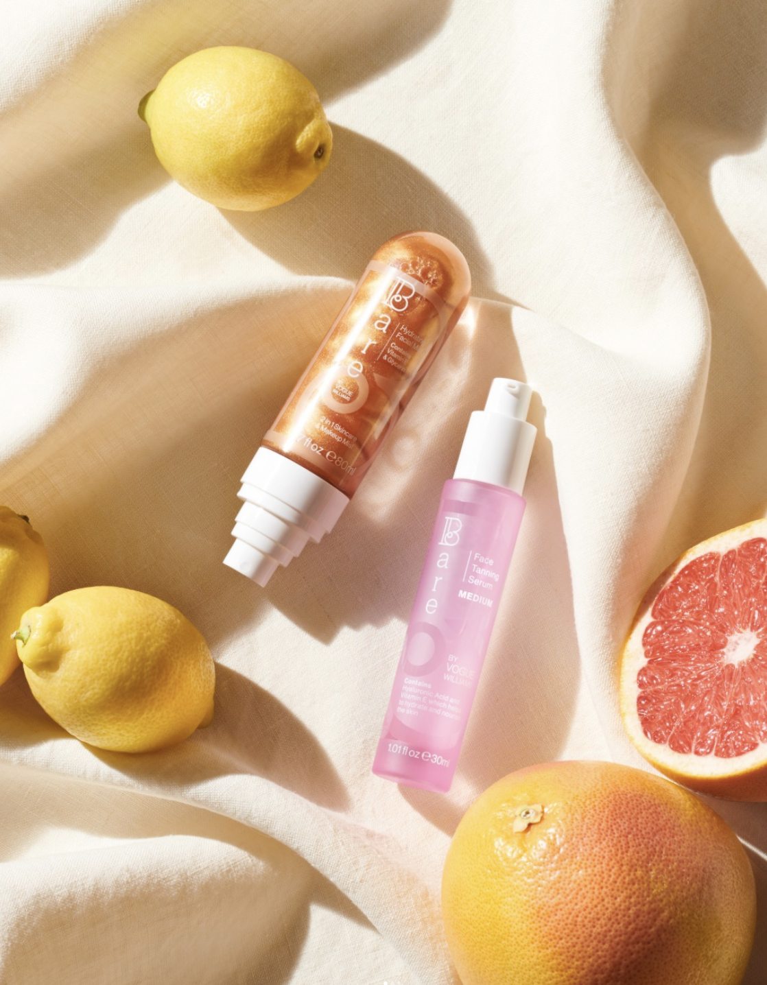
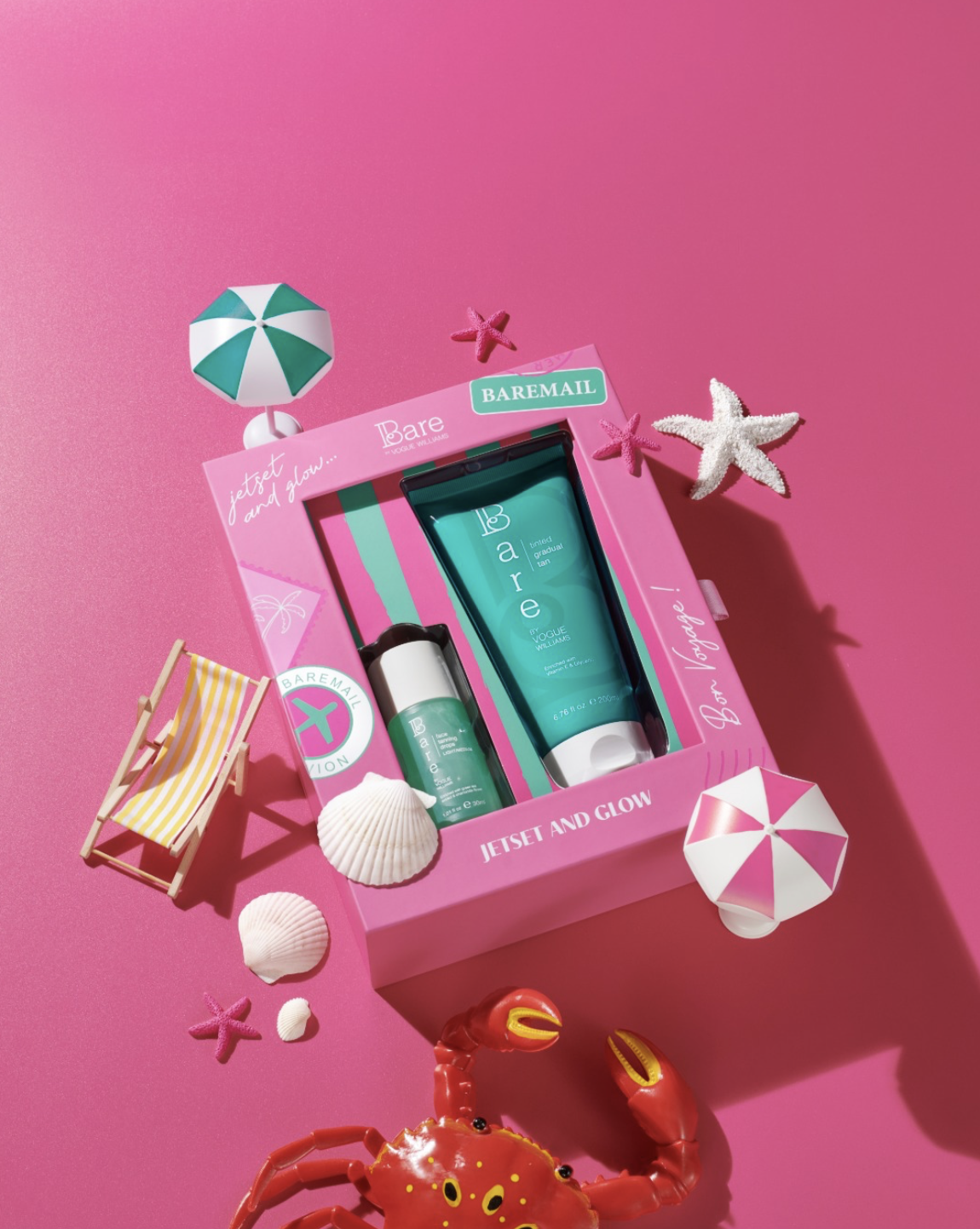
Bare by Vogue uses a softer interpretation of the human-touch aesthetic. It pairs hand-drawn elements, loose linework, and organic textures with a clean base. The result feels approachable yet refined. It balances polish with imperfection.
In the midst of hyper-optimized visuals, we instinctively gravitate toward designs that feel human, imperfect, and emotionally honest. This trend gives us exactly that.
Aliens, AI, and Other Creatures
You didn’t think human-touch design cancelled AI, did you?
As with everything, balance matters. For all the hand-drawn doodles and intentional imperfections, there’s an equal and opposite pull toward a fully artificial and extraterrestrial aesthetic.
Hyper-synthetic visuals, uncanny textures, and unmistakably AI-made designs act as the contrast. This creates tension, novelty, and a new kind of visual equilibrium everyone can’t help to be obsessed with.
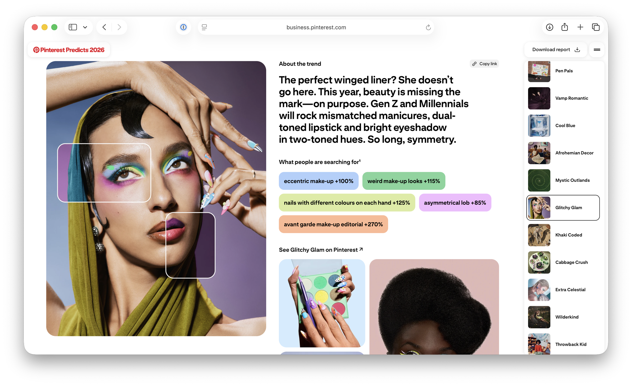
As Pinterest has noted in its 2026 trend predictions, searches for the alien-core aesthetic are up 80%, while interest in opalescent visuals has increased by 115%. It’s clear that extraterrestrial creations are in and getting us inspired.
This blending of machine precision with human imagination is opening doors to new styles, layouts, and visual languages.
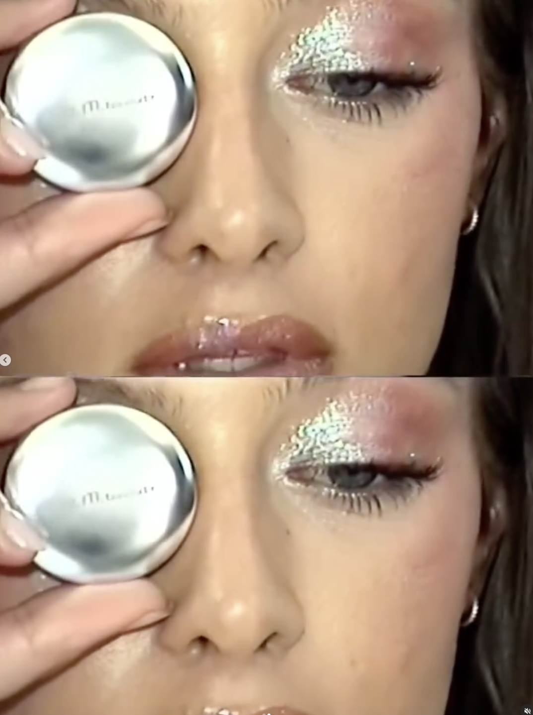
Glitchy Glam, one of Pinterest’s top 2026 beauty trends, translates this digital-meets-alien aesthetic to branding and beyond –the human face, with two-toned lips and color-clash eyeshadow that turn imperfection into playful expression.
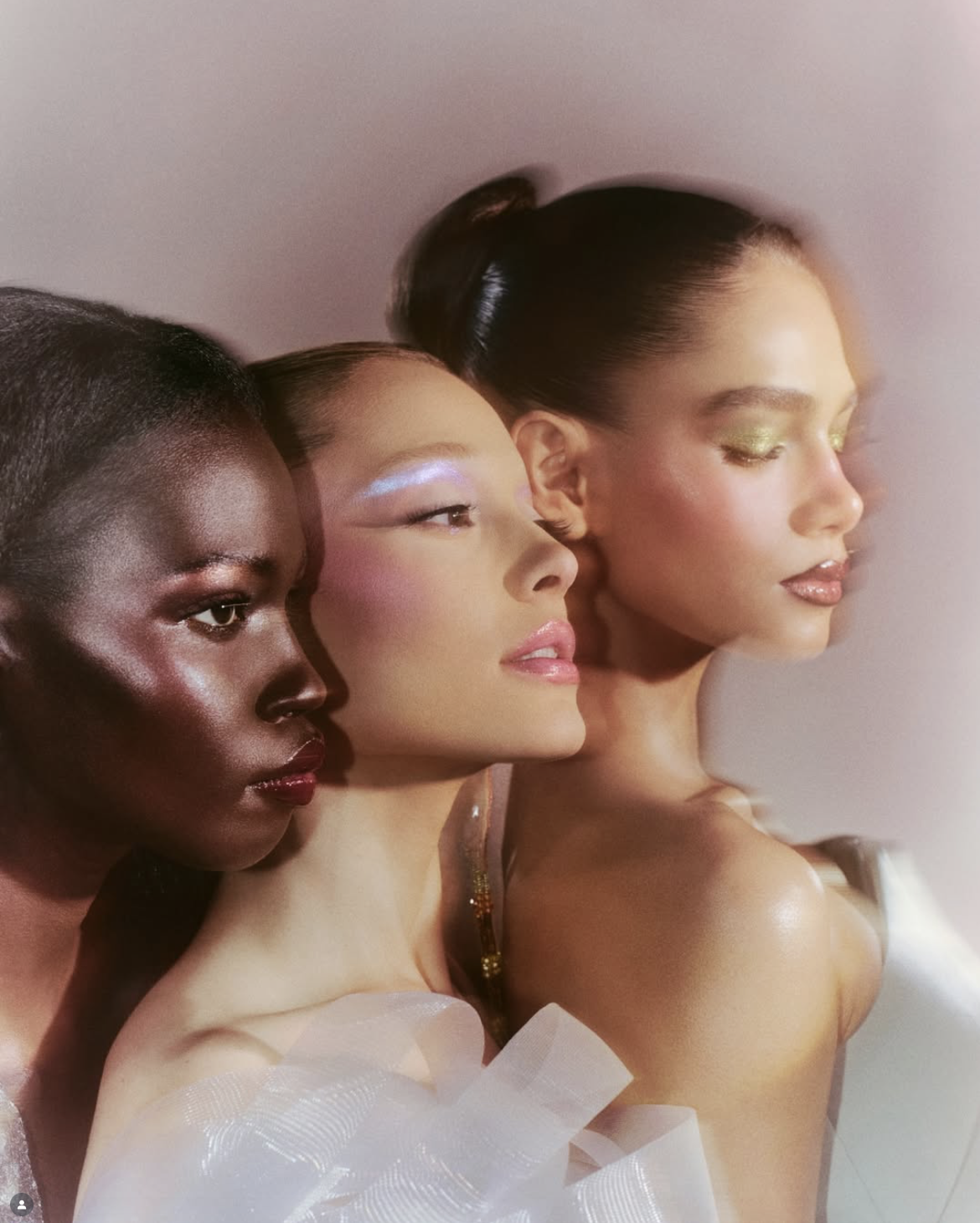
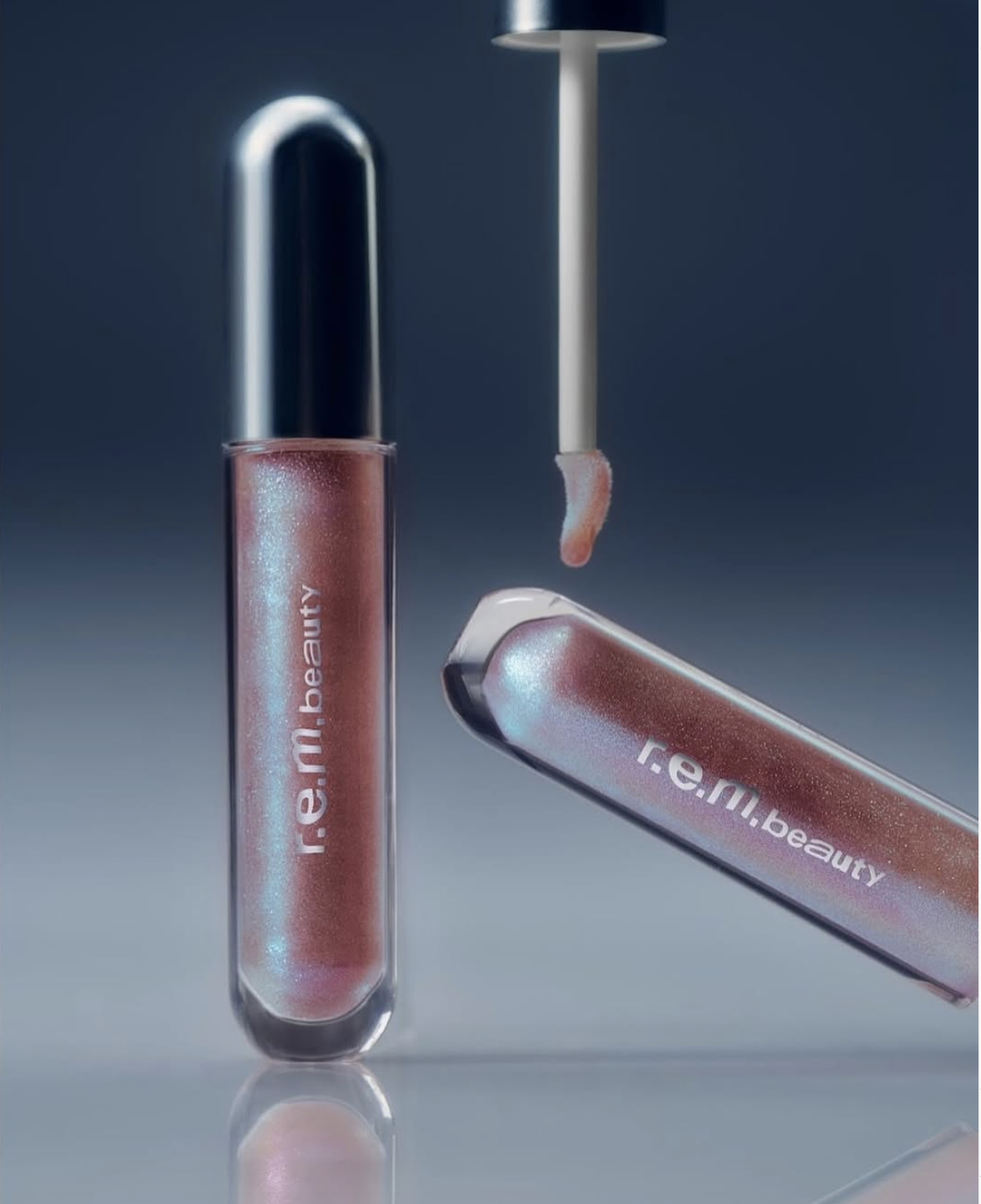
R.E.M. Beauty embraces the alien-core aesthetic, with ethereal, space-inspired visuals that dominate its Instagram feed. Ariana Grande, the brand’s founder, embodies this otherworldly vibe, tying together everything from dreamy composition to lighting. The result is a futuristic identity that feels truly out-of-this-world and unmistakably R.E.M.
Fenty Beauty, meanwhile, isn’t afraid to play with AI and tech-driven content in its TikTok and Instagram feed. It blends dynamic and trendy visuals that feel futuristic and culturally fluent. This strategy keeps its feed feeling fresh, relevant, and rooted in digital culture.
Typography-First
As Destiny’s Child iconically said: “Say my name, say my name.”
In 2026, brands are taking this literally, letting their brand name do all the talking.
Logos take the back seat.
Type now is expected to carry personality, mood, and even the narrative of the brand. From the moment we see a headline, a packaging detail, or a social post, typography sets the tone. It communicates values and becomes the most recognizable part of a brand’s visual identity.
Brands that lead with typography and do it right, become instantly recognizable.
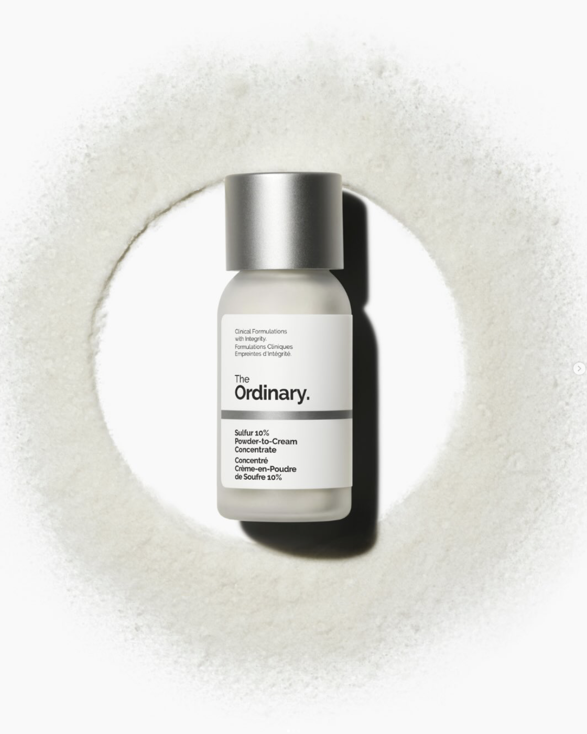
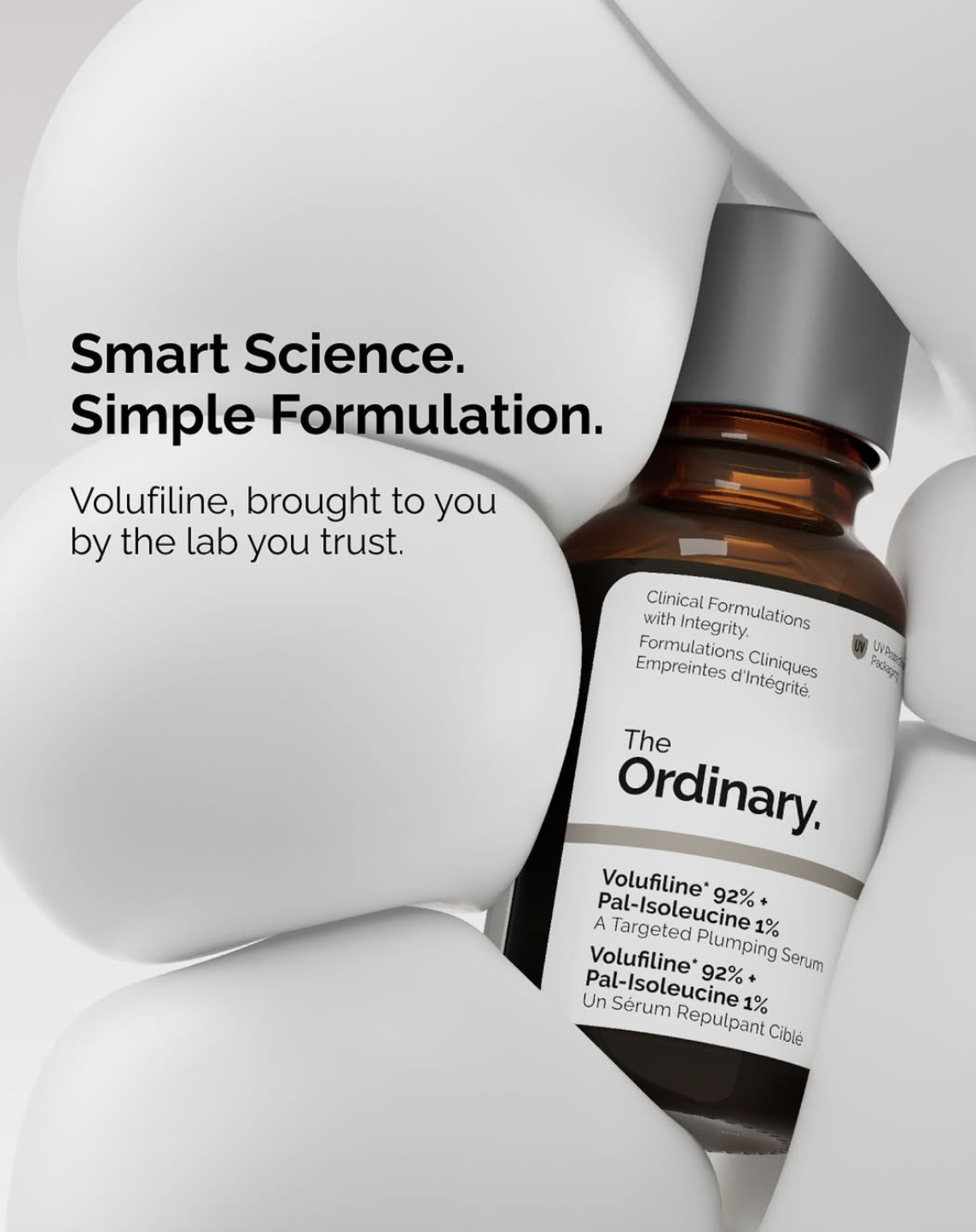
A great example here is The Ordinary. It relies on functional, no-nonsense typography as its primary brand voice. Their clean, consistent type communicates transparency, science, and reliability, letting the content speak for itself.
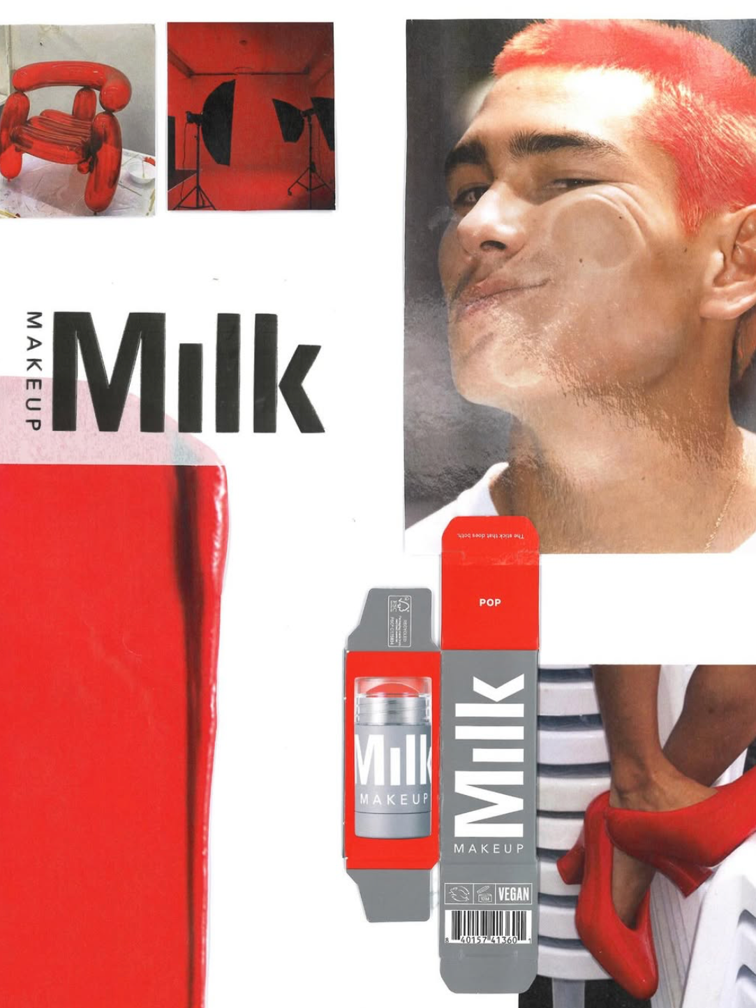
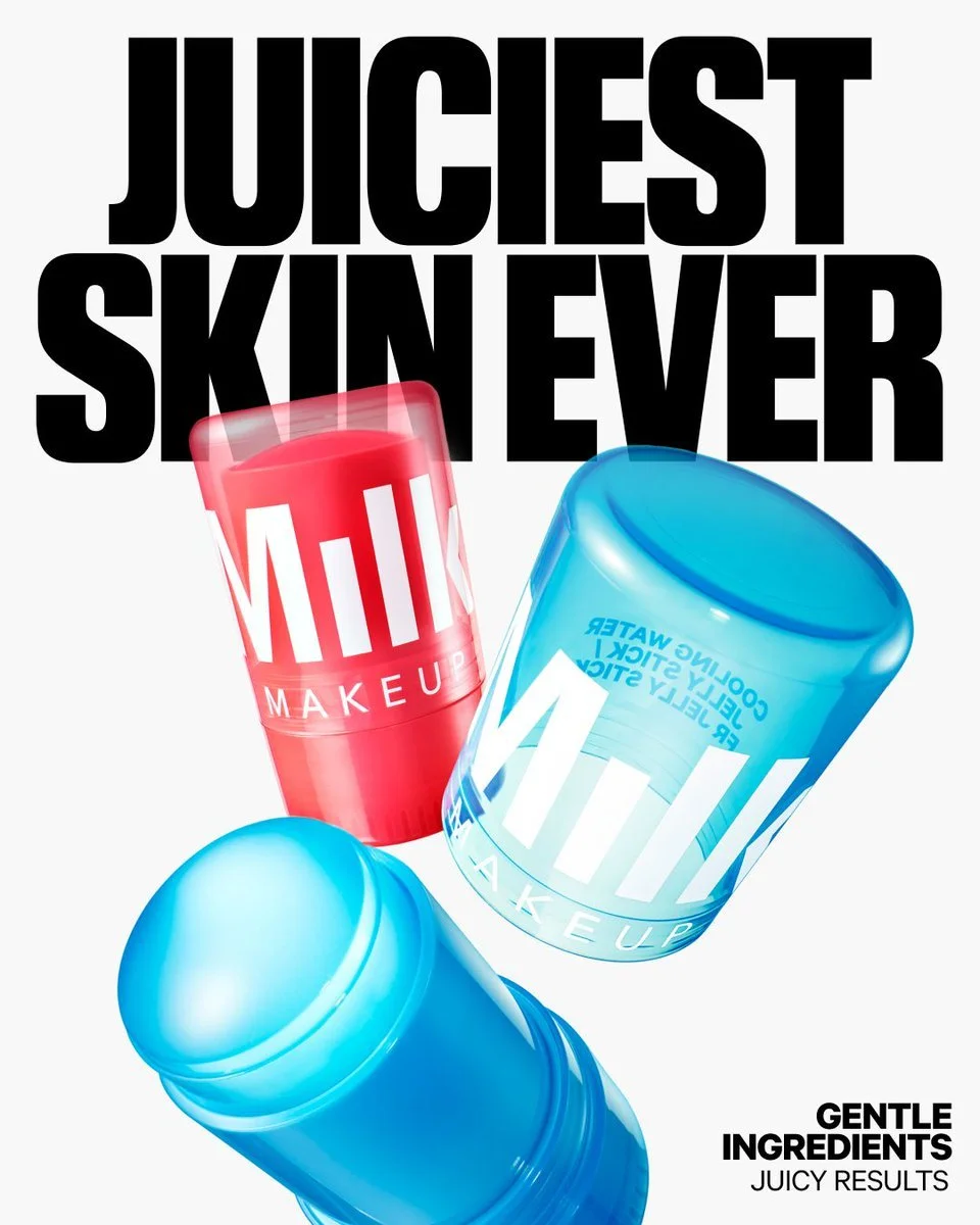
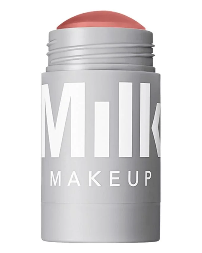
Milk Makeup throws its name front and center, using simple yet confident typography as a primary design element. The brand relies on its name to grab attention in a scroll‑heavy world and turning its own identity into a memorable visual hook.
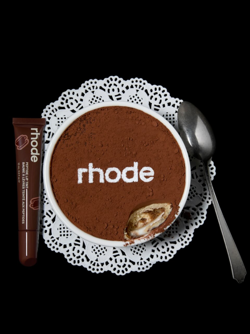
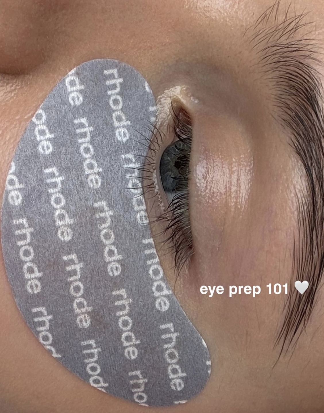
Rhode treats typography as their key branding tactic. Every letter is part of a cohesive visual architecture. Rhode proves that type can be more than a label. It can be the backbone of a brand.
Not to mention, typography in 2026 truly takes up S-P-A-C-E. Oversized headlines, bubbly letterforms, distorted type turns words into bold, visual statements that catch our fleeting attention span.
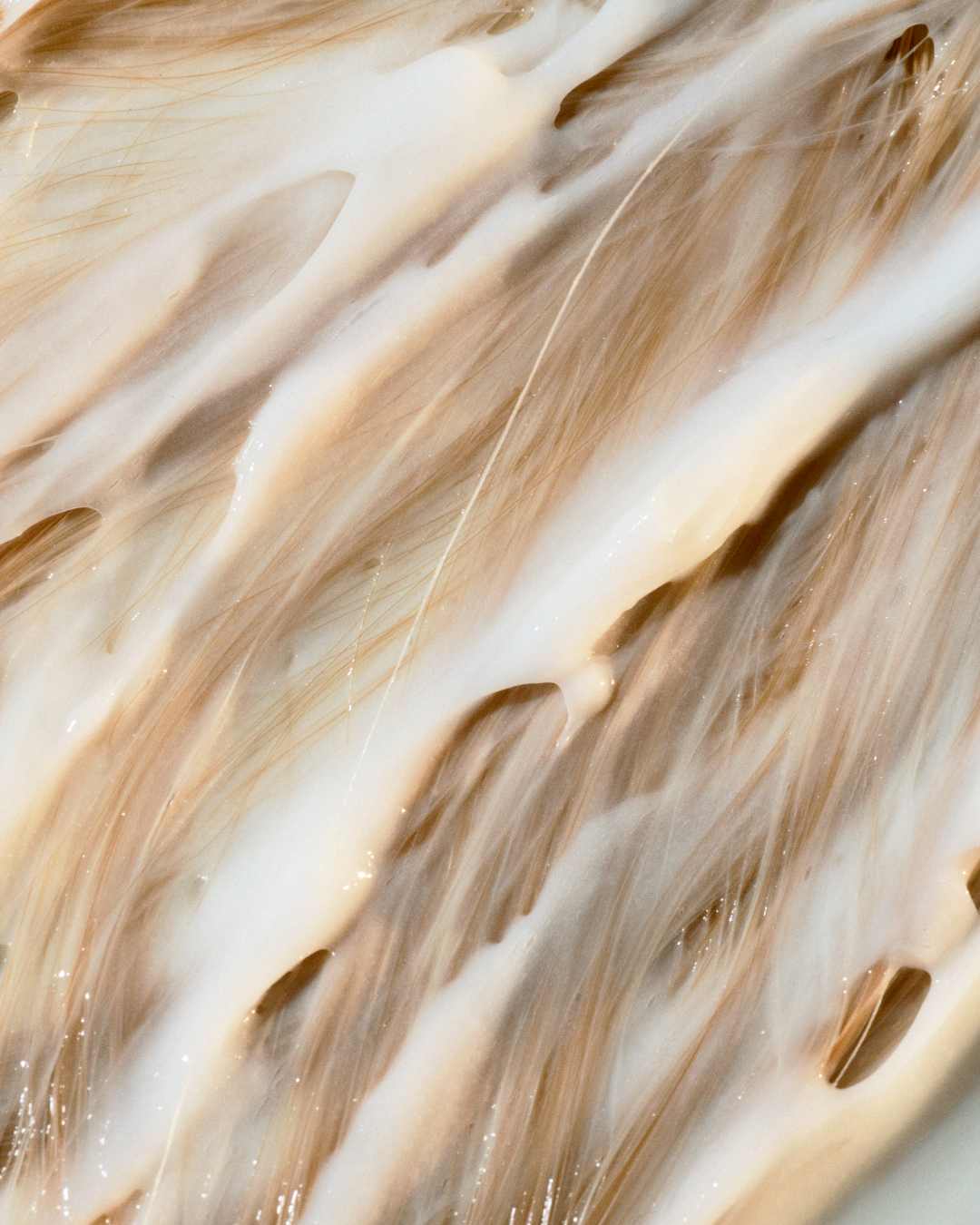
Surreal and Dreamlike
Reality is subjective, everything is fluid, and we’re all just living in the Matrix, right? With abstract and surreal imagery becoming more popular, that’s exactly how it feels.
It’s slightly disorienting, immersive, and strangely familiar.
Whether this trend is a continuation of AI-inspired design or a desire to bend reality just enough to spark new emotion in an overstimulated world, these visuals feel like a breath of fresh air. And they give us a chance to see and feel something new.
Expect the unexpected.
This trend invites us to surrender to dreamlike compositions that let you step outside of reality for a moment.
Brands like Gisou, with its layered ethereal photography; Pleasing, with playful worlds that twist the familiar into the fantastical; and Gezeiten, whose abstract compositions feel like liquid dreams, all show that surreal storytelling can be both emotional and unforgettable. Each brand uses imagery that suspends reality and transports the viewer. Above everything, they reminds us that the most memorable designs are the ones that make us feel something new.
Sensory Experience
All of the design trends we’ve explored are really trying to answer one question: How can a brand make us feel something new? How can storytelling move beyond the purely visual to evoke texture, scent, and mood that makes us truly experience a brand?
In 2026, successful branding will try to find new ways to pick our senses and spark emotion through layered visuals, tactile-inspired textures, squishy shapes, and fluffy forms. All to make us stop scrolling or walking by and indulge with our eyes.
Brands that are already injecting their branding with multi-sensory storytelling include Gisou and Tom Ford Beauty. Gisou attracts us with a mouth-watering aesthetic that engages sight and mood, and our love for food. Tom Ford Beauty invites us with sense-evoking visuals and ads that appeal to sight, touch, and emotion.
Here’s To What’s Next
2026 will be anything but boring.
Extremes and creative freedom will undoubtedly take center stage. From playful maximalism and imperfect, hand-drawn doodles to glitchy AI aesthetics, bold typography, and dreamlike surrealism – they’ll make us stop and stare.
Layered emotions dressed up as collages and extraterrestrial allure captured in the alien core will keep us intrigued for what’s next.
And for beauty brands, the opportunity is clear: lean into the trends that align with your brand identity and create designs that make people feel. When you embrace play, storytelling, and emotional resonance, you’ll build an experience that lingers long after the scroll.
Above everything, approach beauty design as a playground for the senses and as an extension of your emotional world.


Frequently Asked Questions
-
In 2026, beauty branding is defined by bold maximalism, collage storytelling, imperfect hand-drawn design, AI and alien-inspired aesthetics, typography-first identities, surreal imagery, and sensory-led visual experiences.
-
Successful maximalism in 2026 is intentional. It’s about amplifying brand identity through layered visuals, bold typography, and color—while maintaining a clear narrative and consistent brand voice.
-
AI is shaping beauty branding through surreal visuals, glitch aesthetics, and alien-core imagery. Brands are balancing AI-driven creativity with human touchpoints to create tension, novelty, and emotional resonance.
-
Alien-core is a futuristic visual trend inspired by extraterrestrial imagery, opalescent textures, and synthetic forms. In beauty branding, it shows up as otherworldly visuals, digital surrealism, and experimental makeup looks.
-
Brands don’t need to adopt every trend. Choosing one or two, like expressive typography or collage storytelling, and applying them consistently can elevate a brand without requiring massive budgets or full rebrands.
Must read