
Cute Packaging for Small Businesses: Inspo & Ideas for Beauty Brands
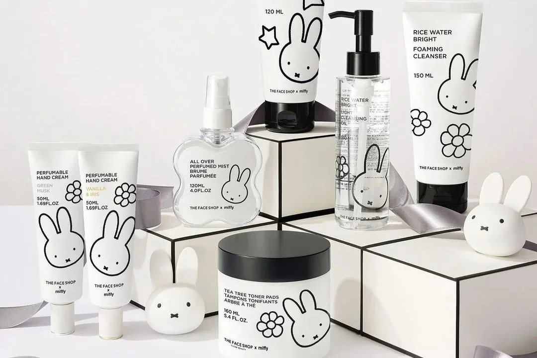
Table of Contents
For beauty founders, packaging is more than a box. It’s your first impression, your silent salesperson. Cute packaging for small businesses can influence value, emotional connection, and how often customers hit “Add to Cart.”
Aesthetics sell in the beauty industry. The right packaging doesn’t just protect your formula. It positions your brand. Research shows that customers often judge products by packaging. In fact, up to 90% of buyers decide based on packaging alone.
Let’s break down exactly why cute packaging works. How it impacts sales and how small brands can execute it. Even with low MOQs and limited budgets.
Why Cute Packaging for Small Businesses Drives Sales
Packaging isn't just aesthetic fluff. It’s often your strongest marketing asset.
1. Shelf Impact (Even If Your Shelf Is Digital)
Cute packaging increases scroll-stopping power. It grabs attention before someone reads the ingredient list.
On Instagram grids, TikTok feeds, and Shopify collection pages, packaging competes for attention. Softer tones, unique shapes, playful typography, or cohesive color systems create visual interruption. And interruption captures clicks.
2. Instagrammability & Social Sharing
The more shareable your product looks, the more free reach your brand gets.
Consumers share:
Aesthetic flat lays
Color-coordinated shelves
Pretty PR boxes
Satisfying unboxings
Packaging that feels “photo-ready” boosts:
User-generated content
Organic reach
Brand recall
3. Emotional Buying & Perceived Value
Beauty is emotional. Cute packaging signals:
Fun
Self-care
Treat-yourself energy
Gifting potential
Packaging doesn’t just hold the product. It upgrades it. The right color palette, texture, and typography can instantly double perceived value. Customers don’t only buy formulas. They buy how a product feels in their hand and on their feed.
4. Brand Memorability
Cute packaging makes you unmistakable. We all know how Rare Beauty’s liquid blush looks like, right? And when we see watermelons, we know it’s Glow Recipe.
If your product has a signature color or a specific detail, customers will remember it. Even before remembering the formula.
Cute Makeup Packaging Ideas That Stand Out
Makeup is naturally expressive. And so is the packaging. Here are some examples of brands doing it really well:
1. ETUDE
ETUDE is a Korean beauty brand. Known for soft, feminine, and playful packaging.
This brand frequently releases collaborations with characters, for example Bearkku.
Character-driven storytelling works because customers don’t just buy a product. They buy into a mood.
Is the character:
Sweet and romantic?
Playful and mischievous?
Soft and cozy?
Confident and bold?
The packaging subtly signals: “This is for girls who are like this.”
2. Rare Beauty
Rare Beauty is known for sleek, soft-touch packaging with rounded caps that are easy to open.
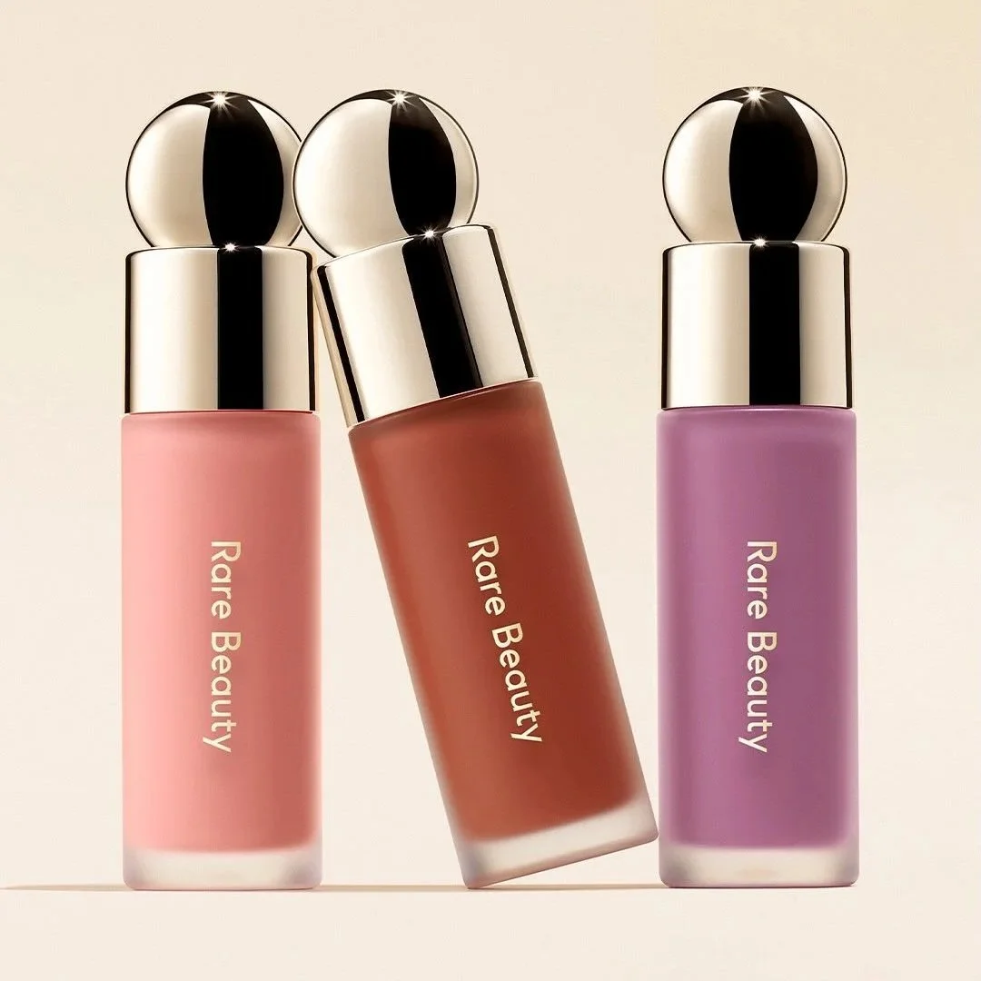
What they do well
Accessibility-driven design
Monochromatic color families
Elevated minimalism
3. Glossier
Glossier built an empire on minimalist pastel branding. Pink color dominates here.
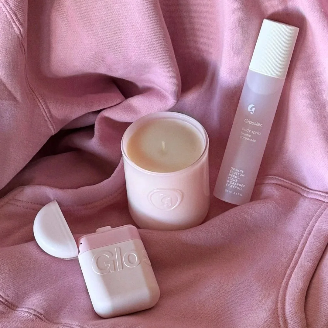
What they do well:
One dominant brand color
Minimal text hierarchy
Packaging that doubles as an accessory
For many years, Glossier packaged products inside their pink bubble-wrapped zip pouches. That was a part of the unboxing experience. Now they have shifted toward a sustainable packaging approach. So the pouch is not automatically included.
4. Benefit Cosmetics
Benefit uses vintage-inspired, whimsical, and colorful packaging.
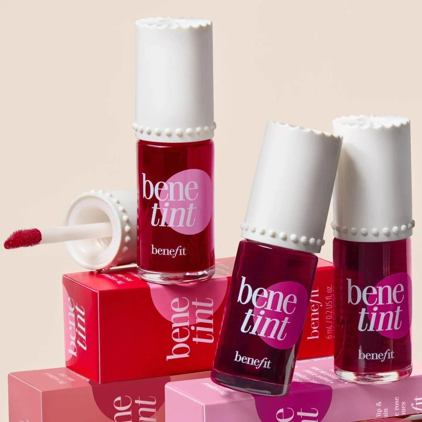
What they do well:
Storytelling through packaging
Distinct illustration style
Memorable product names
The iconic They’re Real! mascara and Benetintcheek and lip stain don’t read like product labels. They rather feel like mini personality statements. These names embody the brand’s witty, confident voice. They make the products feel memorable, collectible, and fun to use.
5. THE FACE SHOP
The Face Shop features soft pastel tones as well as cute, minimalist character designs.
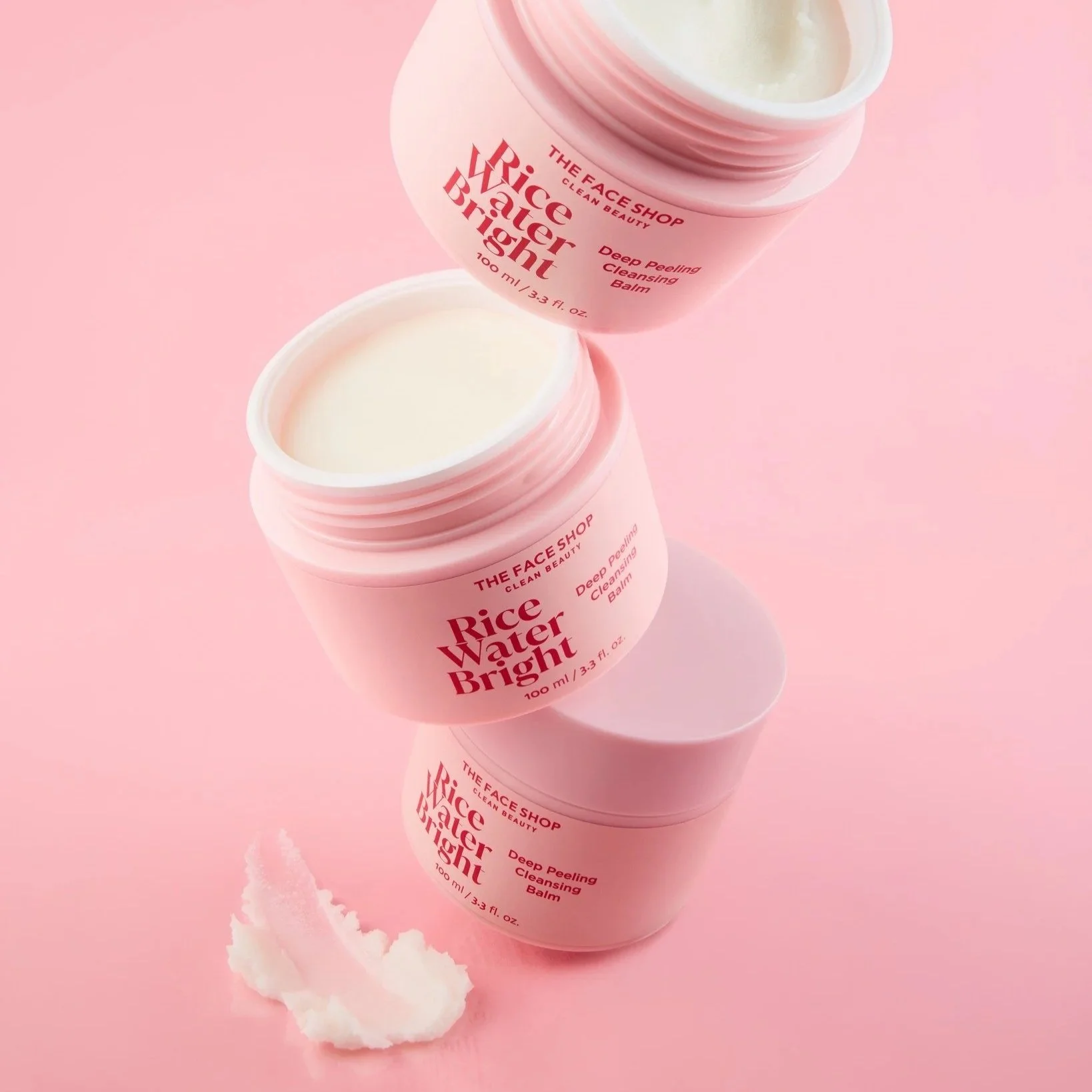
What they do well:
Balancing cute with sophistication
Seasonal refreshes without full redesign
Clean layout with playful main focus
Skincare Brands With Cute Packaging
Let’s look into some skincare brands with cute packaging that balance playfulness and credibility.
1. Glow Recipe
Glow Recipe is famous for fruit-inspired packaging and vibrant color palettes.
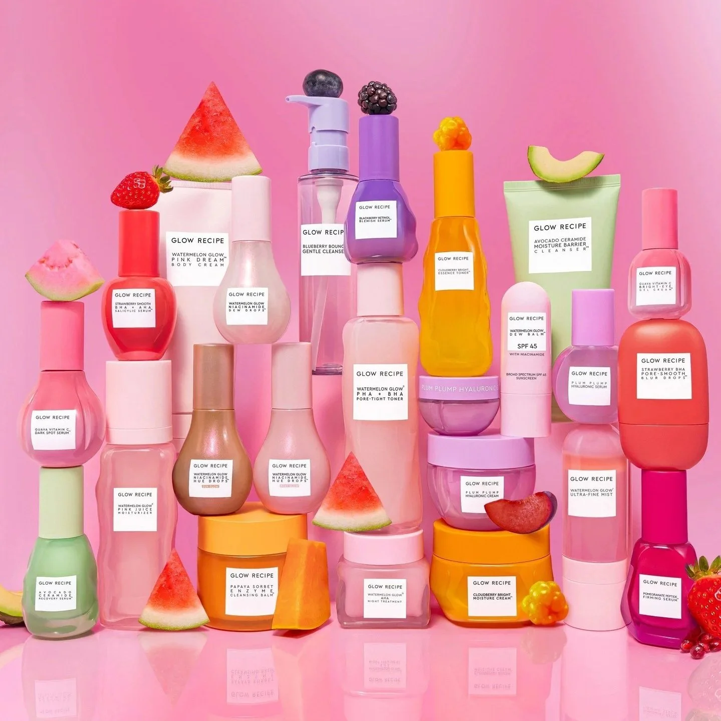
What they do right:
Ingredients tell story
Translucent packaging
Cohesive bottle silhouettes
Visual freshness
Each product color reflects its hero ingredient. For example, watermelon = pink, avocado = green.
2. Innisfree
Innisfree collaborates with artists for playful, nature-inspired designs. For example, they had a collaboration with Steven Harrington:
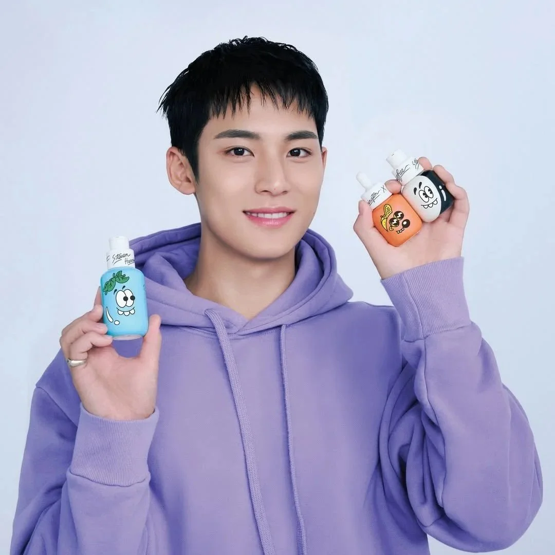
What they do right:
Nature-inspired color schemes
Artist collaborations
Clean layout structure
Strong brand consistency
3. Soap & Glory
Soap & Glory features a mid-century retro, flirty, and typography-forward design. They prove that maximalist cute works when typography is disciplined.
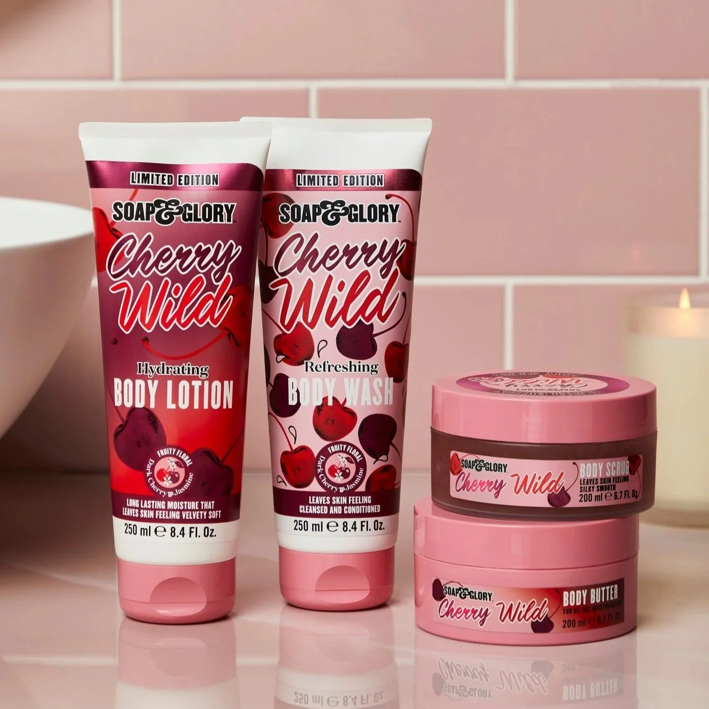
What they do right:
Consistent mid-century design
Confident pink tones
Bold typographic hierarchy
Shelf standout
4. Cocokind
Cocokind blends modern minimalism with sustainability. They use clean and modern labels that are easily removable. This is “clean girl cute” – subtle but intentional.
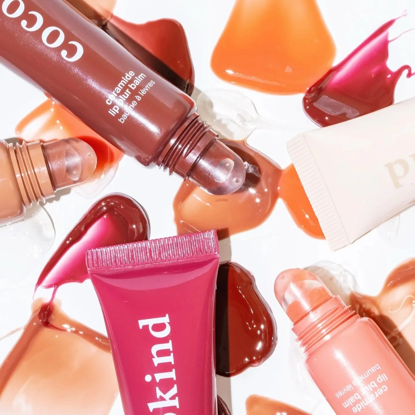
What they do right:
Clean labels
Soft neutral tones
Removable labels
Ingredient clarity
Packaging Styles Beauty Brands Can Experiment With
Design doesn’t need to start from scratch. Selfnamed lets you explore ready-made packaging aesthetics for private-label products.
Design directions you can experiment with:
1. Pastel Aesthetic
Baby pinks, cream tones, rounded fonts.
Whimsical Vintage

Pastel Minimalism
2. Bold Gen-Z
Neon accents, electric blue, large typography, sticker-style graphics.
Marker Chic

Funky Fluid
3. Minimal Cute
Clean layouts, neutral tones.
Nordic Clean
White Modern
4. Soft Luxury
Quiet, soft, and effortless elegance. Minimal, neutral colors.
Modern Noir
Rustic Lux
5. K-beauty Inspired
Rounded shapes, ingredient illustrations, character accents.
Active Highlight
Graphic Shapes
6. Typography-Forward Playful
Oversized fonts, high contrast labels, retro lettering.
Active Motion Purple
Modern Blue
Feel free to explore the Design Studio for more designs. And you can also search for additional inspiration here.
How to Source Cute Packaging Through Private Label
Build a high-end, on-brand look by choosing the right sourcing strategy for your beauty brand. The balance of aesthetics, cost, and quality matter. Start by creating a unique look that’s easy to produce and scale as your brand grows.
Here’s what you should look out for:
1. Identify Low MOQ Options for Scalability
First, prioritize sourcing partners that offer Low Minimum Order Quantities (MOQs). This lets you test cute aesthetic trends without a massive upfront investment, giving your brand the flexibility to pivot as you grow.
2. Start With Stock Packaging Customization
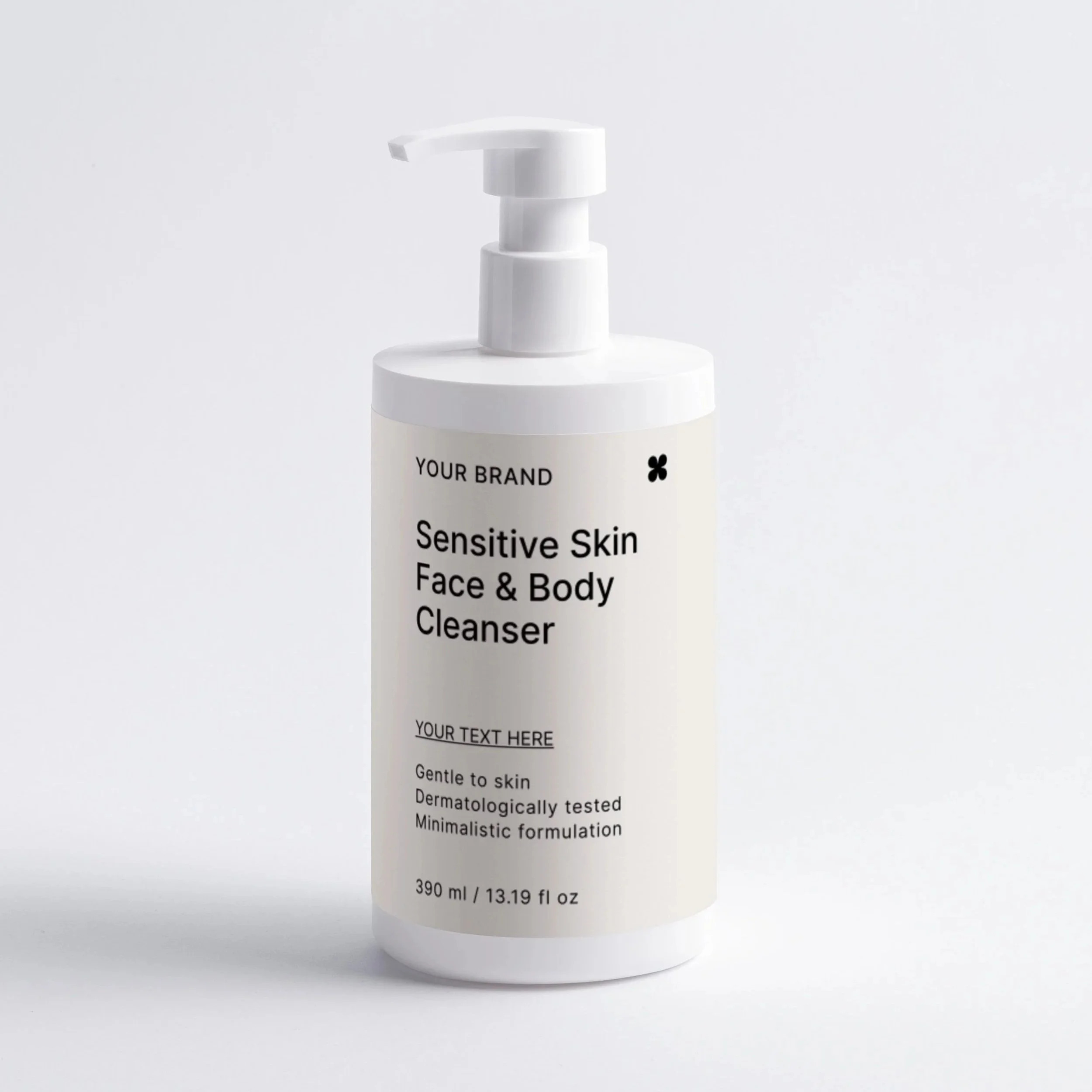
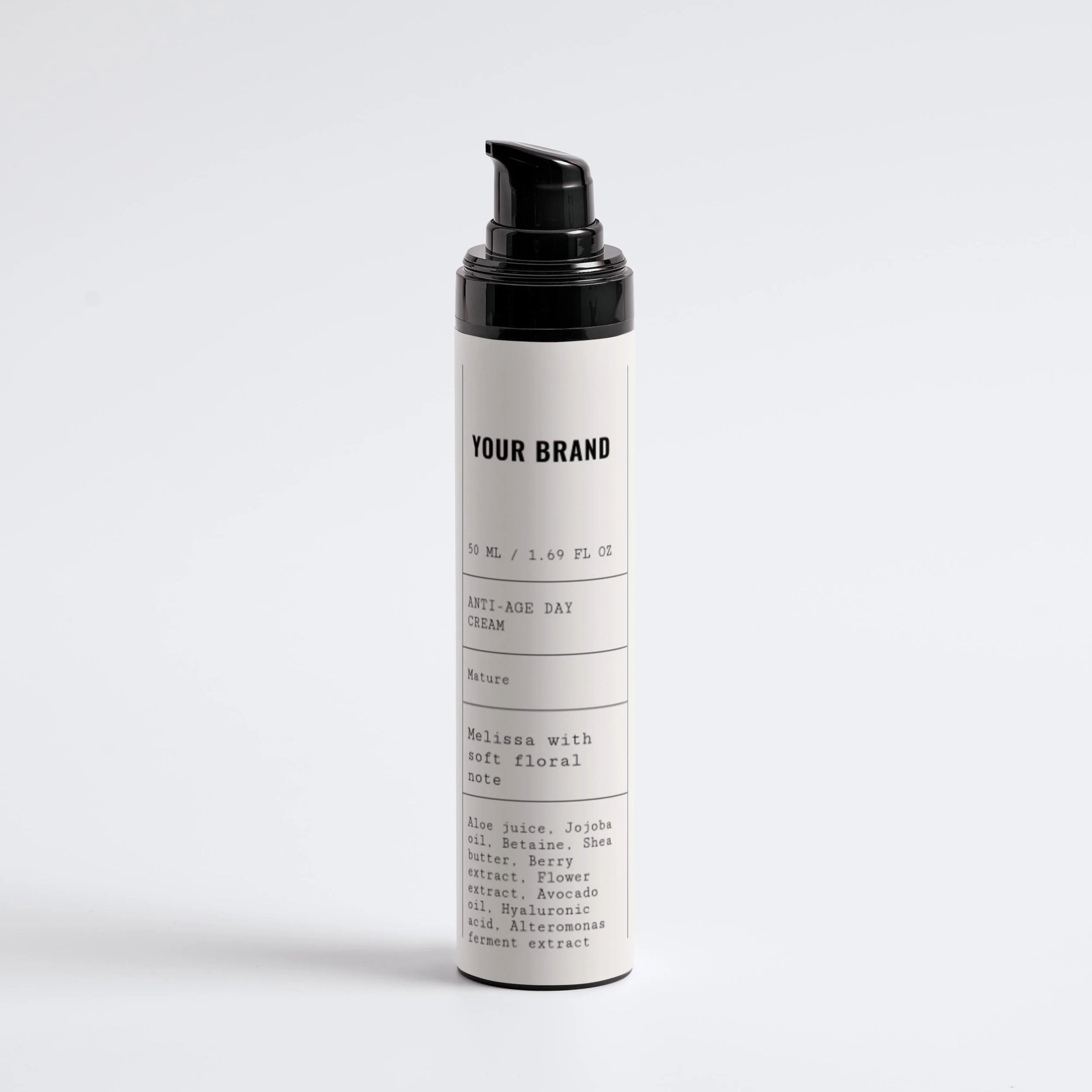
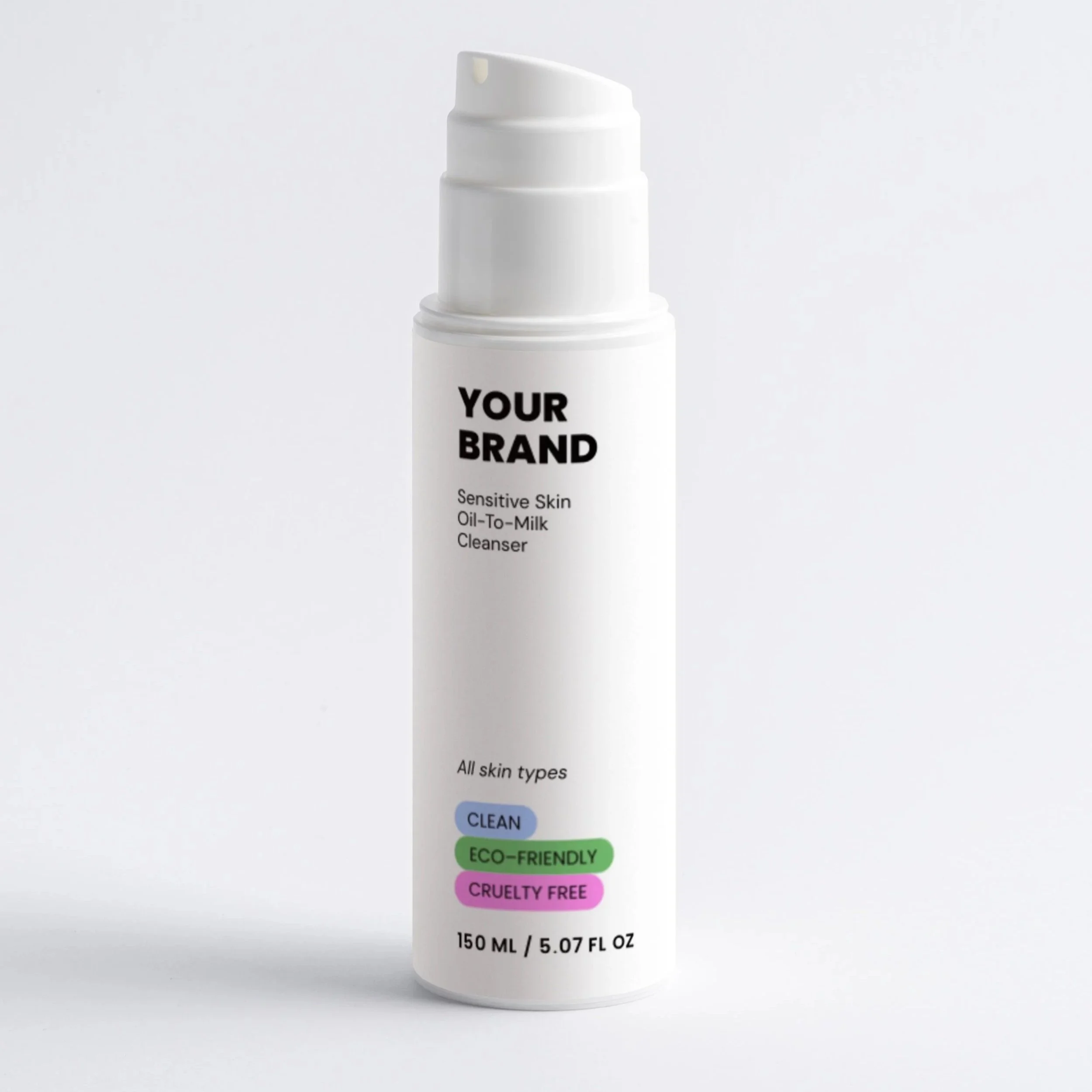
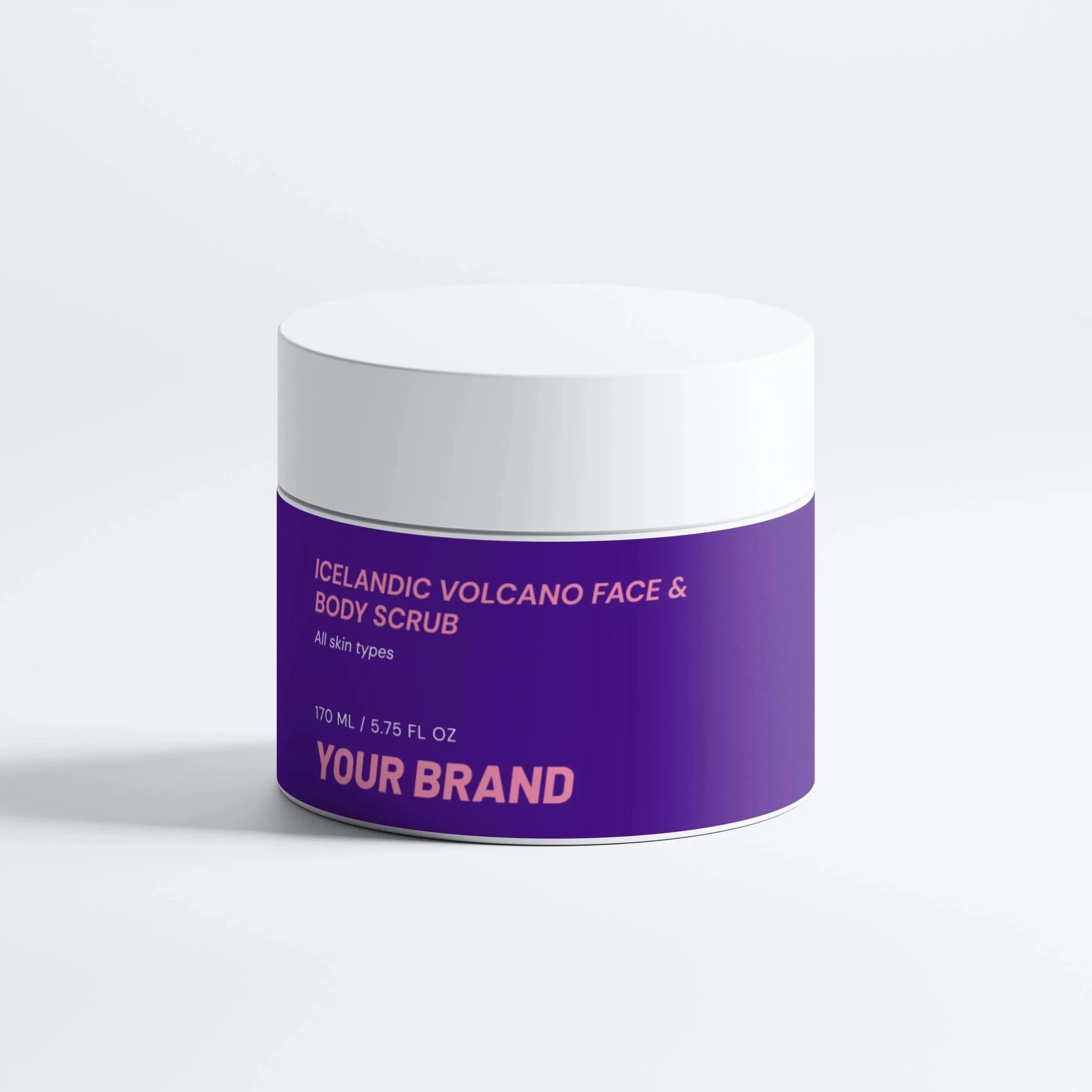
You don’t need a custom mold to look high-end. Especially not right away. Source "stock" (ready-made) packaging and add custom colors, unique textures, or specialized print details. This keeps costs manageable while maintaining a premium feel.
Private label partners like Selfnamed offer stock packaging for quality white-label beauty products. Select a product and customize for free to sell right away under your own brand.
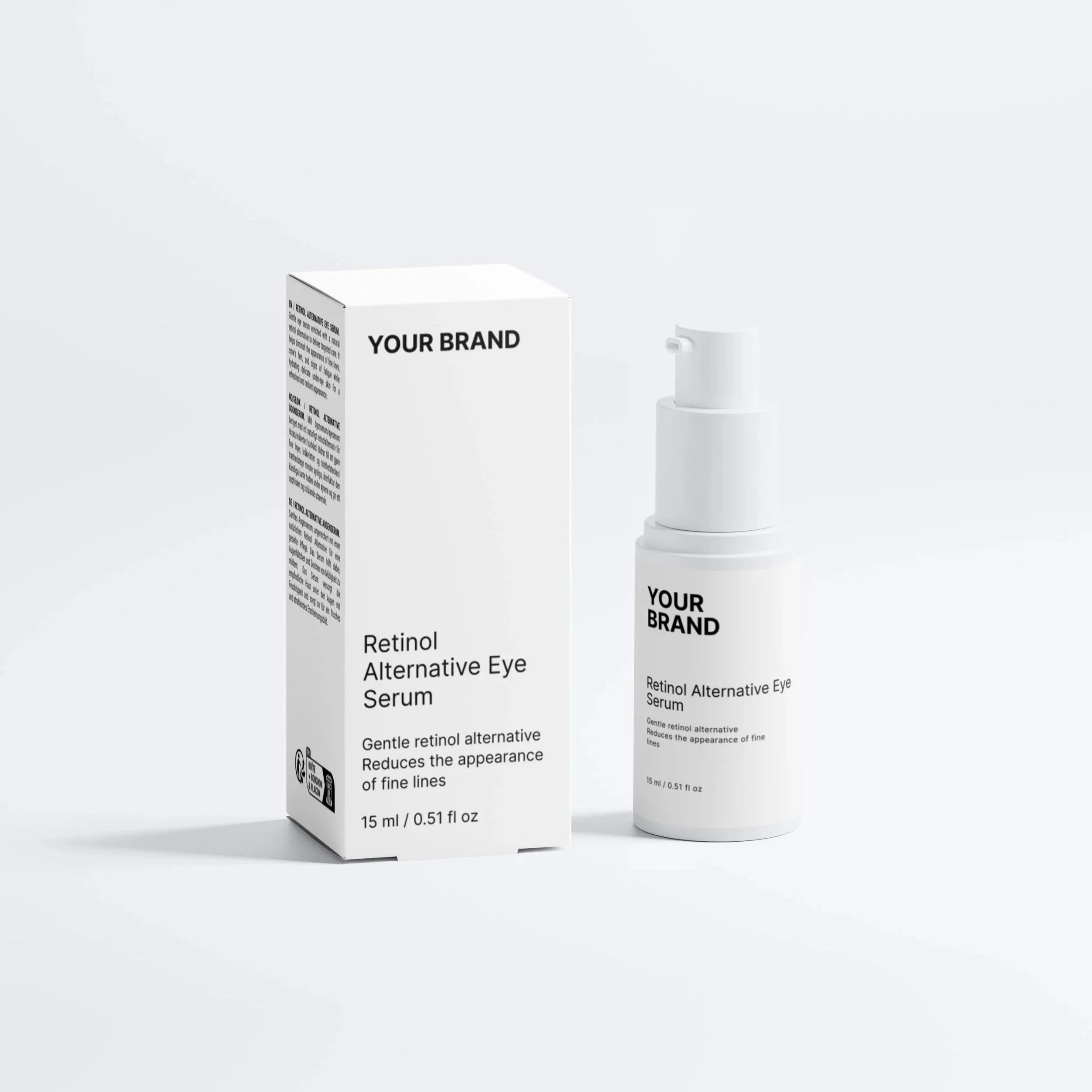
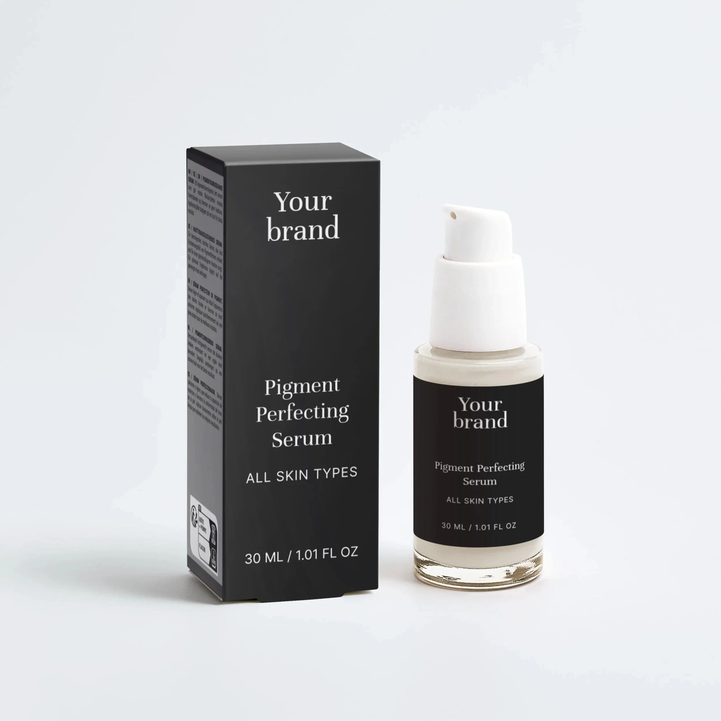
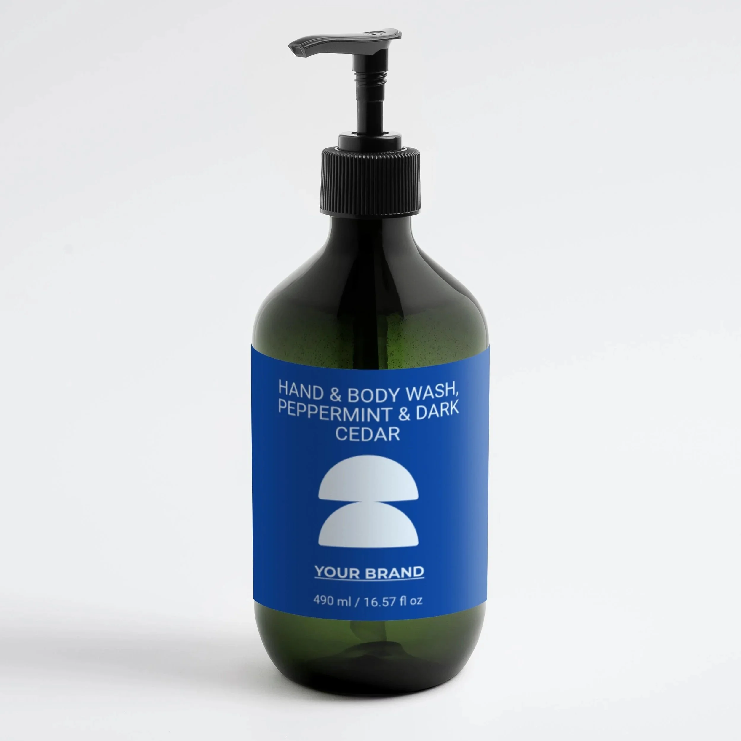
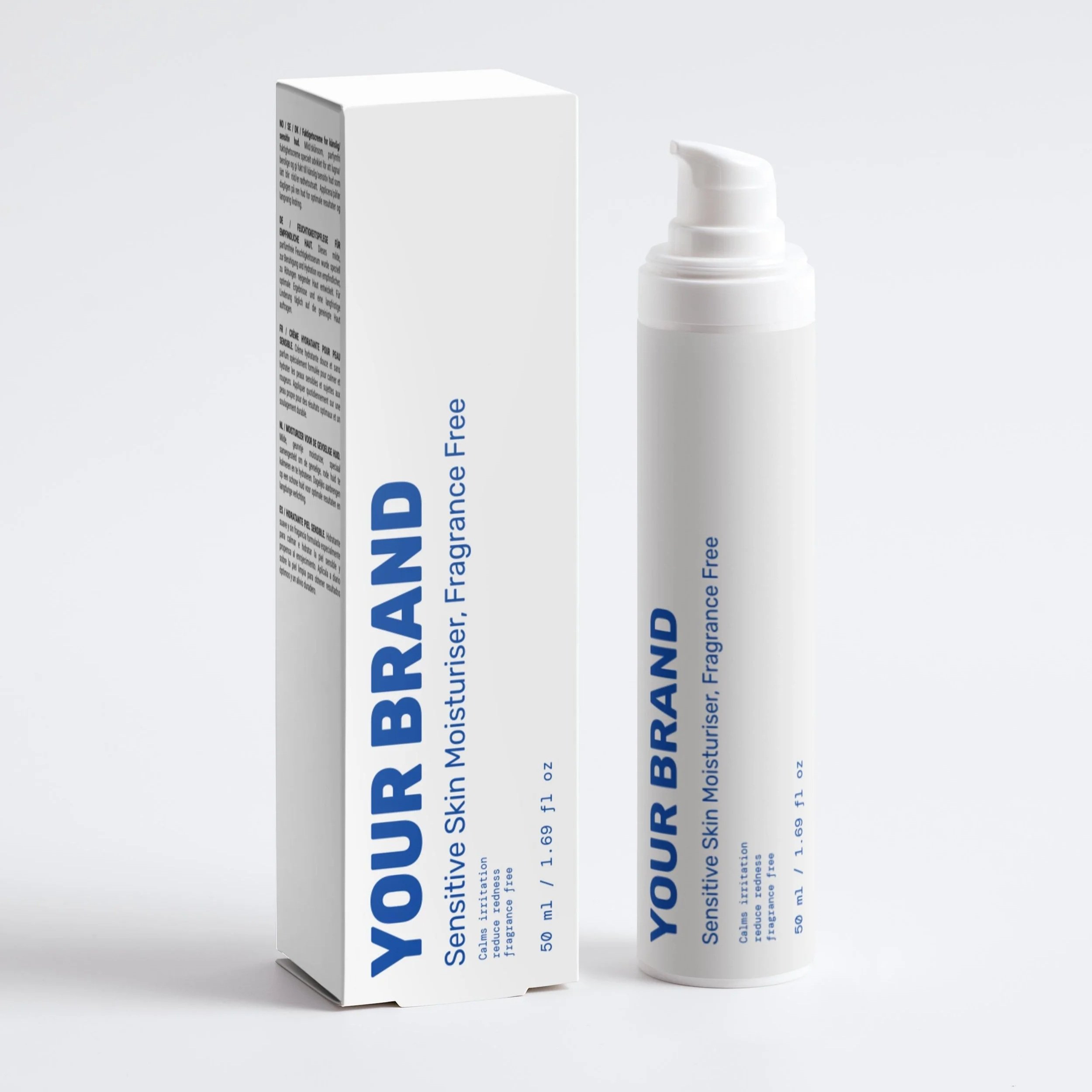
3. Decide Between Labels vs. Fully Custom Packaging
Most successful early-stage brands start with pre-made labels to test the market. The main difference is the scope of your design – do you want a pre-made template or a fully signature label?
Pre-made labels: The fastest, most budget-friendly route for small brands. This lets you to achieve a premium, custom-designed look on standard stock components without the high cost of specialized manufacturing.
Fully custom: Requires tooling costs but creates a signature "identity" once you’re ready to scale. This involves creating a unique, proprietary mold that makes your bottle shape exclusive to your brand and instantly recognizable on the shelf.
Here you’ll find how to create effective label packaging design.
4. Map Out Your Production Lead Times
Sourcing isn't just about the "look" – it’s about the timeline. Make sure your launch stays on track by accounting for:
Printing & Production
Label Application
Shipping & Logistics
QC (Quality Control) Checks
5. Test Packaging Durability
The final step in sourcing is the "Stress Test." Before placing a bulk order, physically test how your packaging holds up during shipping. A cute bottle is a liability if it leaks or cracks before reaching the customer.
Use Selfnamed to source high-quality stock packaging with custom labels, cutting down lead times and bypassing expensive custom molds. It’s the fastest way to test your product's durability and market appeal before you scale.

How to Create a Cohesive Packaging System
Sometimes small brands make this mistake: each product looks like it belongs to a different company.
Instead:
Define a color system, typography rules, iconography style, and keep the silhouettes consistent.
Think of it as building a visual DNA system. Colors, fonts, shapes, and materials stay familiar. Even when product designs change over time.
Great example - Drunk Elephant. This brand is cohesive even with the many different colors they use. It all comes together as a visual DNA system.
Final Thoughts
Cute packaging for small businesses is more than decoration. It’s a powerful tool for building emotional connections and driving sales. The right design can help beauty brands stand out in a crowded market. Always design with your customer’s lifestyle, social sharing habits, and brand story in mind. Great packaging doesn’t just look cute – it helps your brand feel unforgettable.


Frequently Asked Questions
-
The best cute packaging is simple, memorable, and brand-consistent.
-
Use private-label platforms like Selfnamed to design cute packaging on ready-made beauty products. Drag-and-drop soft color palettes, small design details, and more – cute doesn’t have to mean complicated. Sometimes less is more.
-
Success comes from balancing aesthetics + practicality + brand storytelling. It should look good, feel good, and survive real-world shipping.
-
Cute packaging can help brands stand out and attract attention. But product quality and trust are what keep customers coming back.
-
Start with your brand personality, pick 2-3 core design elements, and stay consistent across colors, typography, and materials.
Must read


