
Makeup Brand Logo Ideas: How to Design a Beauty Logo That Sells
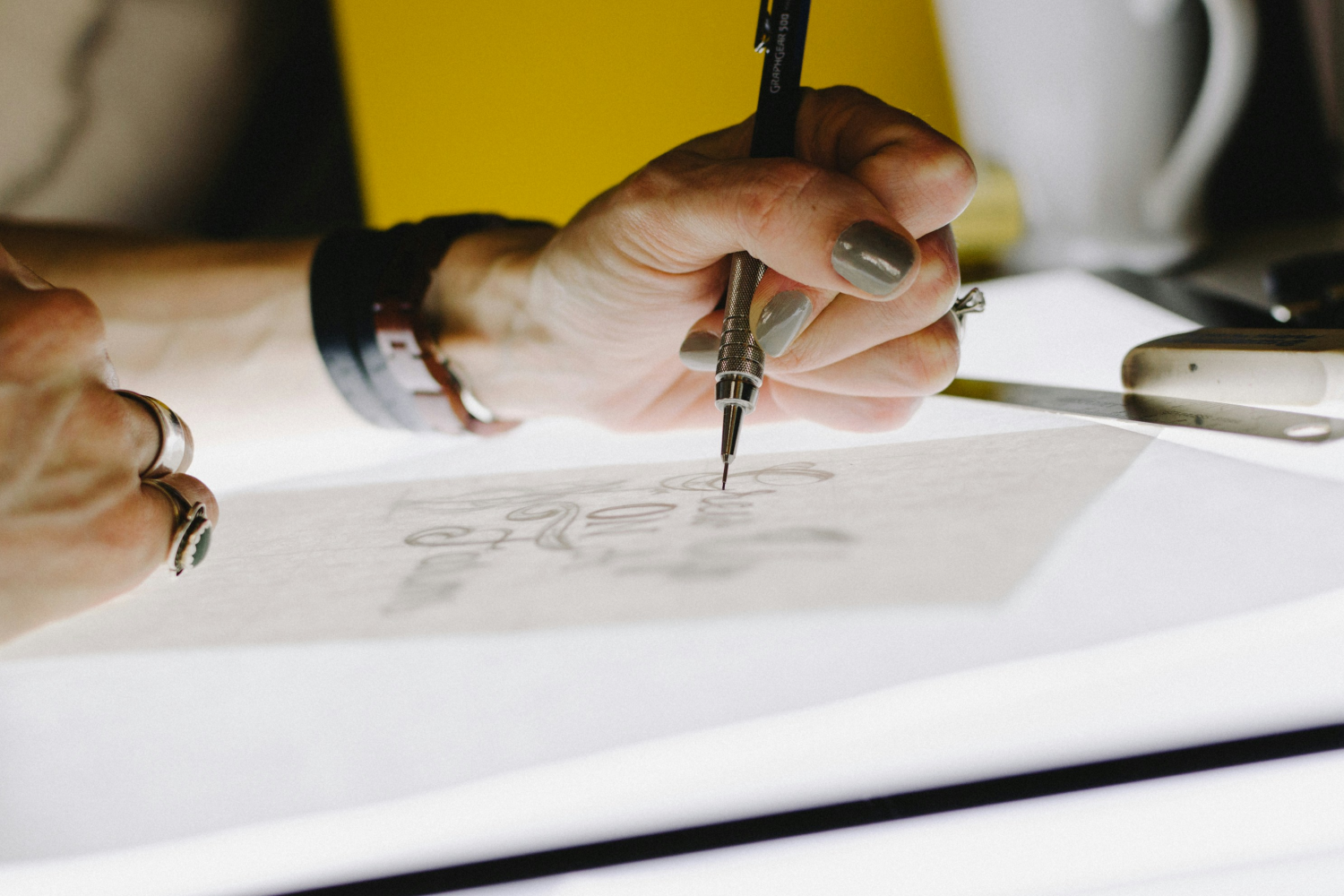
Table of Contents
In beauty, your logo isn’t just a logo. It’s your first impression. Your vibe. Your “add to cart or scroll past” moment.
People don’t just buy makeup. They buy aesthetics, identity. And also the feeling your brand evokes when they pull that lipstick out of their bag. That’s why strong makeup brand logos matter more than ever in the makeup industry.
First impressions happen in about 50 milliseconds, according to research. Barely enough time to blink, but more than enough to judge your design.
This guide explores the best makeup logo ideas. It includes real examples from successful brands. And shows you how to create a logo that looks ready for the shelf.
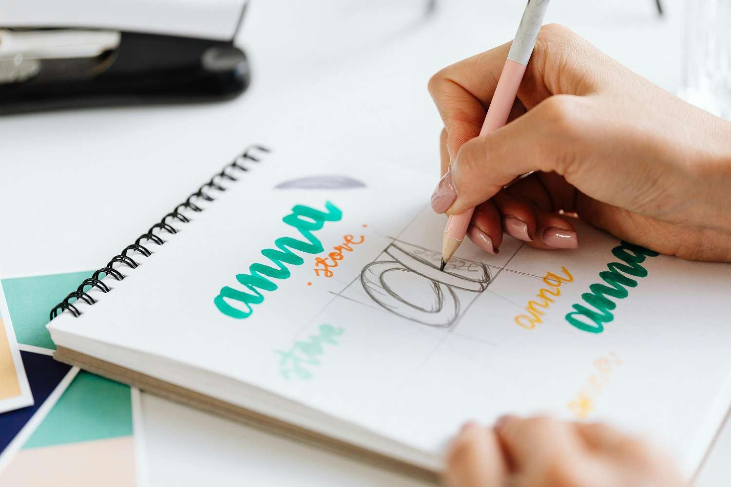
What Makes Great Makeup Brand Logos?
Before diving into inspiration, let’s get one thing clear: great logo design is simple. But definitely not basic. It’s intentional.
Here’s a quick checklist to guide you:
Works in black & white (no color = still recognizable)
Looks good small (think lipstick tube or compact mirror)
Matches your target audience and brand appearance (luxury vs playful vs minimal)
Feels consistent with your brand (design identity and color palette)
Is easy to remember (if it’s forgettable, it’s gone)
If your logo passes this test, you’re already ahead of most first-time founders.
Simplicity matters. Research shows that customers are more likely to engage with and recommend brands that deliver clear and simple experiences.
If you want to explore how this translates specifically into skincare branding, you can also check out this guide on skincare logo ideas for more niche inspiration.
Well Known Makeup Brand Logos (And Why They Work)
The fastest way to get better taste? Study what already works.
Let’s break down some of the most well known makeup brand logos and the business thinking behind them. And what you can learn from them.
Glossier
Glossier is a beauty company built on minimalism and authenticity. This choice wasn’t accidental. The brand emerged from beauty blogging culture, where authenticity mattered more than perfection.
The logo reflects that mindset. Simple, lowercase, and intentionally unpolished. It feels like it belongs in a real bathroom, not a luxury display case.
Why it works beyond aesthetics:
Reinforces the “real skin” movement before it got mainstream
Easy to recognize across packaging, social media, and retail shelves
Feels personal, like a recommendation rather than advertising
Takeaway: The best logos feel like they already belong in your customer’s life.
Fenty Beauty
Fenty Beauty changed the beauty industry not just with products, but with positioning. The brand launched with inclusivity at its core. And the logo had to match that confidence.
The spaced-out, uppercase typography feels deliberate and bold. It doesn’t try to be friendly. It tries to be powerful.
Why it stands out:
Strong visual weight reflects authority in the market
Works across diverse product lines without losing identity
Feels premium without relying on decorative elements
Takeaway: Typography can communicate power better than symbols ever could.
Rare Beauty
Rare Beauty is built around emotional branding. The logo reflects that softness and feels inspired by individuality and imperfection. The irregular spacing and slightly imperfect type choice feel intentional. It visually communicates what the brand stands for: individuality, imperfection, and emotional honesty.
Why it connects emotionally:
Breaks away from “perfect beauty” standards
Feels human rather than corporate
Matches storytelling across campaigns and packaging
Takeaway: A logo doesn’t need to be perfect. It needs to feel honest.
NARS
NARS Cosmetics is one of the clearest examples of long-term brand discipline. The logo hasn’t changed much in decades. And that consistency is exactly the strategy.
It’s sharp, minimal, and slightly aggressive. And there’s a reason for it. It was designed to feel editorial and artistic, not playful.
Why it still works today:
Consistency builds instant recognition
Minimal design ensures longevity across trends
Strong contrast makes it stand out on shelves
Takeaway: Consistency beats reinvention.
e.l.f. Cosmetics
e.l.f. Cosmetics proves that affordability doesn’t have to look cheap.
The lowercase, rounded typography makes the brand feel accessible and friendly. It lowers the barrier between product and customer.
But behind that simplicity is strategy. Everything is designed to feel easy, fast, and non-intimidating.
Why it works:
Matches mass-market accessibility
Feels social-media friendly and modern
Reduces “premium intimidation” in buying decisions
Takeaway: Your logo should match how easy you want your brand to feel within its category.
Milk Makeup
Milk Makeup built its identity in the era of digital-first beauty. The bold, blocky typography feels editorial. Almost like a magazine cover. It’s designed to stand out in fast-scrolling environments, not just physical shelves.
Why it works in 2026-style branding:
Strong geometric form cuts through digital noise
Appeals directly to Gen Z aesthetic culture
Works equally well in motion, packaging, and social content
Takeaway: Modern logos must survive scrolling, not just shelving.
Too Faced
Too Faced takes the opposite approach: maximalism. The script-style logo, combined with playful design language, creates a highly emotional, almost theatrical identity.
It doesn’t try to be subtle. It tries to be memorable.
Why it works:
Strong emotional association (fun, femininity, fantasy)
Highly recognizable even in crowded retail spaces
Reinforces product experience, not just branding
Takeaway: If minimalism is silence, this is personality turned up.
Kylie Cosmetics
Kylie Cosmetics is a masterclass in social-era branding.
The logo itself is simple, but the brand identity around it made it iconic. The dripping lip aesthetic became instantly recognizable because it was designed for virality.
Why it exploded:
Built for Instagram-first visibility
Strong visual storytelling beyond typography
Created instant cultural association
Takeaway: A logo alone isn’t enough. It needs a world around it.
What You Should Notice
Across all these famous makeup brand logos, there’s a pattern:
They’re simple
They’re intentional
They match the brand perfectly
Not one of them is trying to be everything. And that’s your biggest lesson.
Create Your Makeup Brand Logo with Selfnamed
Here’s the good news: you don’t need a design degree or a full creative team to create professional-looking makeup brand logos anymore. There are plenty of free and pro graphics tools available, and freelance services looking to help new brands stand out.
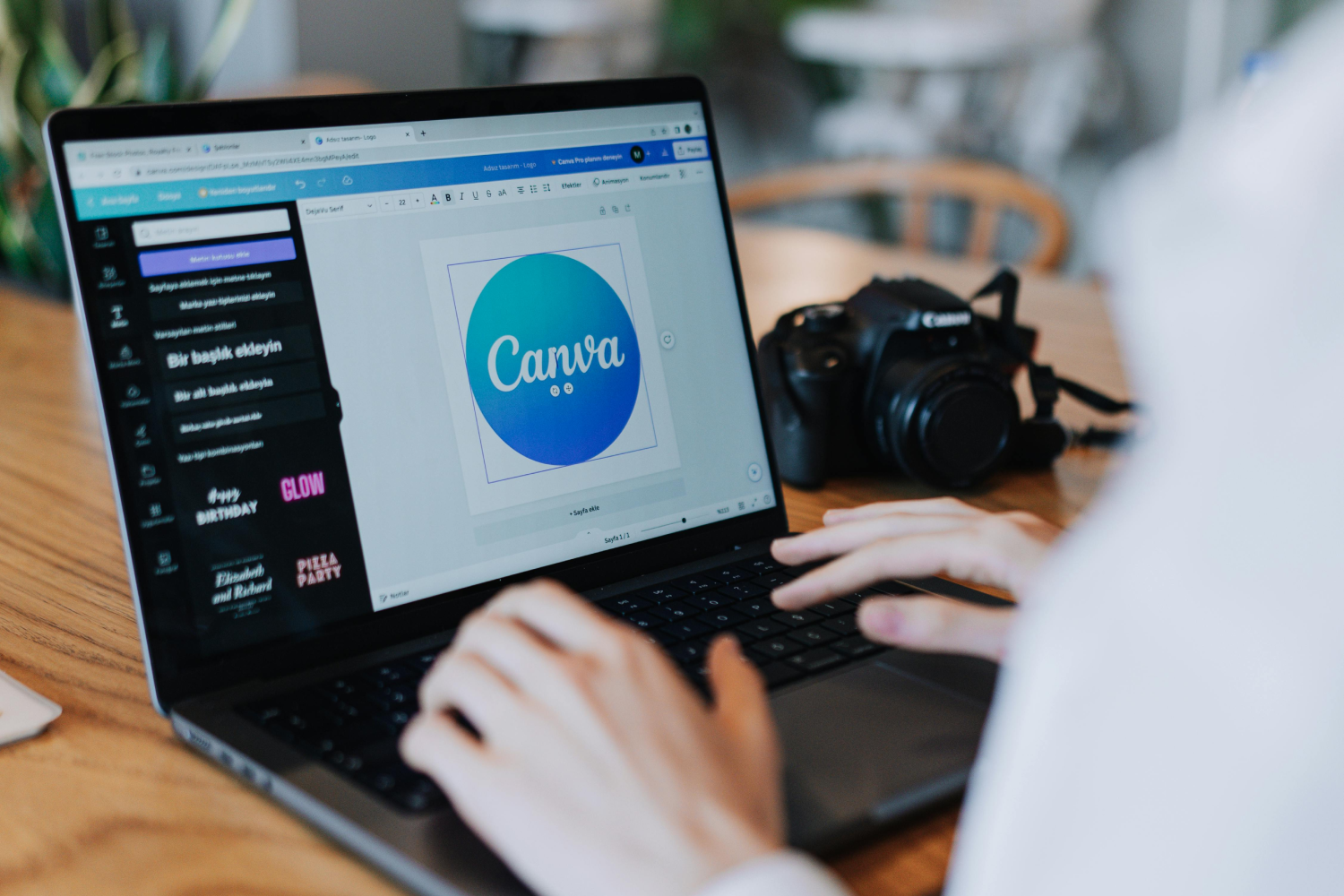
And with Selfnamed, you can go from idea to actual product – fast. Including designing your custom logo and product packaging that matches your brand identity.
And if you’re thinking beyond just the logo, it’s worth understanding how packaging plays into the full brand experience. This guide on skincare packaging design breaks it down really well.
Here’s are your beauty product logo design options with Selfnamed:
1. Quick Design (Fast & Simple)
If you just want to test an idea quickly:
Upload your logo
Instantly preview it on real products
Order samples anytime
Everything saves automatically
You can literally go from idea to branded product in under a minute.
Quick Design is perfect if you’re still experimenting or want to validate your concept before going all in.
2. Ready-Made Designs (Easy, but Elevated)
Want something that looks polished without overthinking it?
Start with pre-designed layouts
Customize fonts, placement, and style within the template
Adjust the look to match your brand
Keep it simple – but make it yours.
Ready-made Designs are ideal if you want personality without starting from scratch.
3. Design Studio (Full Creative Control)
If you have a clear vision for your custom logo:
Adjust fonts
Add icons or clipart
Upload your own graphics
Fine-tune every detail
If you want a deeper look at how this works, check out how to create a skincare label with Selfnamed Design Studio.
This is where your brand identity really comes to life.


4. Done-for-You Design Service
Not into designing at all? You can have a professional team create your packaging and labels for you.
Share your idea
Get custom designs
Ready to order immediately
Think of the Design Service as skipping the stress and going straight to the result.
If you’re looking for inspiration first, these skincare packaging ideas can help you define your visual direction.
Tips for Designing Makeup Brand Logos That Sell
A good logo looks nice. A great logo sells. Here’s how to make sure yours does both:
Think Shelf-First, Not Just Screen-First
Your logo might look amazing on your laptop. But how does it look on a lipstick tube? Or from two meters away? If it disappears on packaging, it doesn’t work.
In case you’re targeting a younger audience, bold and standout visuals matter even more. This guide on bold and eye-catching skincare packaging for Gen Z shows exactly how brands are doing it.
Avoid Over-Designing
More fonts doesn't mean better design. More elements doesn’t create a stronger brand. In beauty, clean almost always wins.
Keep Spacing Intentional
Good logos breathe. Spacing between letters (kerning) can make or break your design. Too tight? Feels cheap. Too wide? Feels disconnected.
Make It Scalable
Your logo should work:
On packaging
On your online store
On social media
On tiny labels
If it only works in one format, it’s not ready.
Test on Real Mockups Early
This is where most founders go wrong. Don’t just design in a vacuum. Put your logo on actual product mockups as early as possible. That’s how you catch mistakes before they cost you money.
Final Thoughts
Your logo isn’t just decoration. It’s your brand’s handshake. The best makeup brand logos don’t try too hard. They just feel right.
So don’t overcomplicate it. Start simple. Test fast. Refine as you grow.
Because at the end of the day, the goal isn’t perfection. It’s creating something people recognize, trust, and want to be part of.
Frequently Asked Questions
-
A good logo is simple, recognizable, and aligned with your brand identity. It should look great both online and on physical packaging.
-
Some of the most famous makeup brand logos include Glossier, Fenty Beauty, Rare Beauty, NARS, and Kylie Cosmetics. All known for their strong visual identity.
-
Not necessarily. Many successful brands rely on typography alone. Icons can help, but they should feel intentional. Not forced.
-
Start with your audience and brand personality. Look at makeup logo ideas from existing brands. Identify what you like, simplify.
-
Yes. Platforms like Selfnamed make it easy to create and test logos without professional design experience.
-
Extremely important. Your logo lives on your packaging, so it needs to look good in real-life formats. Not just on screen.
Must read


