Why Accessible Packaging and Digital Design Should Align
Table of Contents
Design is more than aesthetics. It’s art, architecture, functionality, and more. And in business, it’s the bridge between a brand and its audience.
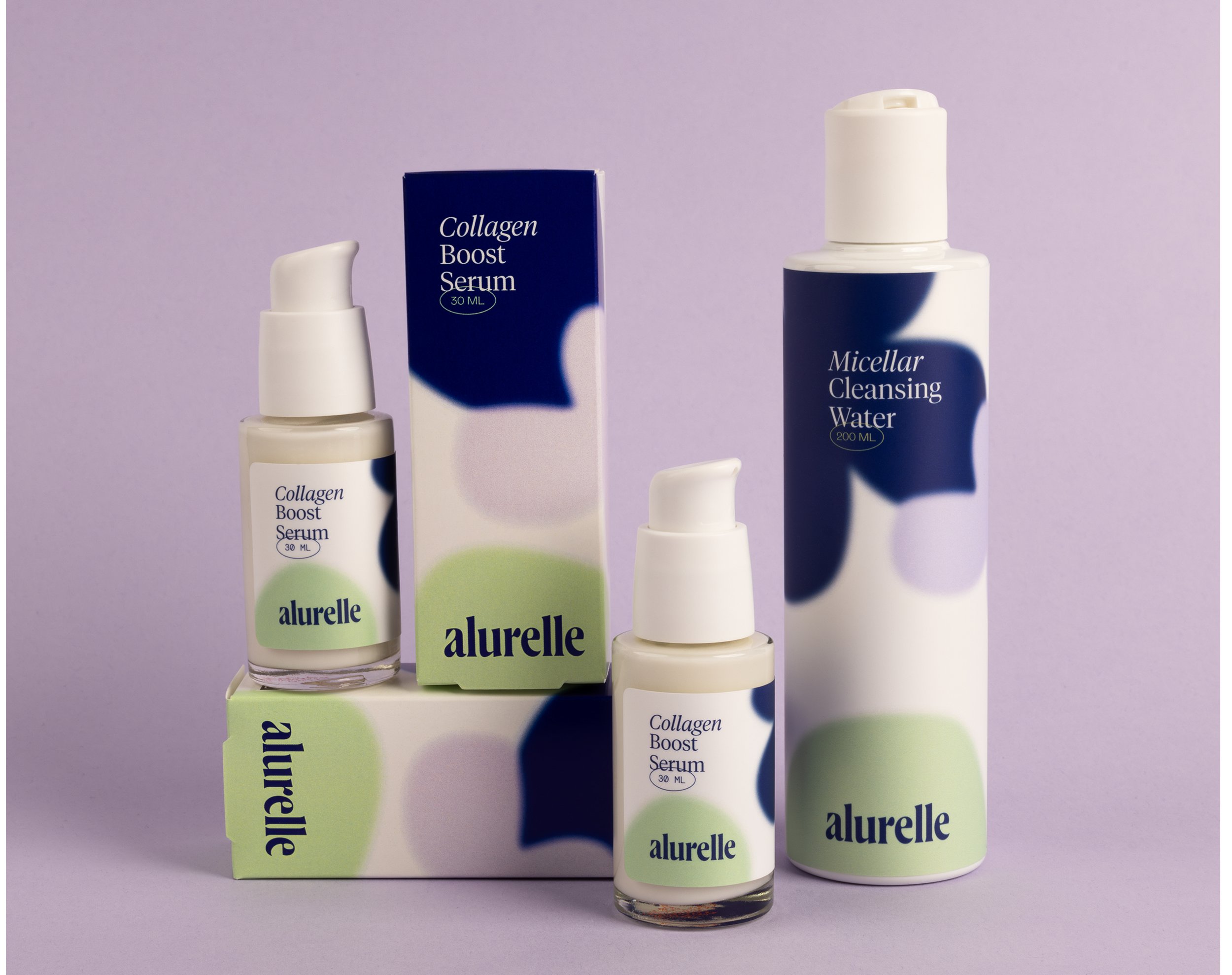
In beauty, product packaging design plays a key functional and branding role. This is something we understand deeply at Selfnamed. We see firsthand how visual identity, physical packaging, and digital presence come together in one to shape a brand’s story.
And one thing is clear – design is only powerful when it’s accessible.
Accessibility in beauty as in anywhere else is no longer an afterthought or a “nice to have.” It’s expected as it should be. So when packaging and digital design follow shared accessibility principles, brands look and communicate better. In this article, let’s explore why accessibility matters, why packaging and digital design must work together, and how beauty founders can build more inclusive brands from day one.
The Beauty Consumer Is More Diverse Than Ever
Today’s consumers span every age, ability, background, and identity. They use beauty for self-expression, wellness, confidence, and ritual. And as this diversity grows, so does the need for design that truly welcomes everyone.
Accessibility in beauty now touches:
Low-vision consumers who need clear typography, strong contrast, and well-established hierarchy
Neurodivergent users who benefit from intuitive layouts and consistent structure
Aging consumers whose sight and dexterity may shift over time
Multilingual shoppers who rely on visual clarity as much as written language
Online-first buyers who must understand the product digitally before ever touching it
Inclusive design is an acknowledgment of reality. And when brands align their physical and digital accessibility approaches, they create seamless experiences for diverse audiences.
Packaging Is Often the First Accessibility Touchpoint
In beauty, packaging does a lot of heavy lifting. It protects, informs, seduces, and differentiates. For many consumers, it’s the first point of contact with a brand. That means packaging must be:
Readable: Typography that isn’t microscopic, fonts that are actually legible, spacing that breathes.
Understandable: Clear ingredient lists, direct usage instructions, and without clutter.
Usable: Components that open easily, labels that don’t peel, textures that guide the hand.
Recognizable: Color choices that contrast well and help categories or product types stand out.
Selfnamed’s Design Studio
At Selfnamed, we encourage every brand founder to use our Design Studio for creating and perfecting their packaging design, and to consider clarity, hierarchy, and functionality. To note, many choices that make packaging accessible are often the same choices that make packaging beautiful.
White space, strong contrast, balanced type hierarchy – these are both design fundamentals and accessibility fundamentals. The overlap is huge.
Digital Design Should Follow the Same Principles
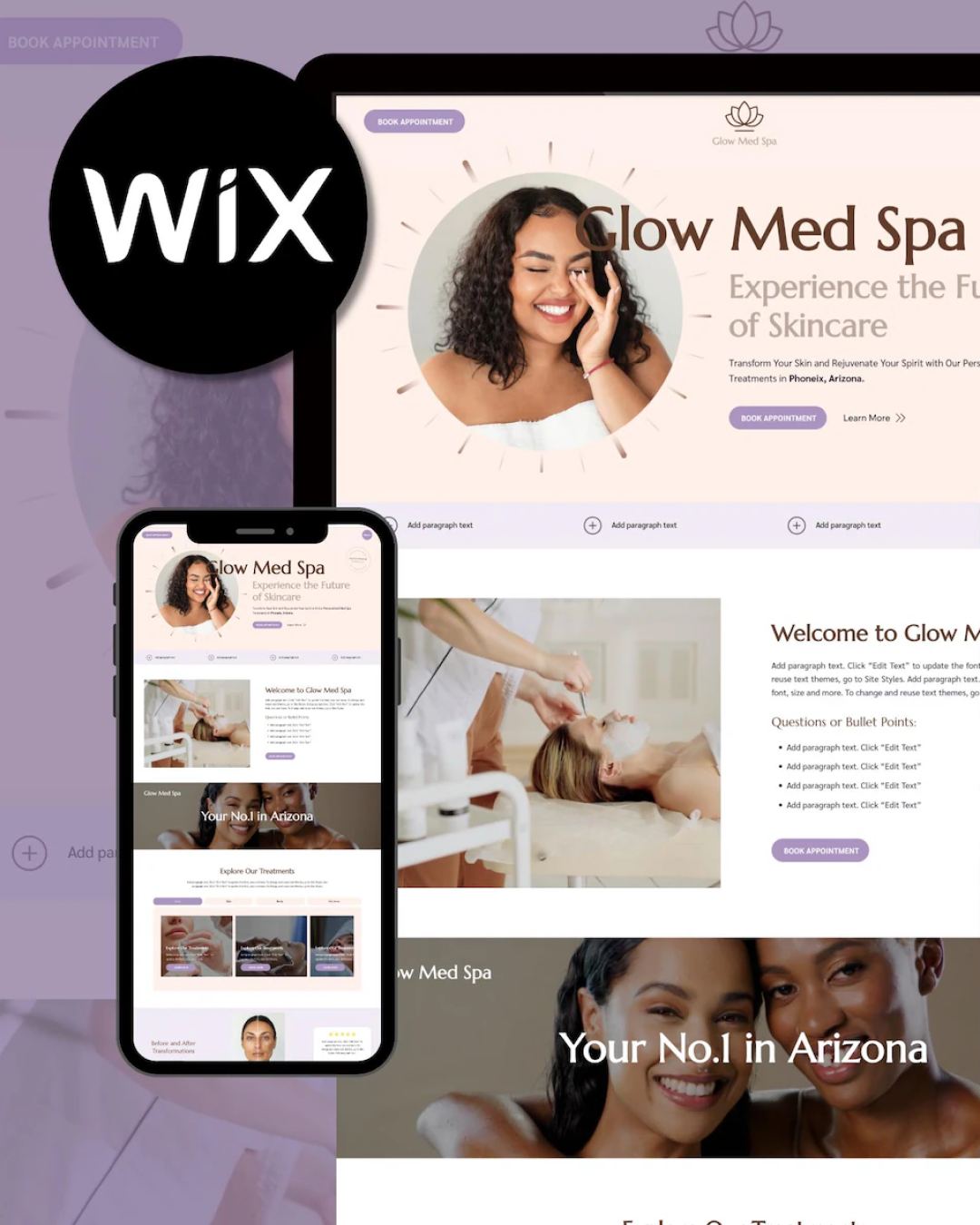
Imagine a potential customer sees your product for the first time on your website or social media. If your packaging has accessible design but your digital experience is off, the brand message becomes inconsistent.
Accessible digital design means:
Readable text
Clear navigation
Alt-text and descriptive assets
Logical hierarchy and layouts
Consistent iconography and structure
These principles support screen reader users, low-vision users, neurodivergent users, and anyone navigating on a small phone screen in the middle of a busy day (that’s many of us right there).
When your digital presence is clear and well-structured, the brand experience becomes more dependable. Trust is built when the brand feels the same, everywhere.
But building accessible digital design is hard: we’ve seen leading beauty brands like Peter Thomas Roth, Joanna Vargas, and DIME Beauty use TestParty to automate digital accessibility for their Shopify Stores.
Why Alignment Matters
1. Accessibility Builds Brand Trust
In beauty, trust is everything. Consumers want to feel confident in:
What they’re buying
How to use it
Whether it fits their needs
When both packaging and digital visuals follow the same rules, the brand appears consistent and trustworthy. A customer shouldn’t squint at a product page only to receive packaging with beautifully clear text. Or vice versa.
Remember: consistency creates credibility.
2. Accessibility Improves Conversion
Clarity sells.
Online, accessible design can improve:
Add-to-cart rates (because shoppers understand the product quickly)
Time on page (because the layout is easier to understand)
Lower return rates (because expectations are clearer)
In-store, accessible packaging grabs attention, communicates function instantly, and reduces uncertainty.
Ultimately, accessible design removes friction across the entire business ecosystem.
3. Accessibility Strengthens Emerging Beauty Brands
Startups often grow faster than expected. What begins as a small indie brand can quickly expand into retailers, international markets, or wholesale.
When a beauty brand builds accessibility into packaging and digital design from the beginning, they avoid costly rebranding or compliance overhauls later.
A strong accessible foundation scales naturally.
Accessible Design Elevates Creativity
There’s a misconception that accessibility limits creativity. That it makes things rigid, predictable, or “too functional.”
But at Selfnamed, we see the opposite.
When beauty brands design with clarity and intention, their brands can become:
More premium-feeling
More modern
More confident
More memorable
Think of iconic beauty brands like Byredo, Fenty Beauty, Rhode. Their minimalist aesthetics owe much of their success to principles that overlap with accessibility: hierarchy, contrast, spacing, simplicity.
Accessible design isn’t a constraint. It’s a design language of its own.
How Founders Can Align Accessible Packaging and Digital Design
Here are practical tips beauty founders can apply immediately.
1. Start with Typography Rules
Minimum 4.5pt on packaging (for darker backgrounds – minimum 4.8pt)
Choose simple, legible fonts (avoid ultra-thin weights)
Use line spacing that improves readability
2. Use High-Contrast Color Palettes
WCAG contrast guidelines are a helpful reference, but as a creative founder, aim for:
Dark text on light backgrounds
Light text on darker panels
Avoid subtle color-on-color combinations
3. Create Clear Information Hierarchies
For packaging:
Product name → function → instructions → ingredients
For digital:
Heading → subheading → feature list → CTA
Hierarchy helps everyone understand the product better.
4. Ensure Consistency Across Platforms
Typography, color, spacing, iconography, language – all of these elements should match between packaging and your digital identity. Consistency itself is a form of accessibility.
Accessible Design Is Better Design
A beauty brand like any other brand needs to be intentional, professional, and ready to grow. That includes creating packaging and digital experiences that combine aesthetics and usability.
When accessibility becomes a shared design language across physical and digital spaces, brands connect more deeply with their audience. And that connection is everything.
Accessible design isn’t just a responsibility. It’s a brand advantage. To learn more about why accessibility matters across every touchpoint, read TestParty’s article on why beauty brands need accessible design.
Must read

