Best Wix Templates for Beauty Businesses
Table of Contents
Thinking about launching your own beauty website? Many founders stop before finishing the idea phase. And it makes sense – the requirements of building a professional brand can feel overwhelming.
The truth? You don't need a giant budget or a massive team to get moving. Wix is a flexible and modern website builder, perfect for launching an online store at any stage of business.
It offers an extensive collection of templates and ecommerce apps. For beauty professionals, this is a great way to get a business online without advanced technical requirements.
We’re here to shed some light on the top Wix website examples and what to pay attention to as a beauty business. I’ve researched the best Wix templates for beauty products in various business models. So if you want to create a solid online presence, this is the right place for you.
What to Look for in a Wix Beauty Template
Selecting the right website template is about more than just what looks good. Whether you’re building for a skincare brand, beauty salon, or even a high-end spa, consider what your niche and audience expect. The layout you pick should first and foremost appeal to your customers.
For example, a luxury clinical brand usually needs a sophisticated design with a simple layout and plenty of white space and social proof from the beauty industry. This look signals authority and precision.
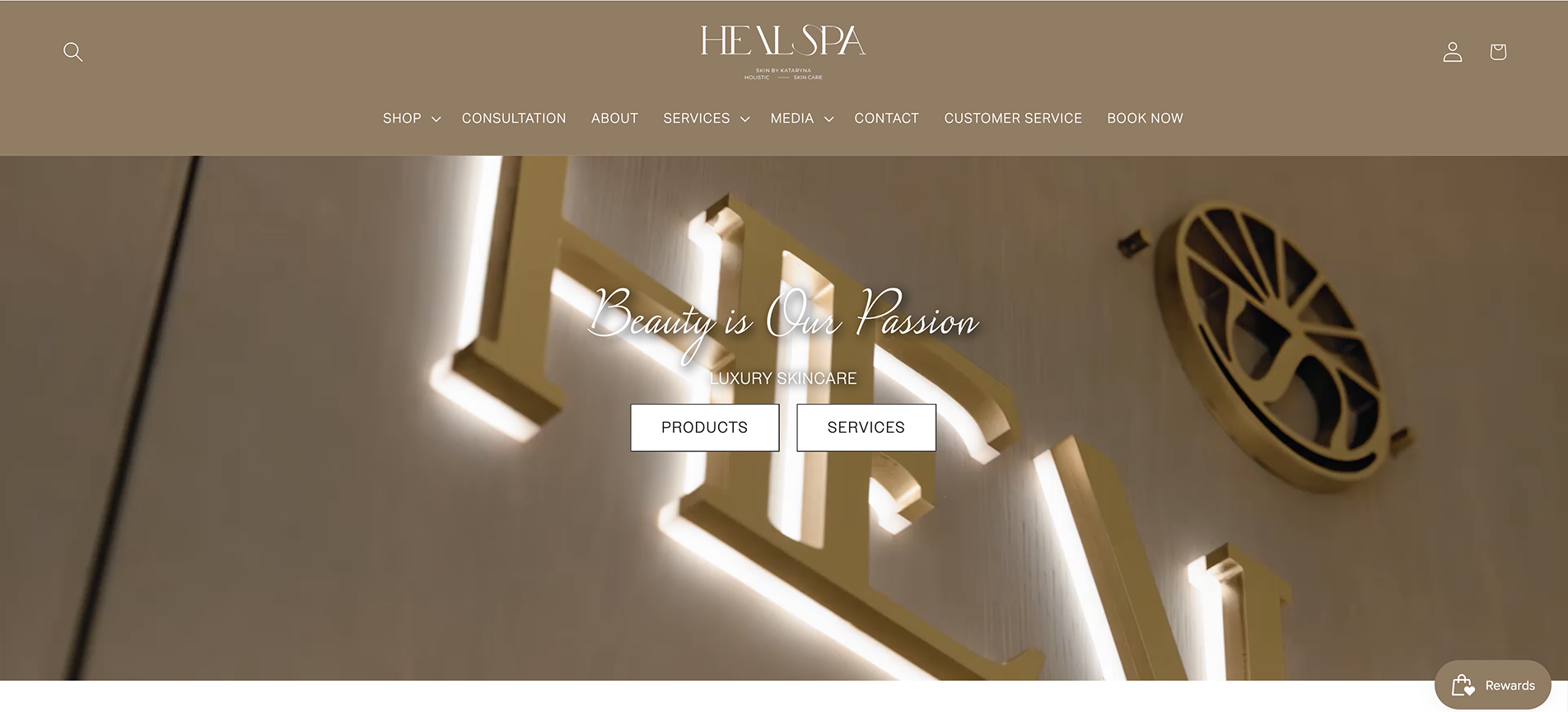
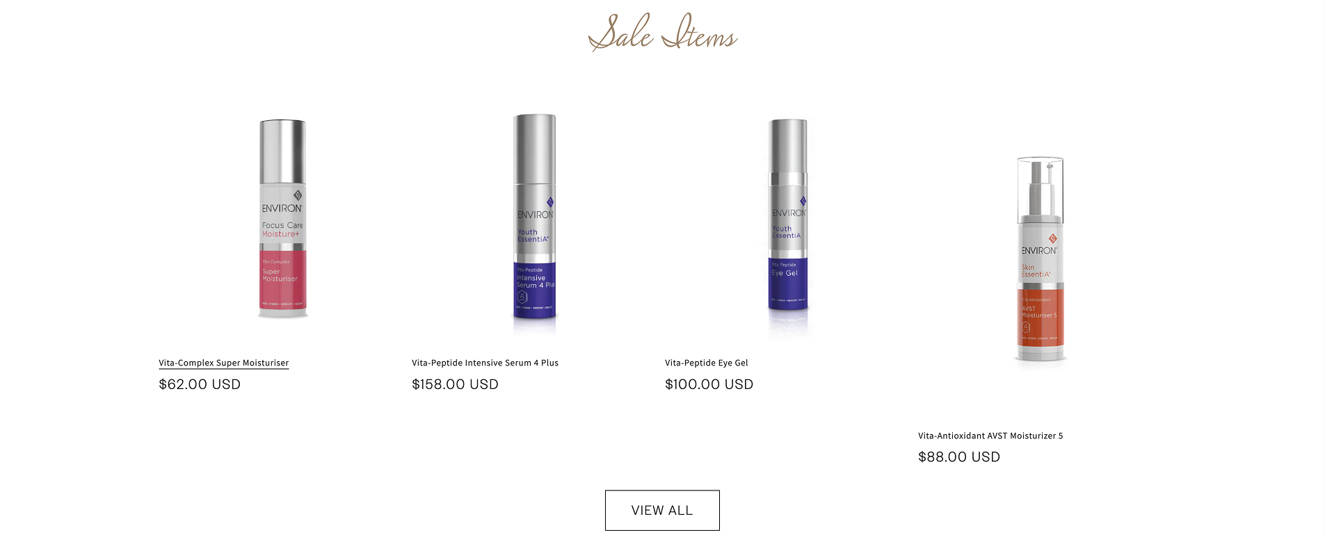
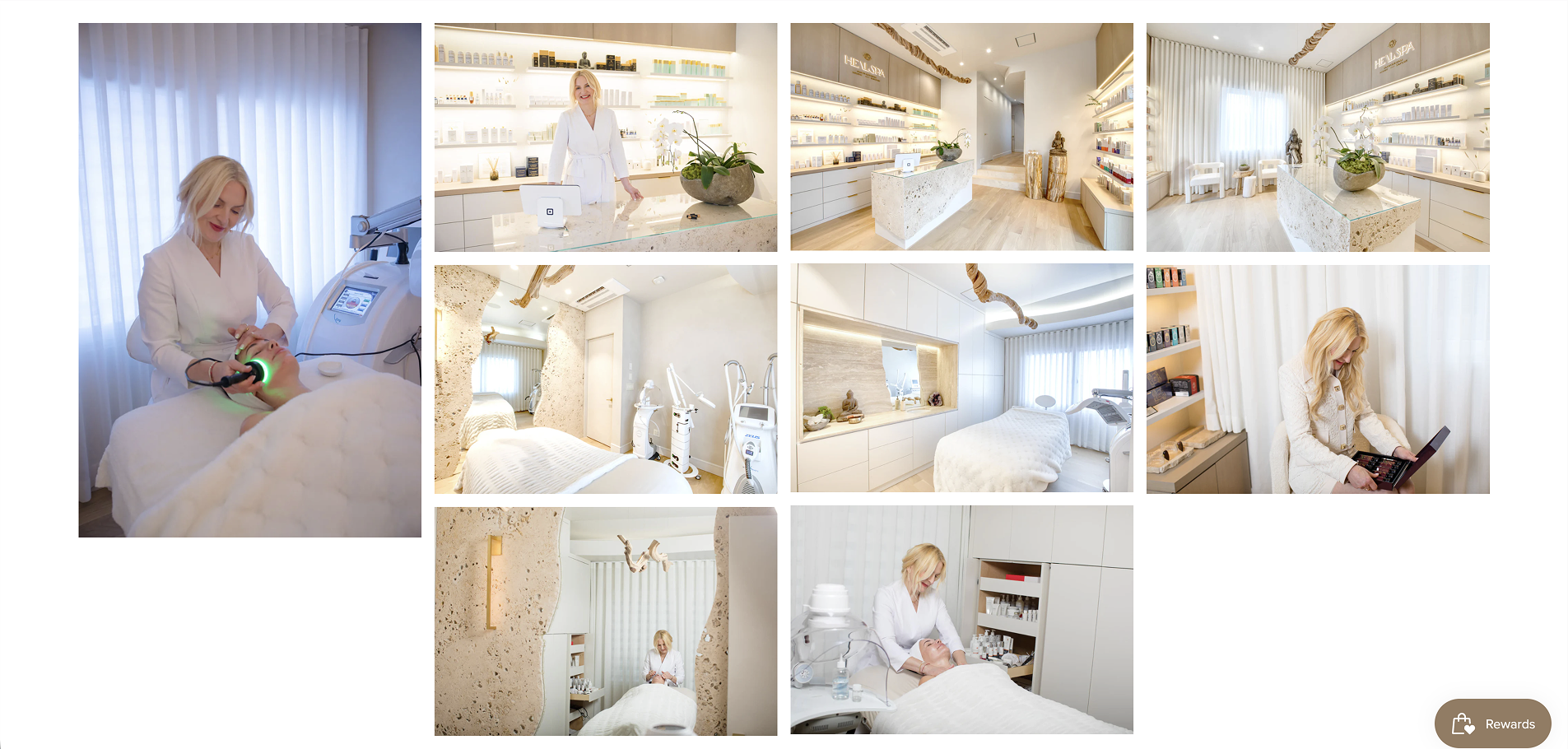
Image source: heal-spa.com
In contrast, an eco-conscious line thrives on a soft color palette and natural beauty aesthetics, with plenty of images featuring botanical ingredients and a rich brand story.
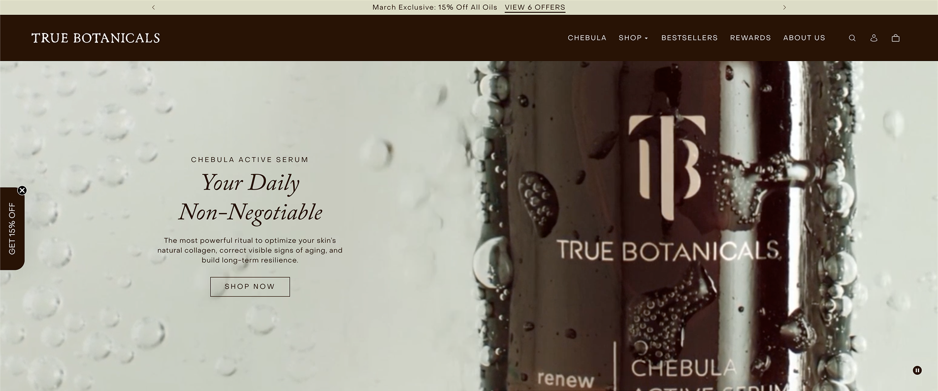
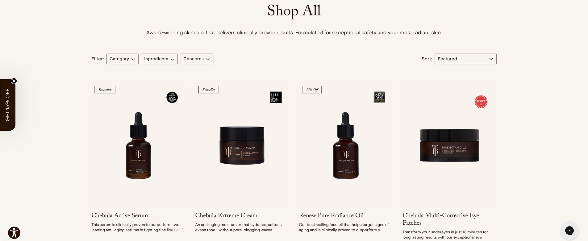
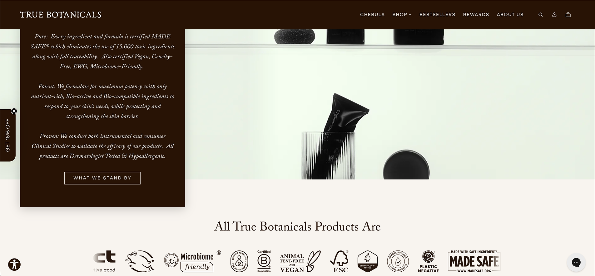
Image source: truebotanicals.com
Your website needs to feel like an extension of the products you sell and the values shared by your audience, which is why finding your niche is so important before you start designing.
So, start with an idea of the type of audience and products you’re trying to welcome and offer in your store. Then, look for the template features to make your website setup work correctly:
Ecommerce features: Tools that enable payments and shipping profiles to process sales without issue.
Intuitive user interface: A simple layout with clear navigation to help guide visitors to the checkout.
High-quality images: Strong website visuals and high quality images to build trust for your brand.
Mobile-friendly design: Layout and image resizing integrations to make sure your online store functions perfectly on all mobile devices.
Customer engagement apps: Tools like live chat and customer reviews’ apps to help answer questions and drive sales.
Online booking tools: For service-based businesses like beauty salons or nail salons, professional online booking lets clients schedule appointments 24/7.
Now let’s take a closer look at what makes a Wix template tick, and what you should consider in order to support every step of the buyer’s journey. Templates simply provide the main interface – multiple pages and ecommerce functions. You’ll be able to customize and tweak them as much as you want.
Top Wix Templates for Beauty Websites
Instead of manually testing hundreds of potential Wix templates, you can start with a foundation built for the beauty industry’s specific needs. Here are four templates that are pre-configured to handle everything from full ecommerce functionality to complex beauty booking calendars.
The Clean & Minimalist: Natural Skincare Store
Best for: High-margin dropshipping or private label stores.
Running an online beauty store as your main business strategy requires a balance of professionalism and absolute transparency. Since you aren’t manufacturing the beauty formulas yourself, your website’s design has to do 100% of the heavy lifting to build trust and sales.
The beauty ecommerce essentials:
Aesthetic cohesion: A clean look that makes ready-made mockups look intentional.
Ingredient callouts: Visible slideshow with markers for ingredients and certifications.
Sensory visuals: High-quality macro shots that show the product in close detail.
Frictionless carting: Frequent and rapid checkout access to get right to the sales.
1. The authority hero shot
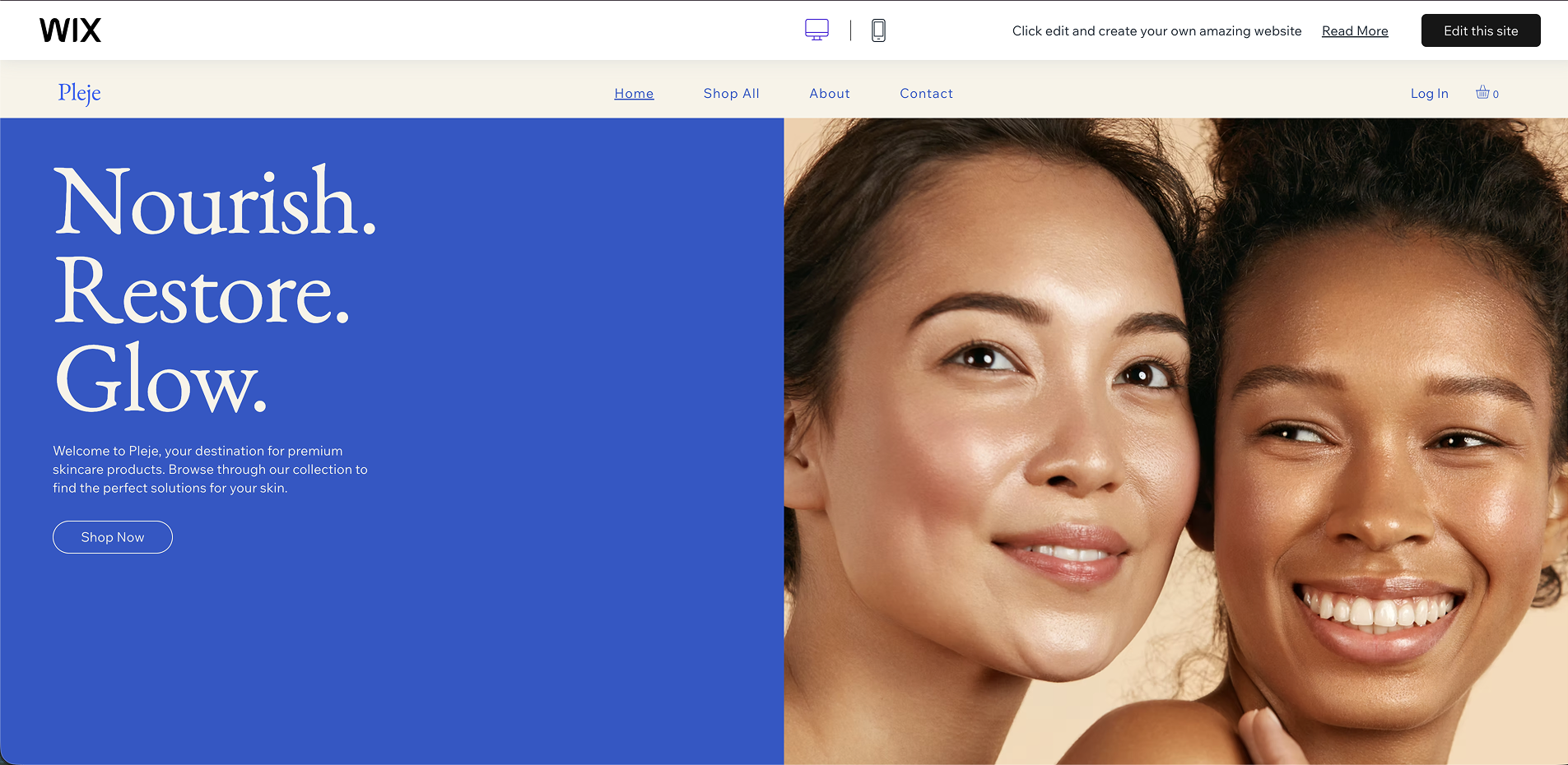
The large, soft-focus imagery here is doing the heavy lifting for your brand identity. In beauty, customers buy the "after" photo – the glowing skin and the self-care moment.
It’s an easy area to customize. A single photo swap can shift your brand from "scientific and clinical" to "boho and organic" in seconds.
2. The "story" bridge [screenshot]
Psychologically, this creates an "editor’s choice" feel. It suggests that your store isn't just a warehouse, but a curated selection of products you personally stand behind.
Even if you don't manufacture the goods, this section lets you explain your vetting process. It bridges the gap between a cold transaction and a personal brand.
3. The high-contrast "about" block
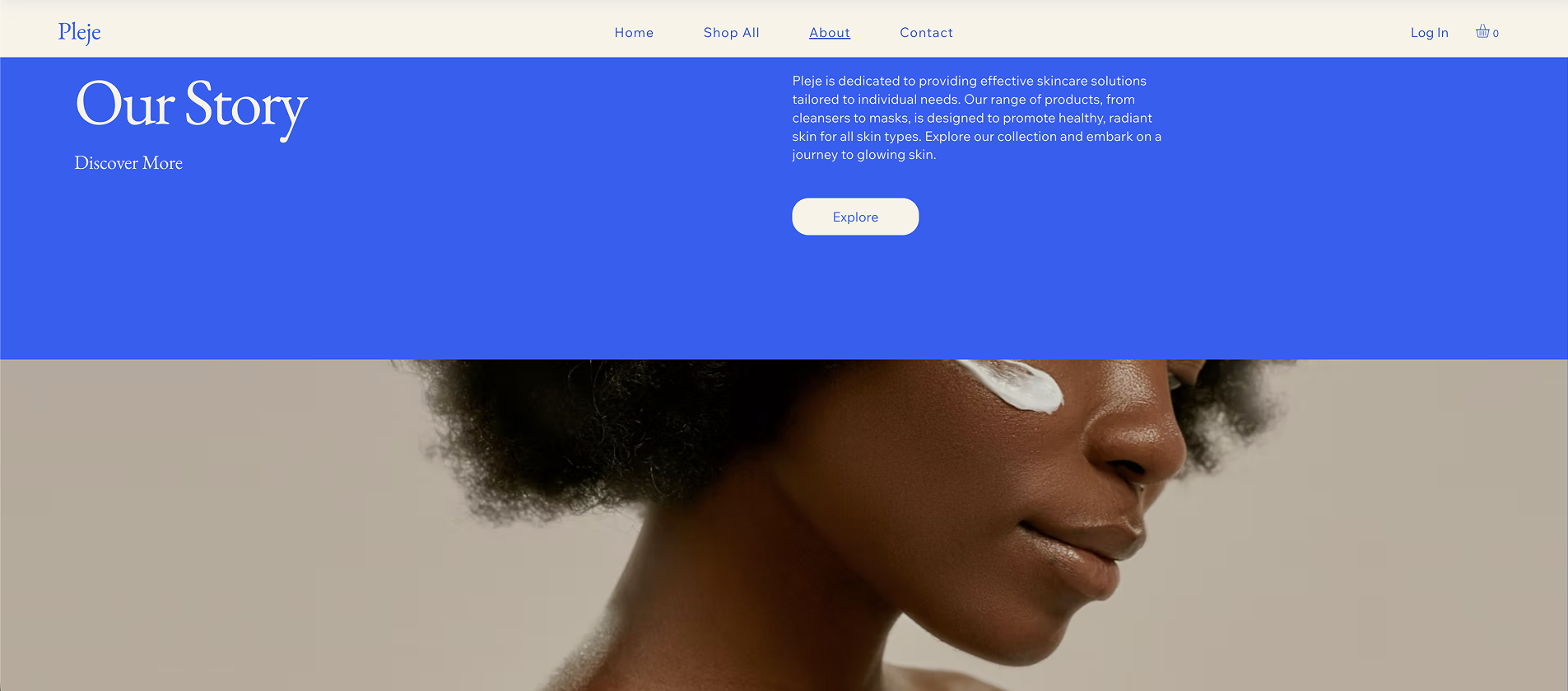
This is a classic high-end editorial layout. The massive image on the left provides a "face" for the brand, while the clean serif typography on the right adds a layer of sophistication.
Use this space to highlight your brand's specific "Why." In the beauty industry, people buy from brands that align with their personal identity. This layout gives you the visual weight to prove your brand belongs in their daily routine.
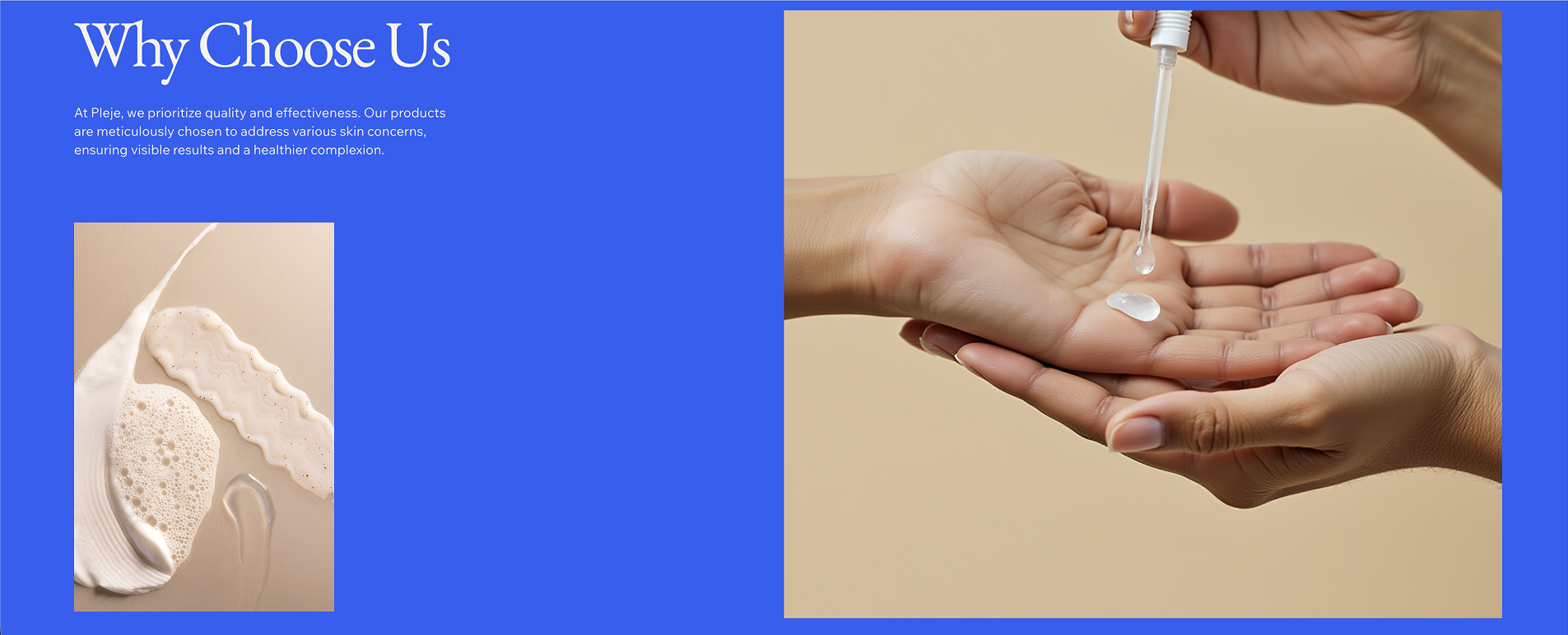
4. The uniform product grid
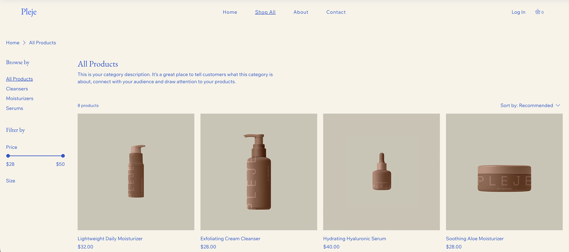
This is your visual glue. The heavy use of white space and consistent borders here act as a buffer, neutralizing any visual product clashes.
It forces the eye to see a "collection" or beauty “routine” rather than a random assortment of items. This organized structure is perfect for showcasing the best skincare dropshipping products for your store.
The Bold & High-Impact: Beauty Store (Bold)
Best for: Modern cosmetics and high-impact beauty brands.
High-energy cosmetics brands need a website that feels as vibrant as their products. This template moves away from the "quiet luxury" and leans into a "loud" aesthetic that signals trendiness and confidence.
Modern beauty store essentials:
High-impact typography: Large, bold fonts that establish a strong brand voice.
Dynamic social proof: Integrated sections for community-generated content.
Education through visuals: Clear "how-to" steps or texture highlights.
Fast-action shopping: Prominent checkout buttons and quick-view options.
1. The brand revolution header
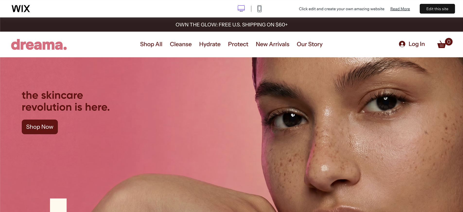
The oversized typography and vibrant background create an immediate sense of modern rebellion. This header establishes the brand as a "revolution" within the beauty industry.
It’s a great fit for high-impact model photography that defines your specific target audience. Swapping the background color or the hero font shifts the brand's intensity to match your specific product line.
2. The "1. 2. 3. Glow" tutorial
This section uses a mix of model shots and macro textures to explain product application. Placing a creamy texture shot in the center bridges the sensory gap for online buyers.
It functions as a silent tutorial that reduces the friction of a first-time purchase. You can customize these steps to highlight the specific results of your best-selling items.
3. The 'Rebel DNA' authority
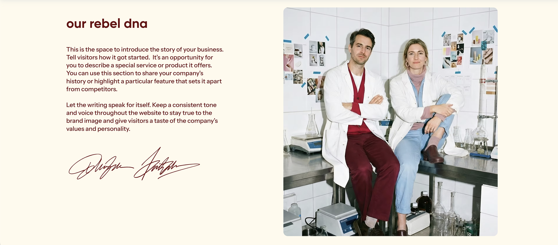
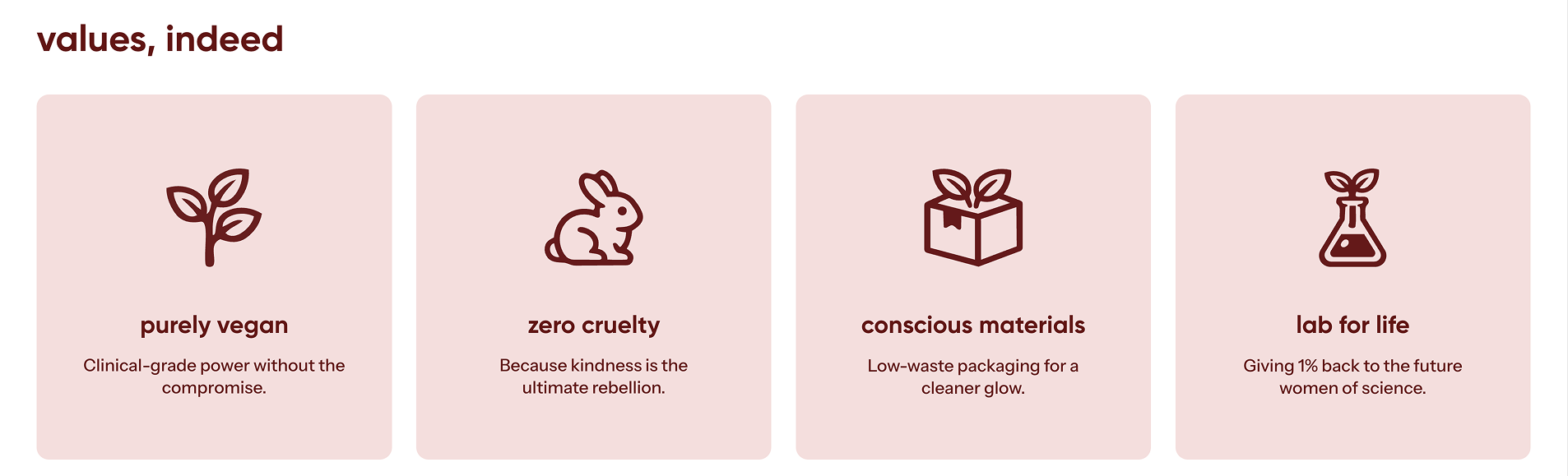
The "Values, Indeed" section uses thick-lined, bold icons to communicate ethical standards like "Purely Vegan" and "Zero Cruelty". For a modern brand, sustainability is a major sales driver.
This visual weight suggests that your brand's ethics are a core part of its identity. It appeals to customers who look for brands that challenge traditional industry standards.
4. The fast-action product grid
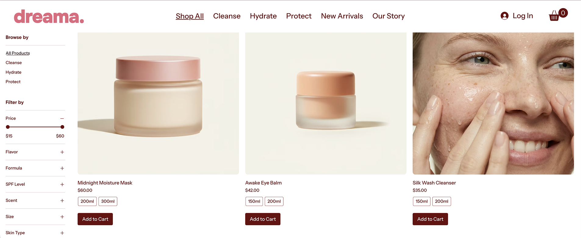
The product catalog uses a high-density grid with vibrant imagery to maintain high visual energy. This page features prominent "Add to Cart" buttons for fast, impulsive purchasing decisions.
The consistent product photography across varied product types makes sure the store looks like a professional, intentional collection. This is where you highlight trend-focused items that stand out.
The Service-First Salon: Hair Salon (Stylish)
Best for: Beauty studios, salons, stylists, and appointment-based pros.
A service-based beauty business lives or dies by its calendar. This template prioritizes professional credibility and immediate action, turning a digital portfolio into a functioning reception desk. It moves away from the "product-only" grid to focus on the skill of the artist.
The service-based essentials:
Frictionless booking: Prominent calls-to-action (CTAs) that lead directly to a calendar.
Visual portfolio: High-quality imagery showing a range of technical skills.
Pricing transparency: A clean menu that sets expectations before the visit.
Atmospheric social proof: Reviews paired with images of the actual salon environment.
1. The high-conversion split hero
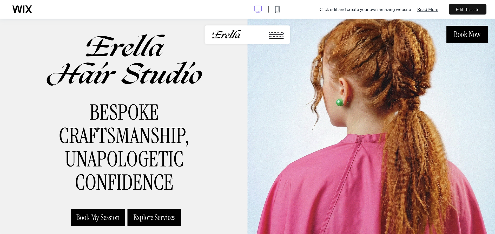
The layout immediately separates the vibe from the action. On the right, a high-detail shot proves technical ability. On the left, the serif typography establishes a bespoke authority.
The "Book Now" button is the primary focal point; it’s designed to capture the visitor's intent the moment they land. You can customize this by swapping the hair shot for your best signature look to instantly define your specialty.
2. The 'signature looks' gallery
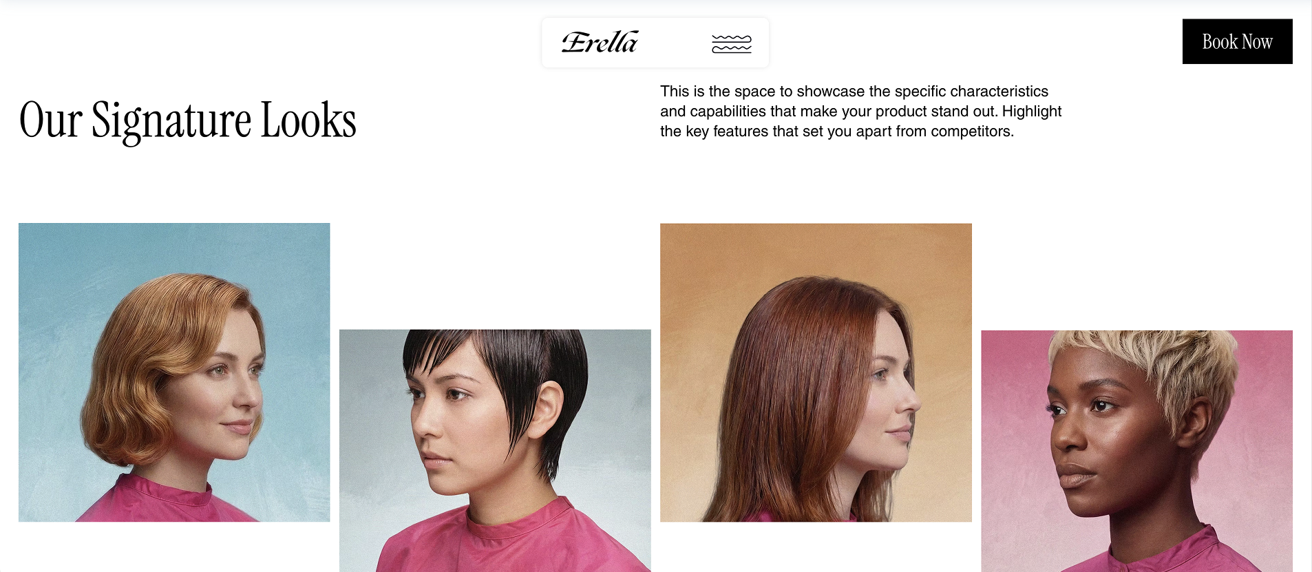
Proof of work is the most important trust-builder for a stylist. This four-column grid uses consistent, colored backgrounds to create a high-fashion editorial feel.
It signals that your salon has a curated, intentional brand rather than a random collection of chair-side selfies. Replacing these with your own professional portfolio shots lets you showcase the specific hair textures or color techniques you want to be known for.
3. The transparent service menu
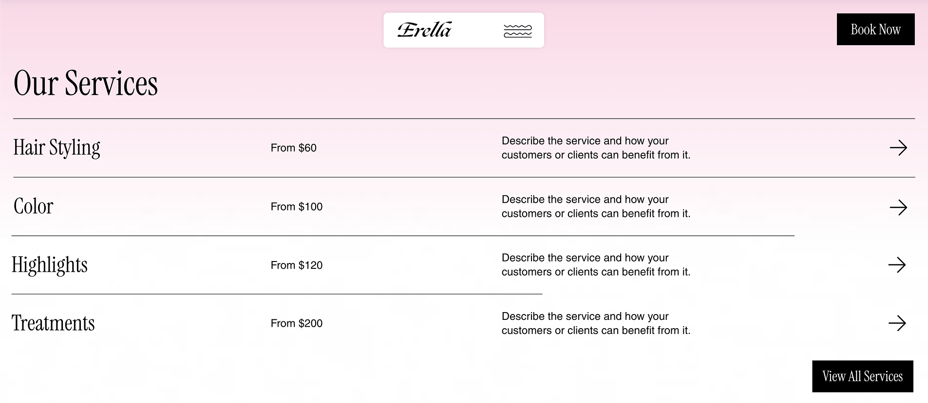
This minimalist list removes the fear of the unknown that often keeps new clients from booking. By listing specific categories like "hairstyling" and "color" alongside starting prices, you qualify your leads instantly.
The generous white space between items makes the menu easy to scan on mobile devices. This is a critical area to customize with the things that make your beauty salon stand out.
4. The testimonial section
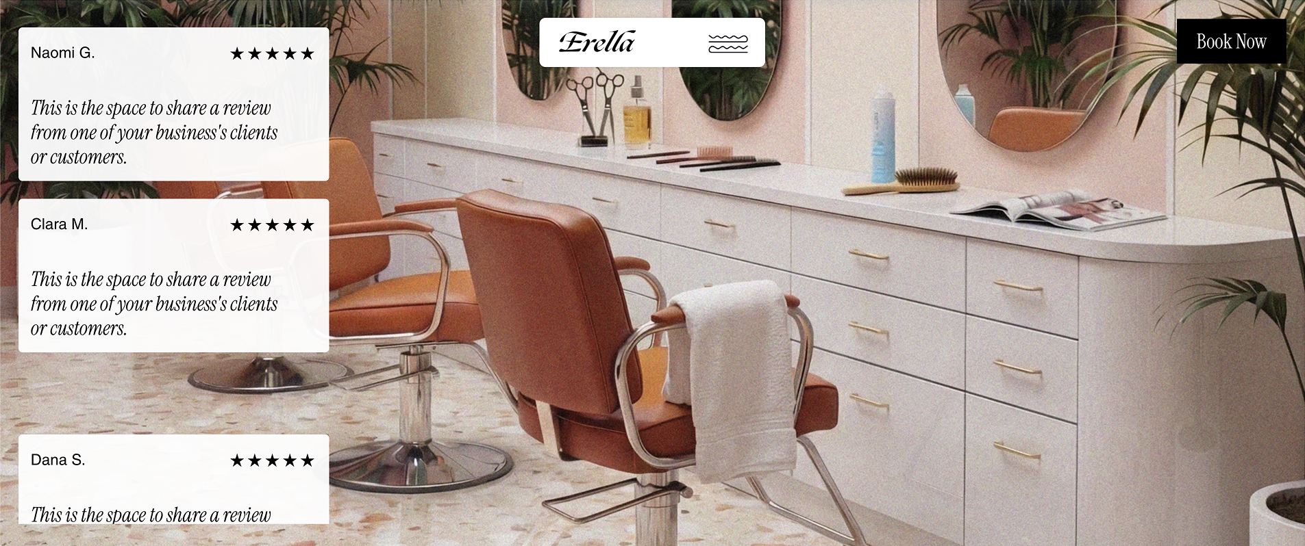
Placing client reviews over a wide shot of the salon interior is a subtle psychological nudge. It lets the visitor visualize themselves in the chair, enjoying the atmosphere.
It transforms a text-based review into a sensory experience. For a salon owner, this is the best place to use a high-quality photo of your retail shelf or your most "Instagrammable" corner to encourage both online booking and product upsells.
The Niche Specialist: Hair Extension & Lash Store
Best for: High-ticket specialty items from niche luxury brands.
Specialty stores dealing in niche products like hair extensions and lashes live on high-contrast visuals. Your customers are looking for drama and transformation, not subtle morning skincare routines. This layout prioritizes texture and specific product variations to justify the higher price.
The niche specialist essentials:
Texture-focused hero shots: High-quality images that highlight the shine and luxury of the products.
Immediate funneling: Clear paths for different product categories to guide visitors and make them feel confident in their choice.
Professional validation: Press logos and social feeds that prove industry standing.
Technical product grids: Layouts that showcase various colors, lengths, and styles.
1. The high-contrast glamor hero
Dark backgrounds are a deliberate psychological choice for high-end beauty. They make the reflective shine of products pop in a way white space can’t. This hero section sells the "red carpet" result immediately. It’s your best tool for setting a luxury price floor. By using high-detail, moody photography, you signal that these are premium products for high-stakes events.
2. Clear navigation for different categories
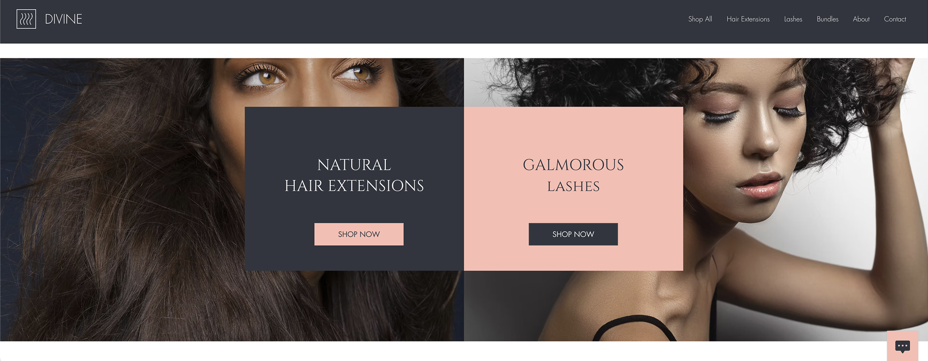
Niche shoppers often come for one specific thing. This split-screen section forces a choice the second a user scrolls. It simplifies the user journey by removing the clutter of a full catalog and pushing the customer into a targeted funnel.
3. The high-detail product showcase
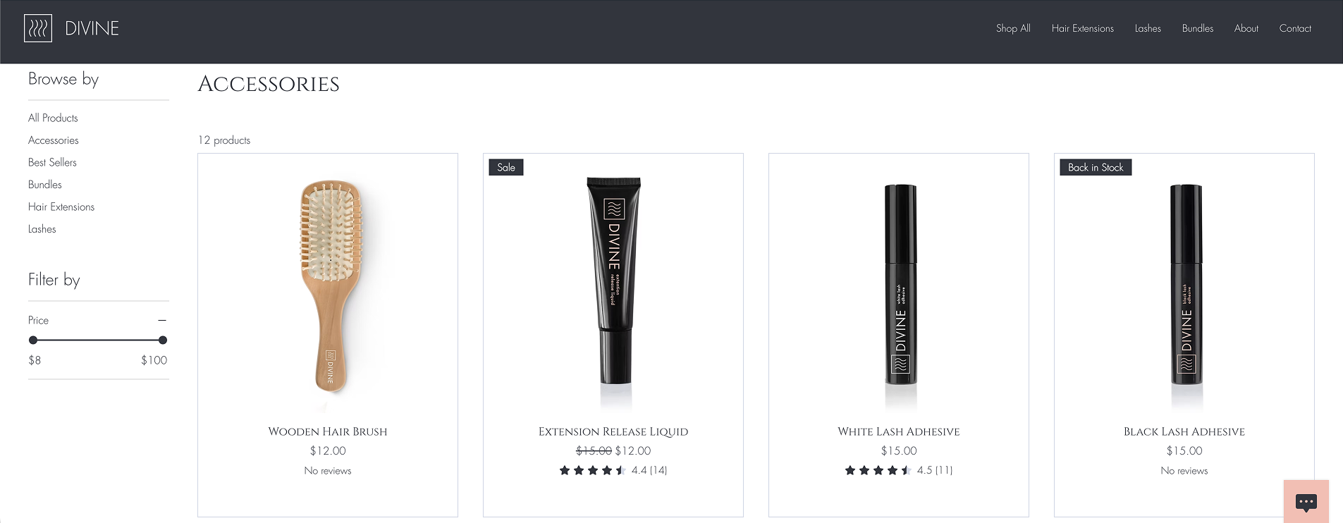
The "Accessories" grid is a proof of range. Niche buyers are meticulous about shades and styles, so showing a variety of options across different categories is vital.
It tells the customer that you have the specific technical solution they need. Keeping the backgrounds neutral here also makes the product textures the undisputed star of the page.
4. The community and press validator
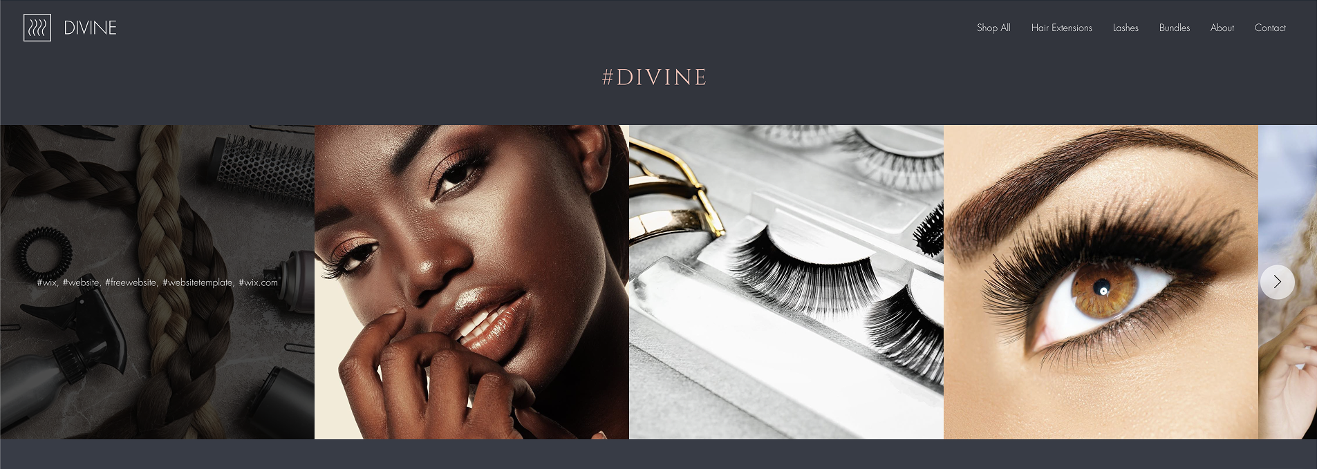
Seeing products "in the wild" via the Instagram feed and professional press logos provides the final push for a purchase. For a niche brand, this section acts as a professional seal of approval.
It moves the store from a nameless online shop to a reputable industry player. It’s also a great spot to highlight how your products look on real people, which helps bridge the gap between studio photo and real-life application.
Beyond The Layout: The Tech That Powers Beauty Growth
A template is the skeleton. Apps are the muscle.
Wix’s app integrations handle the "invisible" work: syncing inventory, managing calendars, and chasing down abandoned carts, so you can focus on the artistry.
Many beauty-specific templates already have these set up, but if you’re willing to invest the time into a brand new template, or just want to see the available options, Wix has got you covered.
Integrating more tools is usually a one-click process in the Wix App Market, but the real work happens in the backend configuration. For example, a booking app needs your specific buffer times, while a store app needs your precise shipping zones to prevent checkout friction.
Popular Wix Ecommerce Apps
Here are some of the best platforms and tools to support your Wix website’s daily operations.
The gold standard for private label skincare. Selfnamed’s partnered Wix integration is coming soon. It’ll let you sync your store directly with clean, ready-to-sell beauty formulas, making it the ultimate tool for those looking to start their own skincare or cosmetics product line.
The essential hub for any service-first business. It lets you schedule appointments, take deposits upfront to prevent no-shows, and send automated SMS reminders to keep your chair full.
The powerhouse engine for all things retail. It handles everything from global shipping and tax calculations to the high-ROI "abandoned cart recovery" emails that rescue lost sales.
Your 24/7 digital shop assistant. Use this to answer technical product questions in real-time, helping undecided buyers move from "just looking" to "checkout."
A high-impact tool for building a community. Reward your repeat buyers with points, referrals, and exclusive "members-only" perks to increase customer engagement and lifetime value.
The ultimate social proof builder. This lets customers upload their own "unfiltered" photos and testimonials directly onto your product pages, proving that your formulas actually deliver results.
Good Design Principles for Your Beauty Site
Image source: Etsy.com
Beauty design works best when it’s clean.
A professional interface tells your customers that you take your products seriously. High-level design is about making the user's journey feel effortless through clear choices and consistency.
Direct the eye with space:
Effective UI design uses plenty of open space to highlight your most important elements. When a page is cluttered, the user's attention is pulled in too many directions.
By giving your products and "Shop" buttons room to breathe, you create a clear path for the customer. Intentional layouts make the site feel organized and high-quality from the first scroll.
Sync your digital and physical branding:
Your website is the digital version of your product line. To build a unified brand, use the exact same colors for your site’s accents as you do for your product labels.
Use your product packaging ideas as a blueprint for creating your web design. This consistency creates immediate trust the moment a customer unboxes their order.
Select clean, readable typography:
Choose fonts that look sharp on every screen size. High-end beauty brands often use thin, elegant titles with slightly more space between each letter to create a clean, boutique feel.
And just like with effective packaging design, think about the hierarchy of your information. Make sure your brand and product benefits stand out first.
Build trust through consistency:
Professional design is about the details. Use the same shapes for every button, the same style for every icon, and the same border styles for every image.
Carrying these small choices through from the homepage to the checkout signals that you’re meticulous about your business. A cohesive look gives your customers the confidence they need to complete their purchase.
The Power of The Wix x Selfnamed Integration
Building a brand is traditionally expensive. Selfnamed changes that by letting you sell professional-grade beauty products under your own name without manufacturing anything yourself. It’s a low-risk way to turn your influence or salon expertise into a physical product line.
Wix is the ideal launchpad for this because it balances high-end design with easy management. Check our comparison analysis between WooCommerce vs. Shopify vs. Squarespace vs. Wix to make an informed decision. When choosing a platform, Wix stands out for its flexibility.
How to Start Selling in 3 Steps
Set up your beauty brand on Wix and move straight from design to delivery with Selfnamed.
Choose your products: Select the private label products from Selfnamed to add to your beauty line.
Upload your branding: Use the Selfnamed design studio to add your logo and colors to the product labels. Or partner with our custom design service.
Connect and go live: Link your Wix store to the Selfnamed catalog. Once our direct Wix integration is ready, your orders will sync automatically, letting you focus entirely on marketing and your clients.


Technical Checklist: From Template to First Sale
A great design only works if the "Buy" button actually functions. Use this checklist to make sure your site is technically sound before you drive traffic to it.
Test your payment setup: Complete a real transaction using a credit card or PayPal to test whether your Wix Store is connected correctly.
Write clear page titles: Fill in the SEO settings for every page. Use simple titles like "Natural Face Serums | [Your Brand Name]" to help Google understand what you sell.
Check your mobile navigation: Open your site on your phone. Make sure the menu is easy to tap and that no pop-ups block the checkout button.
Verify your shipping rules: Set your shipping rates and regions in the Wix dashboard so customers don't get an error message at the final step.
Optimize for revenue: Review our pro tips to grow your beauty brand's revenue. Learn how to fine-tune your product pages and checkout flow to turn new visitors into paying customers.
Launch Your Professional Beauty Website
Any small business worth their salt has a clean digital home for their brand. By choosing a solid Wix template, you’re skipping the technical bottlenecks and moving straight to brand design.
The technology is already built for you. Your job is to stay consistent with your workflow and keep your customers' needs at the center of every choice you make.
Success comes down to how well you execute the details. When your website looks professional and your products arrive exactly as promised, you build the kind of trust that turns a first-time visitor into a loyal fan.
Frequently Asked Questions
-
A very good answer goes here.
-
Wix is a great balance of design flexibility and ease of use. It handles your payments, shipping, and bookings in one place, which is why many beauty professionals prefer it over more technical platforms.
-
Every Wix beauty template features mobile-friendly accessibility. Your layout will automatically adjust so that your modern layout, gallery, booking calendar, and shop look great for customers using their phones.
-
The drag-and-drop editor is built for everyone. You can move elements around and upload your own photos easily. These templates provide a professional foundation so you can focus on your brand identity rather than technical building.
Must read